13.3 How a Monopolist Maximizes Profit
As we’ve suggested, once Cecil Rhodes consolidated the competing diamond producers of South Africa into a single company, the industry’s behaviour changed: the quantity supplied fell and the market price rose. In this section, we will learn how a monopolist increases its profit by reducing output. And we will see the crucial role that market demand plays in leading a monopolist to behave differently from a perfectly competitive industry. (Remember that profit here is economic profit, not accounting profit.)
The Monopolist’s Demand Curve and Marginal Revenue
In Chapter 12 we derived the firm’s optimal output rule: a profit-
In addition to the optimal output rule, we also learned in Chapter 12 that even though the market demand curve always slopes downward, each of the firms that make up a perfectly competitive industry faces a perfectly elastic demand curve that is horizontal at the market price, like DC in panel (a) of Figure 13-4. Any attempt by an individual firm in a perfectly competitive industry to charge more than the going market price will cause it to lose all its sales. It can, however, sell as much as it likes at the market price. As we saw in Chapter 12, the marginal revenue of a perfectly competitive producer is simply the market price. As a result, the price-
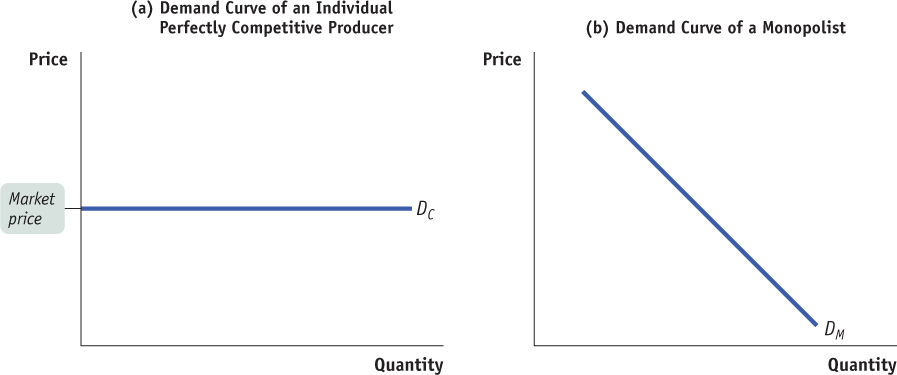
A monopolist, in contrast, is the sole supplier of its good. So its demand curve is simply the market demand curve, which slopes downward, like DM in panel (b) of Figure 13-4. This downward slope creates a “wedge” between the price of the good and the marginal revenue of the good—
Table 13-1 shows this wedge between price and marginal revenue for a monopolist, by calculating the monopolist’s total revenue and marginal revenue schedules from its demand schedule.
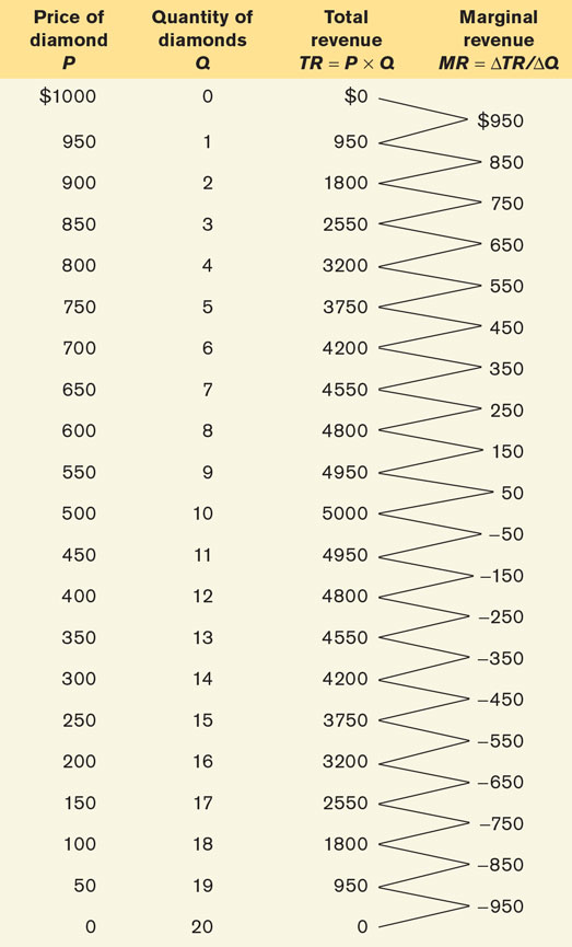
The first two columns of Table 13-1 show a hypothetical demand schedule for De Beers diamonds. For the sake of simplicity, we assume that all diamonds are exactly alike. And to make the arithmetic easy, we suppose that the number of diamonds sold is far smaller than is actually the case. For instance, at a price of $500 per diamond, we assume that only 10 diamonds are sold. The demand curve implied by this schedule is shown in panel (a) of Figure 13-5.
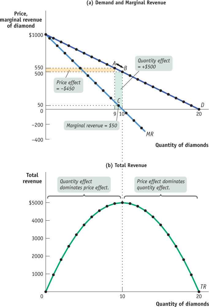
Panel (b) shows the monopolist’s total revenue curve for diamonds. As output goes from 0 to 10 diamonds, total revenue increases. It reaches its maximum at 10 diamonds—
The third column of Table 13-1 shows De Beers’s total revenue from selling each quantity of diamonds—
Clearly, after the first diamond, the marginal revenue a monopolist receives from selling one more unit is less than the price at which that unit is sold. For example, if De Beers sells 10 diamonds, the price at which the 10th diamond is sold is $500. But the marginal revenue—
Why is the marginal revenue from that 10th diamond less than the price? It is less than the price because an increase in production by a monopolist has two opposing effects on revenue:
A quantity effect. One more unit is sold, increasing total revenue by the price at which the unit is sold.
A price effect. In order to sell an additional unit, the monopolist must cut the market price on all units sold. This decreases total revenue.
The quantity effect and the price effect when the monopolist goes from selling 9 diamonds to 10 diamonds are illustrated by the two shaded areas in panel (a) of Figure 13-5. Increasing diamond sales from 9 to 10 means moving down the demand curve from A to B, reducing the price per diamond from $550 to $500. The green-
Point C lies on the monopolist’s marginal revenue curve, labelled MR in panel (a) of Figure 13-5 and taken from the last column of Table 13-1. The crucial point about the monopolist’s marginal revenue curve is that it is always below the demand curve. That’s because of the price effect: a monopolist’s marginal revenue from selling an additional unit is always less than the price the monopolist receives for the previous unit. It is the price effect that creates the wedge between the monopolist’s marginal revenue curve and the demand curve: in order to sell an additional diamond, De Beers must cut the market price on all units sold.
In fact, this wedge exists for any firm that possesses market power, such as an oligopolist as well as a monopolist. Having market power means that the firm faces a downward-
Take a moment to compare the monopolist’s marginal revenue curve with the marginal revenue curve for a perfectly competitive firm, one without market power. For such a firm there is no price effect from an increase in output: its marginal revenue curve is simply its horizontal demand curve. So for a perfectly competitive firm, market price and marginal revenue are always equal.
To emphasize how the quantity and price effects offset each other for a firm with market power, De Beers’s total revenue curve is shown in panel (b) of Figure 13-5. Notice that it is hill-
FINDING THE MONOPOLY PRICE
In order to find the profit-
However, it’s important not to fall into a common error: imagining that point A also shows the price at which the monopolist sells its output. It doesn’t: it shows the marginal revenue received by the monopolist, which we know is less than the price.
To find the monopoly price, you have to go up vertically from A to the demand curve. There you find the price at which consumers demand the profit-
The Monopolist’s Profit-Maximizing Output and Price
To complete the story of how a monopolist maximizes profit, we now bring in the monopolist’s marginal cost. Let’s assume that there is no fixed cost of production; we’ll also assume that the marginal cost of producing an additional diamond is constant at $200, no matter how many diamonds De Beers produces. Then marginal cost will always equal average total cost, and the marginal cost curve (and the average total cost curve) is a horizontal line at $200, as shown in Figure 13-6.
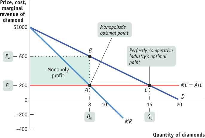
To maximize profit, the monopolist compares marginal cost with marginal revenue. If marginal revenue exceeds marginal cost, De Beers increases profit by producing more; if marginal revenue is less than marginal cost, De Beers increases profit by producing less. So the monopolist maximizes its profit by using the optimal output rule:

IS THERE A MONOPOLY SUPPLY CURVE?
Given how a monopolist applies its optimal output rule, you might be tempted to ask what this implies for the supply curve of a monopolist. But this is a meaningless question: monopolists don’t have supply curves.
Remember that a supply curve shows the quantity that producers are willing to supply for any given market price. A monopolist, however, does not take the price as given; it chooses a profit-
The monopolist’s optimal point is shown in Figure 13-6. At A, the marginal cost curve, MC, crosses the marginal revenue curve, MR. The corresponding output level, eight diamonds, is the monopolist’s profit-
Monopoly versus Perfect Competition
When Cecil Rhodes consolidated many independent diamond producers into De Beers, he converted a perfectly competitive industry into a monopoly. We can now use our analysis to see the effects of such a consolidation.
Let’s look again at Figure 13-6 and ask how this same market would work if, instead of being a monopoly, the industry were perfectly competitive. We will continue to assume that there is no fixed cost and that marginal cost is constant, so average total cost and marginal cost are equal.
If the diamond industry consists of many perfectly competitive firms, each of those producers takes the market price as given. That is, each producer acts as if its marginal revenue is equal to the market price. So each firm within the industry uses the price-

In Figure 13-6, this would correspond to producing at C, where the price per diamond, PC, is $200, equal to the marginal cost of production. So the profit-
But does the perfectly competitive industry earn any profits at C? No: the price of $200 is equal to the average total cost per diamond. So there are no economic profits for this industry when it produces at the perfectly competitive output level.
We’ve already seen that once the industry is consolidated into a monopoly, the result is very different. The monopolist’s calculation of marginal revenue takes the price effect into account, so that marginal revenue is less than the price. That is,

As we’ve already seen, the monopolist produces less than the competitive industry—
So, just as we suggested earlier, we see that compared with a competitive industry, a monopolist does the following:
Produces a smaller quantity: QM < QC
Charges a higher price: PM > PC
Earns a profit
Monopoly: The General Picture
Figure 13-6 involved specific numbers and assumed that marginal cost was constant, that there was no fixed cost, and, therefore, that the average total cost curve was a horizontal line. Figure 13-7 shows a more general picture of monopoly in action: D is the market demand curve; MR, the marginal revenue curve; MC, the marginal cost curve; and ATC, the average total cost curve. Here we return to the usual assumption that the marginal cost curve has a “swoosh” shape and the average total cost curve is U-shaped.
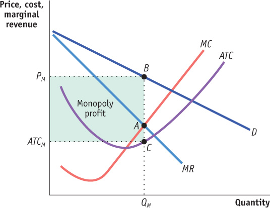
Applying the optimal output rule, we see that the profit-maximizing level of output is the output at which marginal revenue equals marginal cost, indicated by point A. The profit-maximizing quantity of output is QM, and the price charged by the monopolist is PM. At the profit-maximizing level of output, the monopolist’s average total cost is ATCM, shown by point C.
Recalling how we calculated profit in Equation 12-5, profit is equal to the difference between total revenue and total cost. So we have:

Profit is equal to the area of the shaded rectangle in Figure 13-7, with a height of PM - ATCM and a width of QM.
In Chapter 12 we learned that a perfectly competitive industry can have profits in the short run but not in the long run. In the short run, price can exceed average total cost, allowing a perfectly competitive firm to make a profit. But we also know that this cannot persist. In the long run, any profit in a perfectly competitive industry will be competed away as new firms enter the market. In contrast, barriers to entry allow a monopolist to make profits in both the short run and the long run.
PRIVATIZATION OF NOVA SCOTIA POWER— A GOOD IDEA?
Historically, electric utilities were recognized as natural monopolies. A utility serviced a defined geographical area, owning the plants that generated electricity as well as the transmission lines that delivered it to retail customers. The rates charged customers were managed by the government; set at a level to cover the utility’s cost of operation plus a modest return on capital to its shareholders.
Traditionally, public utilities in Canada were corporations owned by the provincial government. However, in the early 1990s the provincial government of Nova Scotia under Premier Donald Cameron decided to privatize the Nova Scotia Power Corporation, the province’s electrical utility. This move by Cameron’s government caused much controversy. Many believed the sale was driven by the pressure to reduce the province’s budget deficits and debt-servicing cost. Cameron’s government argued that by privatizing the utility the province could better allocate its limited revenues to other much needed services such as health care and education. Many were skeptical, fearing the sale would create more harm than benefits for Nova Scotians, and some worried that the price of electricity would increase. When the privatization of the Nova Scotia Power Corporation was finalized in 1992 it was the largest private equity transaction in the country’s history.
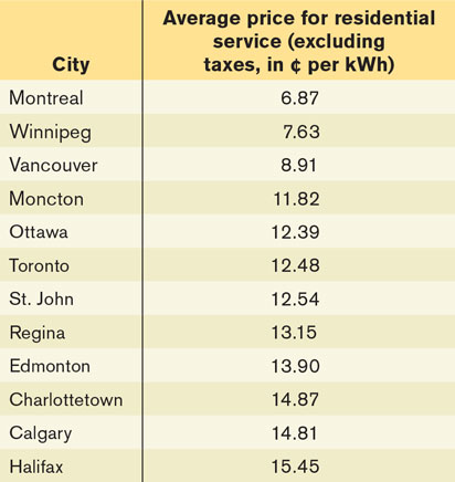
So what happened to the price of electricity in Nova Scotia following the privatization? The privately owned Nova Scotia Power has raised its prices seven times since 2000. These increases in prices have been proposed to finance updates to infrastructure and to cover the cost of investing in renewable energy. However, many perceive these increases as a result of the lack of competition, which allows Nova Scotia Power to exercise its monopoly power to charge consumers higher prices and earn higher profits. The table shows the average price of electricity on April 1, 2013 in cents per kilowatt-hour for selected cities in Canada. It clearly shows that residents in Halifax paid the highest rates (15.45¢/kWh) while residents in Montreal paid the lowest rate (6.87¢/kWh). Not surprisingly, some Nova Scotians have called for the return of a province-owned corporation for electricity.

Quick Review
The crucial difference between a firm with market power, such as a monopolist, and a firm in a perfectly competitive industry is that perfectly competitive firms are price-takers that face horizontal demand curves, but a firm with market power faces a downward-sloping demand curve.
Due to the price effect of an increase in output, the marginal revenue curve of a firm with market power always lies below its demand curve. So a profit-maximizing monopolist chooses the output level at which marginal cost is equal to marginal revenue—not to price.
As a result, the monopolist produces less and sells its output at a higher price than a perfectly competitive industry would. It earns profits in the short run and the long run.
Check Your Understanding 13-2
CHECK YOUR UNDERSTANDING 13-2
Question 13.4
Use the accompanying total revenue schedule of Emerald, Inc., a monopoly producer of 10-carat emeralds, to calculate the answers to parts (a) to (d). Then answer part (e).
The demand schedule
The marginal revenue schedule
The quantity effect component of marginal revenue per output level
The price effect component of marginal per output level
What additional information is needed to determine Emerald, Inc.’s profit-maximizing output?
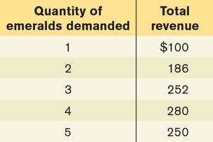
The price at each output level is found by dividing the total revenue by the number of emeralds produced; for example, the price when 3 emeralds are produced is $252/3 = $84. The price at the various output levels is then used to construct the demand schedule in the accompanying table.
The marginal revenue schedule is found by calculating the change in total revenue as output increases by one unit. For example, the marginal revenue generated by increasing output from 2 to 3 emeralds is ($252 − $186) = $66.
The quantity effect component of marginal revenue is the additional revenue generated by selling one more unit of the good at the market price. For example, as shown in the accompanying table, at 3 emeralds, the market price is $84; so when going from 2 to 3 emeralds, the quantity effect is equal to $84.
The price effect component of marginal revenue is the decline in total revenue caused by the fall in price when one more unit is sold. For example, as shown in the table, when only 2 emeralds are sold, each emerald sells at a price of $93. However, when Emerald, Inc. sells an additional emerald, the price must fall by $9 to $84. So the price effect component in going from 2 to 3 emeralds is (−$9) × 2 = −$18. That’s because 2 emeralds can only be sold at a price of $84 when 3 emeralds in total are sold, although they could have been sold at a price of $93 when only 2 in total were sold.
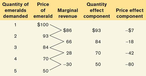
In order to determine Emerald, Inc.’s profit-maximizing output level, you must know its marginal cost at each output level. Its profit-maximizing output level is the one at which marginal revenue is equal to marginal cost.
Question 13.5
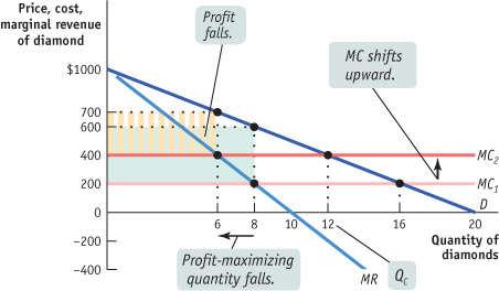
Use Figure 13-6 to show what happens to the following when the marginal cost of diamond production rises from $200 to $400.
Marginal cost curve
Profit-maximizing price and quantity
Profit of the monopolist
Perfectly competitive industry profits
As the accompanying diagram shows, the marginal cost curve shifts upward to $400. The profit-maximizing price rises and quantity falls. Profit falls from $3200 to $300 × 6 = $1800. Competitive industry profits, though, are unchanged at zero in the long run.
