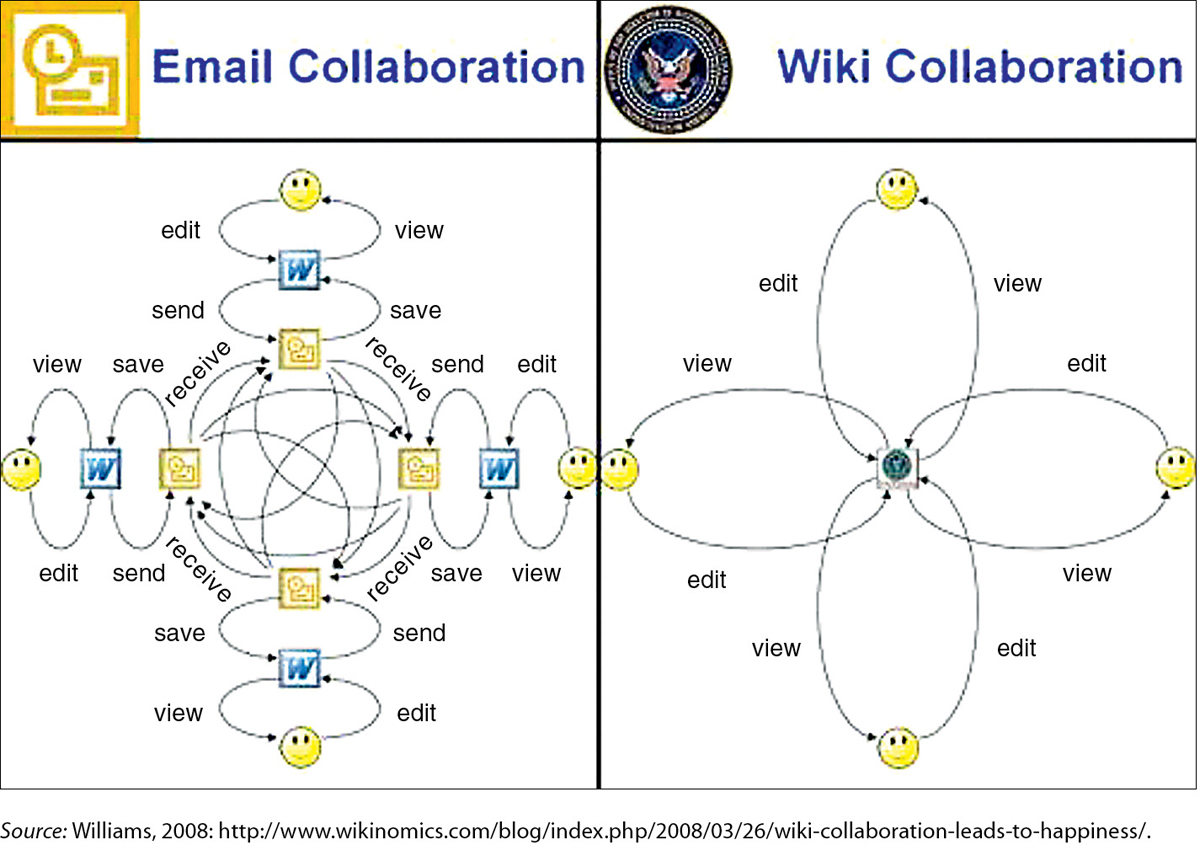
One characteristic that distinguishes technical communication from many other kinds of writing is its heavy use of graphics to clarify concepts and present data. This graphic, from a PowerPoint presentation, compares two technologies used for collaborative writing. The image on the left represents how a writer creates a document and then distributes it via email to others for editing. The image on the right represents how a writer creates a document in a wiki (an online writing and editing space), to which others come to view and edit the document.
The history of this graphic says something about how information flows in the digital age. The graphic was originally created by one person, Manny Wilson of U.S. Central Command, who shared it with a colleague at another U.S. government agency. Eventually, it made its way to another person, Anthony D. Williams, who incorporated it into a presentation he delivered at a corporation. From there, it went viral.
The writer who created this image doesn’t need to say that a wiki is a better tool than email for editing a document. The complexity of the image on the left, compared with the simplicity of the image on the right, shows why the wiki is the better tool for this job.
Figure 1.2 A Graphic Comparing Two Communication Media