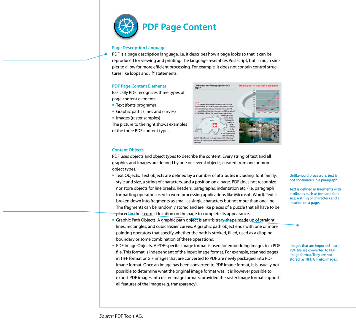
FIGURE 7.19 A One-Column Design
This page from a software company’s white paper—a marketing document usually distributed on the web—shows one approach to a one-column design.
The main text column is relatively narrow, making the line easy to read.
The right margin is wide enough to accommodate text boxes, small graphics, or other items.
One goal of document design is to reduce the number of pages needed—but when you design a page, you want to make the text inviting and easy to read. Figuring out how to balance these two priorities is one of the major challenges of designing a page.