FIGURE 7.20 A Magazine Page Design
This is a page from State, the magazine for employees of the U.S. State Department. Magazines for people who work together tend to include a lot of photographs, including many showing people from that organization.
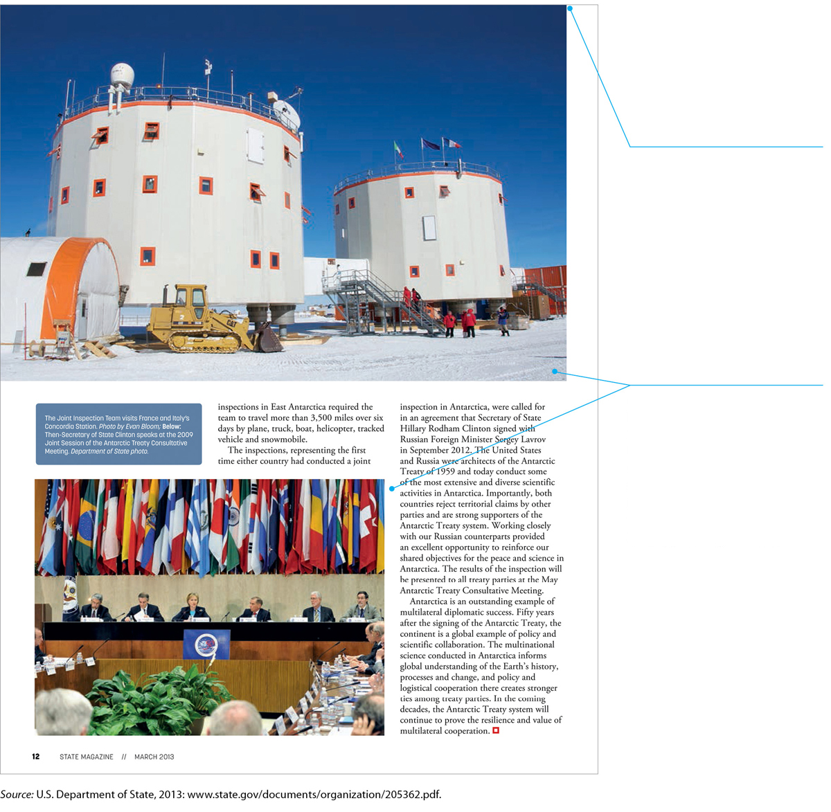
The large photograph extends to the top edge and the left edge of the page. Eliminating the margins in this way would be a mistake if the graphic were crammed with information that readers needed to study; a dense table of data, for instance, would be overwhelming. But in this case, the blue sky in the background acts as a decorative frame for the “information” in the bottom half of the photo.
Although this page uses a simple three-column design, note that one photo spans all three columns, another photo spans two columns, and the caption box spans one column. This creative use of the multicolumn design enables the designer to fill the page with content while keeping it visually interesting.