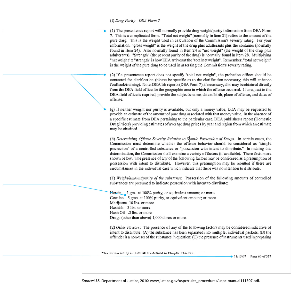
FIGURE 7.21 A Poorly Designed Page
The writer of this document hasn’t designed the page. He or she has simply hit the Enter key repeatedly.
The full justification makes for a boxy appearance and irregular spacing between words.
The wide column results in long, difficult-to-read lines.
The two hierarchical levels — numbered and lettered — have the same design and therefore are difficult to distinguish from each other.
In the table, the second column is misaligned.
The footer, which includes the date and the page number, is a useful design feature, however.