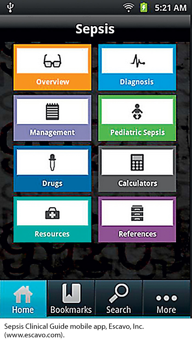
This app helps physicians diagnose sepsis quickly and effectively. The information most crucial to evaluating the condition is easily accessible on the home screen. At the top of the screen, where the reader’s eyes will initially fall, is an overview of the condition and, most importantly, the diagnostic tool. Less-essential items, such as resources and references, are located at the bottom of the screen. Supplementary information, such as a call for authors and a feedback form, is deeper on the site, behind the “More” tab.
This simple screen uses the principle of contrast effectively to highlight key content. Each of the eight main content areas has its own color and its own icon to distinguish it from the seven other areas. In addition, the four navigation items at the bottom of the screen use contrast in that the name and icon for the screen the reader is now viewing—in this case, the home page—are presented against a blue screen, whereas those for the other three navigation buttons are presented against a black screen.