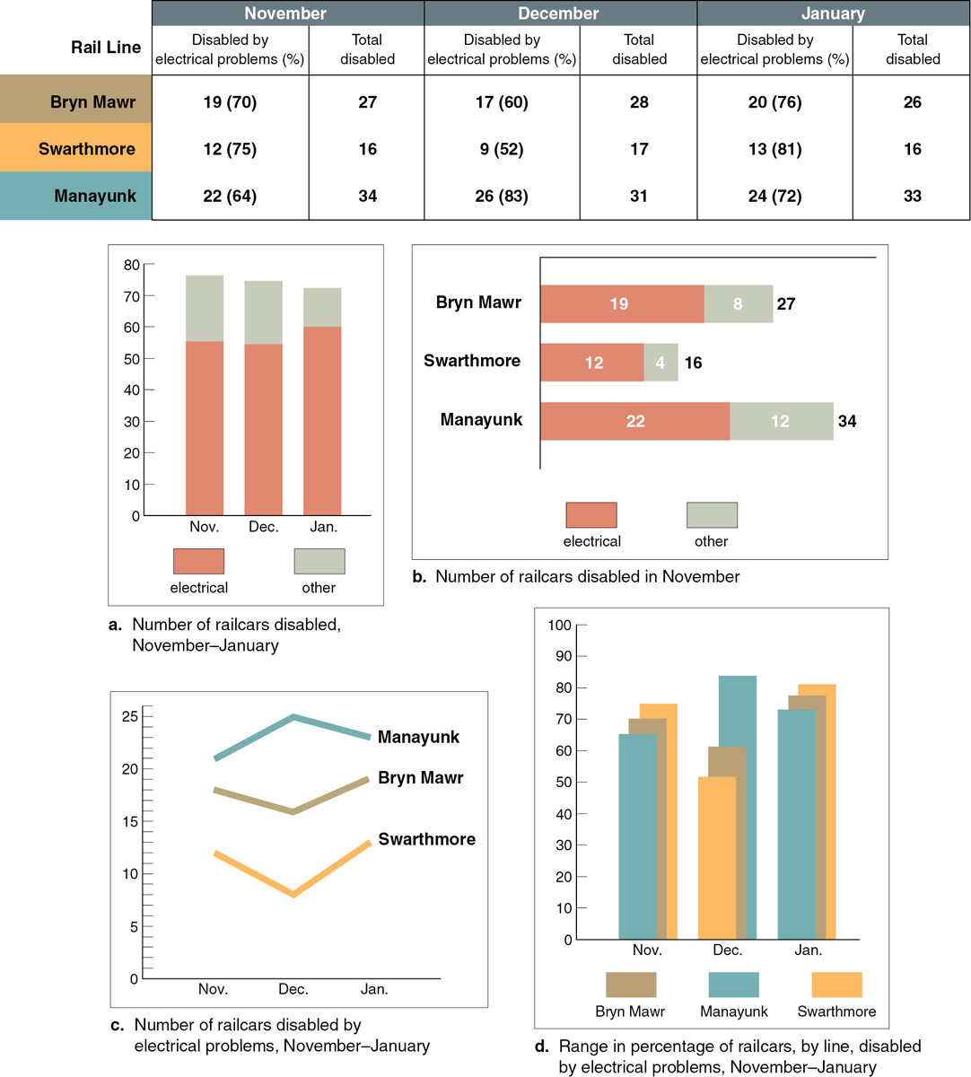
FIGURE 8.6 Different Graphics Emphasizing Different Points
Each of these four graphs emphasizes a different point derived from the data in the table. Graph (a) focuses on the total number of railcars disabled each month, classified by cause; graph (b) focuses on the three rail lines during one month; and so forth.