 FIGURE 8.12 Line Graph
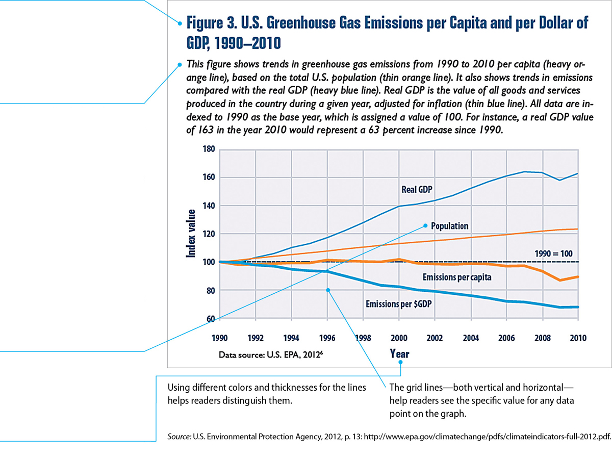
Note that the title is lengthy because it specifically names the main variables presented in the graph. Name all the important data in the title; it is better for a title to be lengthy than to be imprecise or unclear.
The designer has included a caption that explains how to read the graph. Because this graph is illustrating several items that are measured in different units and therefore cannot be plotted on the same scale (including population and greenhouse gas emissions), the designer chose to have the y-axis express variations from a norm. In this case, the norm is represented by the quantity of each item in the year 1990. If this graph illustrated several items that were measured in the same units, such as the sales figures, in dollars, of several salespersons, the designer would start the y-axis at zero.
Because the four data lines are sufficiently far apart, the designer placed the appropriate data label next to each line. Alternatively, the designer could have used a separate color-coded legend.
Each axis is labeled clearly.