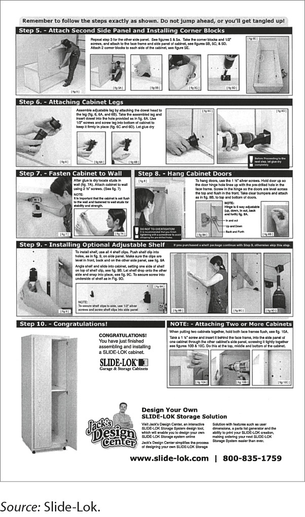
a. Cluttered design

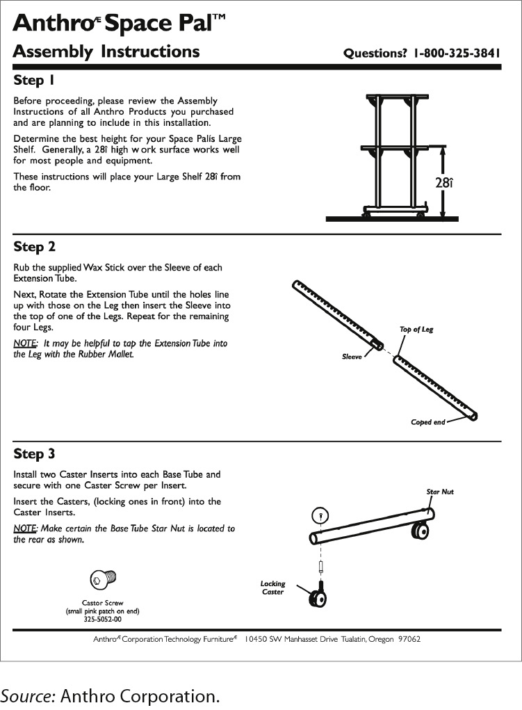
b. Attractive design
FIGURE 14.7 Cluttered and Attractive Page Designs in a Set of Instructions
The left-hand page is cluttered, containing far too much information. In addition, the page is not chunked effectively. As a result, the reader’s eyes don’t know where to focus. Would you look forward to using these instructions to assemble a cabinet?
The right-hand page is well designed, containing an appropriate amount of information presented in a simple two-column format. Notice the effective use of white space and the horizontal rules separating the steps.