Case 1 Graphics: Selecting and Presenting Data
Case 1
Graphics
Selecting and Presenting Data
The Situation
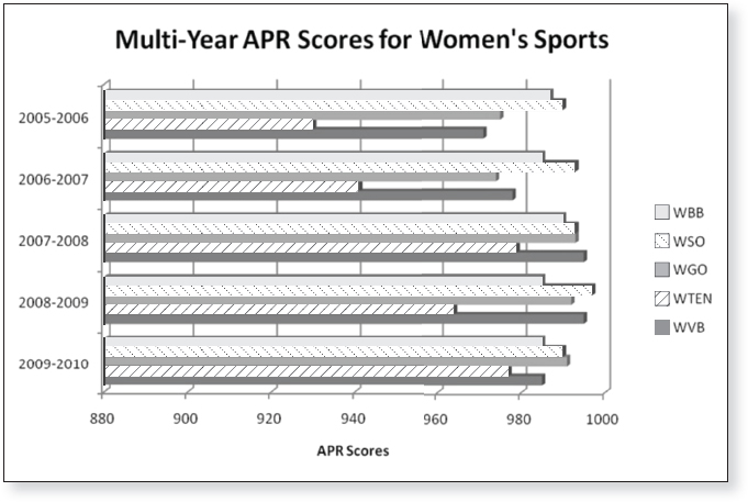
The Gulls Department of Athletics at Bayside State College fields 10 National Collegiate Athletic Association (NCAA) Division I intercollegiate teams: five women’s sports (volleyball, tennis, golf, soccer, and basketball) and five men’s sports (tennis, golf, soccer, basketball, and water polo). The teams compete in the Metro Sports Conference. In addition to tracking the graduation rates and grade point averages of their student-athletes, the staff at the Department of Athletics uses academic progress rates (APRs) developed by the NCAA to measure the academic achievement of student-athletes at Bayside.
A team’s APR score reflects how successful its student-athletes are at maintaining their academic eligibility and whether they remain enrolled in school. To be academically eligible to compete, student-athletes must meet a certain grade point average and make steady progress toward their degree by passing a specific number of degree-applicable courses each semester. Because turnover of nonscholarship players on a team roster can be high and because these student-athletes have not signed an agreement to stay on the team or at the school, coaches have less influence over them. Consequently, the NCAA includes only students receiving athletically related financial aid when calculating APR scores.
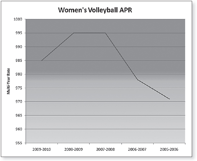
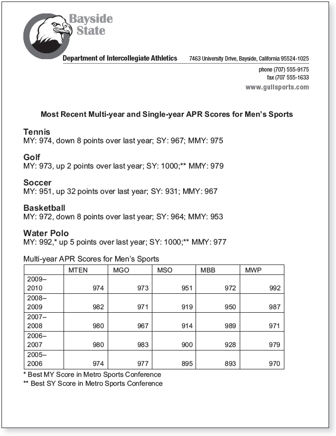
Recently, Bayside calculated two APR scores for each team: a multi-year APR score that reflects academic performance and progress over four years and a single-year score that focuses on just one academic year. Although a multi-year score includes data from the past four academic years, it is referred to by the most recent academic year included. Similarly, a single-year score is labeled by the academic year from which the data was drawn. For example, a multi-year score for 2009–2010 includes data from fall 2009, spring 2010, and the three previous years, going back to fall 2006. A single-year score for 2009–2010 includes data only from fall 2009 and spring 2010.
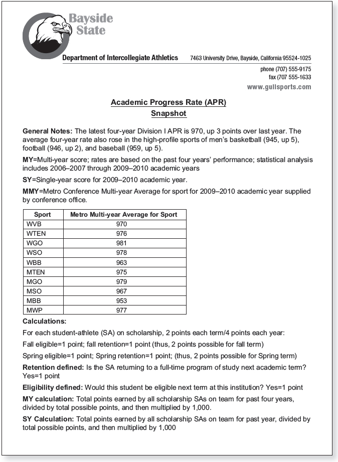
The APR measures the academic achievement of teams each fall and spring using a point system (Figure 1.1). Each student-athlete on scholarship earns one point if he or she stays in school and one point for being eligible to compete each term. Thus, a scholarship student-athlete can earn up to four points each year: two in the fall and two in the spring. A team’s single- and multi-year scores are calculated by dividing the total points earned (over one year or the past four years) by the total points possible and then multiplying the result by 1,000. For example, a team earns 34 points for the year out of a possible 36. The single-year APR score for the team is 944 (34 divided by 36 = .944, which is then multiplied by 1,000). A perfect score for the year is 1,000. Teams with low APR scores face penalties, such as scholarship losses and restrictions on practice and competition.
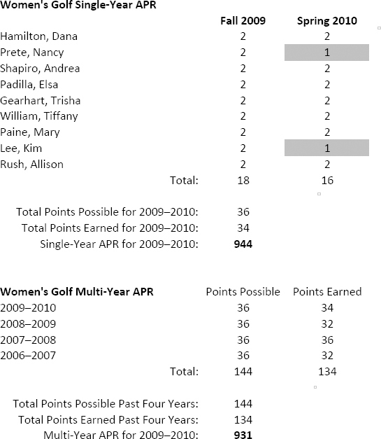
In SP10 the golf team lost two points because two student-athletes were academically ineligible to compete. However, both of these students earned a retention point for returning to school that semester.
The single-year APR score is calculated by dividing the points earned (34) by the possible points (36). The resulting number (.9444) is rounded to the nearest thousandths and then multiplied by 1000.
The multi-year APR score is calculated by dividing the total points earned over the last four academic years (134) by the possible points (144). The resulting number (.93055) is rounded to the nearest thousandths and then multiplied by 1000.
Because of your current position as an intern with the Bayside State College Sports Information Office and your expertise as a technical communicator, the athletic director, Cheryl Mueller, has enlisted your help in preparing materials to communicate the recently released APR scores. In particular, she seeks your assistance in explaining APR scores, selecting relevant APR data, and presenting the information in ways that coaches, faculty, and community members will understand. Because APR scores track each team’s classroom performance, the scores can be used to gauge the commitment of the student-athletes and their coaches to academics, to measure a team’s academic improvement, and to compare a team’s academic performance to that of conference rivals. An athletic department with consistently high APR scores demonstrates that its teams are competitive in the classroom as well as on the field.
The Challenge
Organizations often collect a wide variety of data on organizational performance, and they manipulate these data in numerous ways. This results in a mass of information that must be organized and transformed before the data can be used for a specific purpose. The data-collection process may seem foreign at first, and you may need to do further research at the organization or on the Internet to understand the numbers. Your challenge is to avoid becoming overwhelmed by the amount of data you must analyze and to instead discover ways to identify, manage, and present the data that are applicable to your task while ignoring what is irrelevant.
Your Job

To download electronic copies of documents in this chapter, click here.
The data that Department of Athletics staff members have collected can be confusing. Your job is to help organize and present the data to show the faculty and larger community that the department is focused on the academic success of its student-athletes as well as to help coaches and athletic administrators track academic performance and, if necessary, identify teams struggling in the classroom. This case asks you to analyze data on the academic achievement of several intercollegiate teams at a state college. You may be asked to do the following:
- Evaluate the effectiveness of graphics to be used in a report published by the Department of Athletics.
- Revise documents the department currently uses to communicate academic achievement scores to coaches.
- Create graphics that highlight various teams’ academic achievement to the faculty senate.
- Create graphics and text for a press release that communicates the Department of Athletics’ recent academic achievement to various stakeholders, such as campus administrators, faculty, and fans.
Your instructor will tell you which of the tasks you are to complete.
You can view case documents at the bottom of each task below. To download copies of the documents that you can work with, click here.
Task 1 Evaluate the Effectiveness of Graphics
Cheryl Mueller, the athletic director, shows you two graphics (Documents 1.2 and 1.3) she plans to use in the department’s next annual report. “I haven’t had a chance to ask anyone about these graphics,” she tells you. “I’d like to use these graphics in our next report. What do you think?” Write Cheryl a brief memo evaluating the effectiveness of the two graphics and suggesting how she should revise them. You may wish to annotate the graphics with comments and include them with your memo.
Task 2 Assess and Improve Communication Strategies
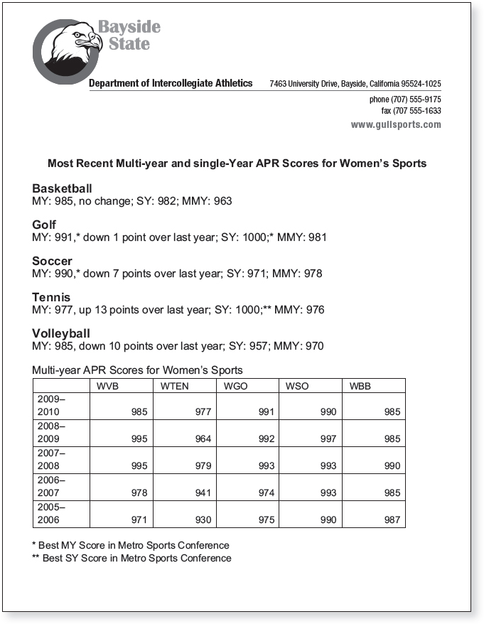
At the fall coaches’ meeting, attendees receive the latest APR statistics (Documents 1.4 and 1.5) as well as a sheet briefly explaining APR scores (Document 1.6). An athletics staff member sitting next to you points to the sheets and asks, “You know something about graphics and design, don’t you? Do you think we could improve the way we communicate this information? To be honest, I’m not convinced that some of the coaches understand these sheets. I’m sure the athletic director would appreciate some help communicating this information.” Study which aspects of the design are effective and which can be improved. Consider the graphics, the text, and the overall design of each document. Then revise the documents so that they work together to better communicate the information.
Task 3 Create Effective Graphics and Speaker’s Notes
“Given some of the high-profile scandals at other institutions and recent news reports critical of intercollegiate sports in general, the faculty has become increasingly interested in how our student-athletes are performing in the classroom,” Cheryl explains. “I’m going to address our institution’s faculty senate next month. I have our most recent APR scores to illustrate the academic achievement of our student-athletes, but if I start going over a pile of statistics and using a bunch of acronyms, their eyes will glaze over and we’ll likely not make a good impression. I think the scores provide strong evidence that the entire Department of Athletics makes academics a priority. Having the support of our faculty is critical to our continued success, both in the classroom and on the field or court. Can you help me create some graphics that effectively communicate the academic success of our student-athletes?”
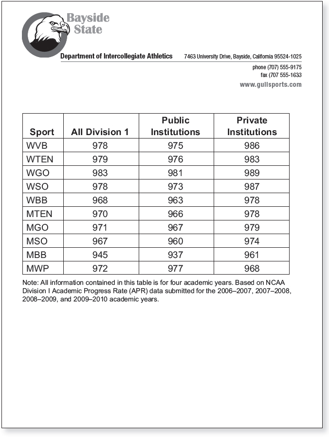
Cheryl would like to make the following two arguments in her appearance before the faculty senate: (1) based on APR scores, many Bayside student-athletes are above average academically compared to other Division I schools, and (2) based on the most recent APR scores, Bayside teams do better academically than many teams in their conference.
Cheryl hands you the APR statistics for both women’s sports (Document 1.4) and men’s sports (Document 1.5) in 2009–2010, the APR scores for conference schools in 2009–2010 (Document 1.6), and the APR scores for Division I schools in 2009–2010 (Document 1.7) and asks you to create one or more graphics for each argument. “It would be a huge help,” she adds, “if you also suggested some speaking notes that I could use to introduce and explain each graphic to the faculty senate.” Based on the two points Cheryl wants to make, determine the data and type of graphics that will best help her persuade her audience. Then write speaker’s notes that will help Cheryl explain the graphics to her audience. When writing the speaker’s notes, consider whether Cheryl will need to provide some background information to senate members before they can understand the graphics of the institution’s APR scores.
Task 4 Write a Press Release, and Integrate Text and Graphics
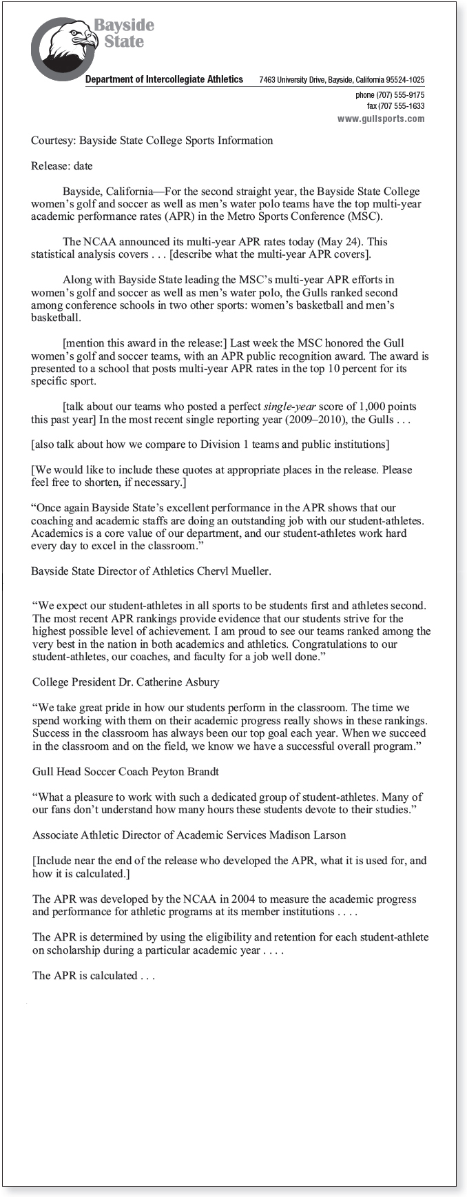
Each year, after APR scores are ready, the athletic director posts a press release on the department’s Web site highlighting the academic success of Bayside teams compared to other teams in the Metro Conference. This year, she asks for your help in creating the press release. “I want to call attention to the teams that are outperforming their conference foes in the classroom,” Cheryl explains. “I also want to help our fans understand how we are measuring academic success. Most people understand grade point averages, or GPAs. But few people outside of athletics understand APR scores.” She hands you an outline for a press release (Document 1.8) that is missing the important data for this year. “This is just a start. Because this will be posted on our Web site, you may use color graphics, but keep the paragraphs short for easy reading. Keep the release under 750 words, and include the Bayside logo and at least one other graphic.” Complete the press release, revising and reorganizing as necessary. You will need to consult Documents 1.4 and 1.5 to gather any missing data.
When You’re Finished
Reflecting on This Case In a 250- to 500-word response to your instructor, discuss (a) what you learned from this case, (b) how you could relate this case to work situations you will face in your chosen career, and, if applicable, (c) the ways in which this case compares to similar situations you have already faced at work. Your instructor will tell you whether your response should be submitted as a memo, an email, or a journal entry, or in a different format.
Moving beyond This Case Collect data for two different products within a specific category. For example, you might choose to research the nutritional values of two different energy bars, or you might investigate the features of two different video game consoles, the cost of living in two different towns, or the value of two different stocks. Using the data you collect, create the following:
- A graphic effectively showing that option 1 is the best choice.
- A graphic effectively showing that option 2 is the best choice.
- An unbiased graphic comparing the two options.
Be prepared to explain the choices you made when selecting and presenting data as well as the rhetorical situations in which each of your graphics would be appropriate.