Suggested Responses to Additional Exercises and Cases for Chapter 15: Making Oral Presentations
Suggested Response to “Poking Fun at Presentation-
Norvig’s parody of presentation-
Suggested Response to “Evaluating Presentation-
Although responses will vary, a strong response will address the template’s adherence to the core design principles of proximity, alignment, repetition, and contrast; its simplicity and whether any of its features introduce unnecessarily clutter; the degree of flexibility it offers in allowing users to customize the presentation of text to their needs; and the relevance of any visual aids included.
Suggested Response to “Delivering an Impromptu Presentation”
Responses will vary. If this is students’ first opportunity to present in class, I try to keep the feedback short and simple. I recommend that each listener write down one part of the presentation that he or she thought was particularly effective and one element that was confusing or distracting.
Suggested Response to “Evaluating a Recent Presentation”
Although responses will vary, successful responses will address many, if not all, of the issues covered in the Speaker’s Checklist at the end of Chapter 15. This project provides students with an opportunity to listen critically to a live presentation and to reflect on the effectiveness of the techniques used.
Suggested Response to “Creating Presentation Graphics”
Responses will vary. This project provides students with practice designing presentation graphics to accompany a speech. Students also learn the limitations of bulleted lists as a format for presentation graphics. Finally, this project requires students to evaluate the content of the speech and not its delivery.
Suggested Response to “A Presentation on Presentation Graphics”
The following slide explains some principles of effective presentation graphics:
Principles of Effective Presentation Graphics
Simplify.
Use color.
Translate numbers into graphics.
Include only one key point per graphic.
Use graphics that relate to your topic.
The following slide describes questions to ask when designing presentation graphics:
Planning Presentation Graphics
Your answers to the following questions will help you design effective presentation graphics:
How complex is my message?
How big is my audience?
How formal is the atmosphere?
How much interest will my audience have in my message?
Where will I deliver my message?
Will I deliver this message again?
Although these two examples are text only, students will likely include graphics as well as text in their slides, to illustrate both good and bad examples of presentation graphics.
Suggested Response to “Presenting Resources for Students in Your Major”
This case calls for students to synthesize all the information in Chapter 15. They have been given an audience and a purpose, but they need to generate the information, select an appropriate organizational pattern, create the slides, rehearse the presentation, and deliver it.
Suggested Response to “Choosing Effective Slide Layouts”
1. Sample email message with guidelines:
From: your_name@mail.com
To: sang_lee@adacounty.gov
Subject: Slide Layout Guidelines
Sang,
Last night I spent some time on the Internet researching guidelines for preparing effective presentation graphics. I focused on guidelines related to slide layout. Below I have distilled my findings into a list of 10 guidelines:
Organize your content first, and then select slide layouts that best present your content. Focus first on deciding what you want to say and how you will organize your presentation. Once your content is set, you can start thinking about how best to support it with presentation graphics (slides).
Use a grid for designing the slide layout. In PowerPoint, for example, you can display guides that will help you align and balance elements on a slide. From the “View” menu, select “Grid and Guides.”
Choose a layout based on which elements you want on a slide. Let the content and your purpose guide your choice of slide layouts. The preset slide layouts provide different combinations of text, white space, graphics, clip art, and objects. Avoid choosing different layouts just to add variety to your slides.
Use layouts with lists for specific purposes. Numbered lists suggest a sequence or priority. Use bullets to avoid sequence or priority. Use open boxes for checklists. Keep your lists under 10 items, if possible.
Use layouts with text and graphics (referred to as “content” in PowerPoint) when both are needed. Include a graphic to communicate information that is difficult to communicate with words alone. Add text to explain a complicated graphic.
Use key words and phrases rather than entire sentences. Avoid putting your entire presentation (word for word) on your slides. Use your slides for previewing, simplifying, elaborating, and reviewing material.
Follow the 7 ×7 guideline to avoid cluttering your slides. That is, include no more than seven words per line and seven lines per slide. If necessary, break major points into separate slides. Of course, this is just a guideline to remind you to be brief. Some slides will have more text and some will have less text.
Use at least 24-
point type . Anything smaller will make it difficult for your audience to read your text.Include informative headings and footers. Descriptive headings, for example, help audiences reorient themselves when they get distracted or momentarily zone out. Including your organization, the presentation title, the date, and the slide number in the footer provides your audience with additional information.
Use the landscape orientation for slides. A landscape orientation allows both the tops and the bottoms of slides to fit onto the projection screen.
Later this afternoon I plan to take a look at the sample slides you emailed me. I’ll get back to you this evening. If you have questions about the above guidelines, let me know.
[your name]
2. Sample email message and revised slides:
From: your_name@mail.com
To: sang_lee@adacounty.gov
Subject: Fingerprint Slide Revisions
Hello Sang,
I’ve revised the slides for your fingerprinting presentation. In some cases, I recommend creating additional slides. Below I discuss the revisions I made to each slide.
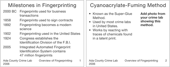
Slide 1 (Some Fingerprint Background). This slide was cluttered with too much text. I reduced the amount of text and focused the slide on important milestones in fingerprinting. I omitted details such as specific names because I thought the event was more important than the specific person. During your presentation, you can connect a specific name with each event.
Slide 2 (Cyanoacrylate-
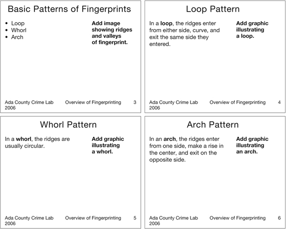
Slide 3 (Different Patterns of Fingerprints). I deleted the distracting watermark of a fingerprint. I revised this slide to include an overview slide of the basic patterns and then added three slides describing the patterns. I used a different slide for each pattern to allow space for including a graphic illustrating each feature. On the overview slide, you might want to include a picture of an actual fingerprint that clearly shows the minute ridges and valleys that form the patterns you list.
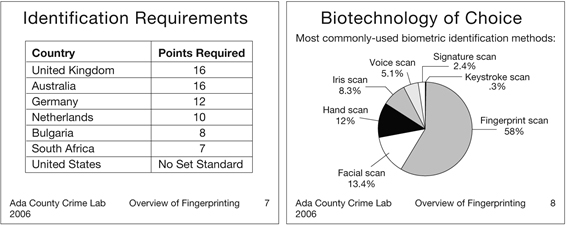
Slide 4 (Identifications). As in the case of slide 2, I think you need to use more than one slide to discuss your content. Before you discuss examples of different numbers of points required for making an identification, you should include a slide on the requirements of matching fingerprints. The bullets on slide 4 were a bit overwhelming. I presented the information in a table.
Slide 5 (The Future of Fingerprinting). Again, I think you should include a slide before this one covering “Fingerprints and Biometric Technology.” Then you could use slide 5 to illustrate the important role of fingerprinting in biometric identification. I changed your list to a pie chart to better show the relative importance of fingerprinting compared to other biometric identification methods.
For each slide, I added a light yellow background to soften the contrast between the solid white background and the black text. I also used the footer in the master slide to add the name of your organization, the year, the title of your presentation, and the slide number to each slide.
If you have questions about my revisions or would like to further discuss your presentation, let me know.
[your name]