Suggested Responses to Additional Exercises and Cases for Chapter 7: Designing Print and Online Documents
Suggested Response to “Analyzing the Design of a Catalog”
Although responses will vary, a few brief comments follow. The reverse type (white text on a black background) effectively emphasizes the first-
Suggested Response to “Creating Thumbnails for an Improved Design”
This project introduces students to the technique of using thumbnail sketches to experiment with design elements. The page from the report by the Bonneville Power Administration is underdesigned most obviously in that the second-
Suggested Response to “Analyzing the Design of an Online Magazine”
Responses will vary depending on which issue and pages students choose to analyze. Successful responses might comment on the use of leading to separate sections of articles, color to set off headings, italics to set off biographical blurbs, and headers and footers to set off the body content. Successful responses might also discuss how the column grid is used to present a lot of information economically.
Suggested Response to “Comparing Two Designs”
Although responses will vary, your students will likely notice some differences in design. For example, textbooks for upper-
Suggested Response to “Buying from a Spanish-
Because websites are periodically revised, responses will vary. Students will want to see whether the site of the computer manufacturer contains a prominent link to a Spanish-
Suggested Response to “Determining Site-
Responses will vary. The influence of search engines on the success of a company is growing. Getting registered on a popular search engine is a make-
Suggested Response to “Identifying Poor Sites”
Although responses will vary, most students will report that they can at least learn what not to do by looking at examples of bad design. Students with some web design experience can recognize design mistakes they are currently making. Even students with no design experience can relate as web users to the examples.
Suggested Response to “Is Cool Good?”
Responses will vary. Cool, like humor and beauty, is in the eye of the beholder. What is cool to one person is annoying to another. A cool site is not necessarily a well-
Suggested Response to “Creating a Website”
This case requires that students synthesize all the information in this chapter, from analyzing audience and purpose to testing and revising the site they have created. The additional activities at the end—
Suggested Response to “Designing a Report Template”
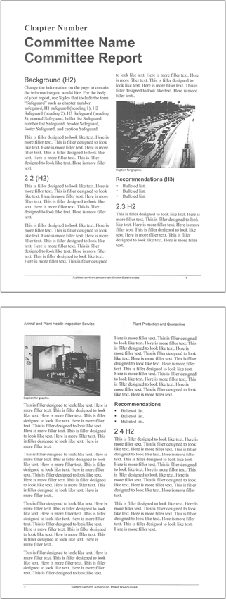
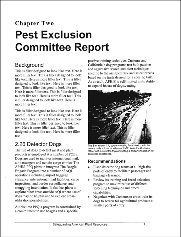
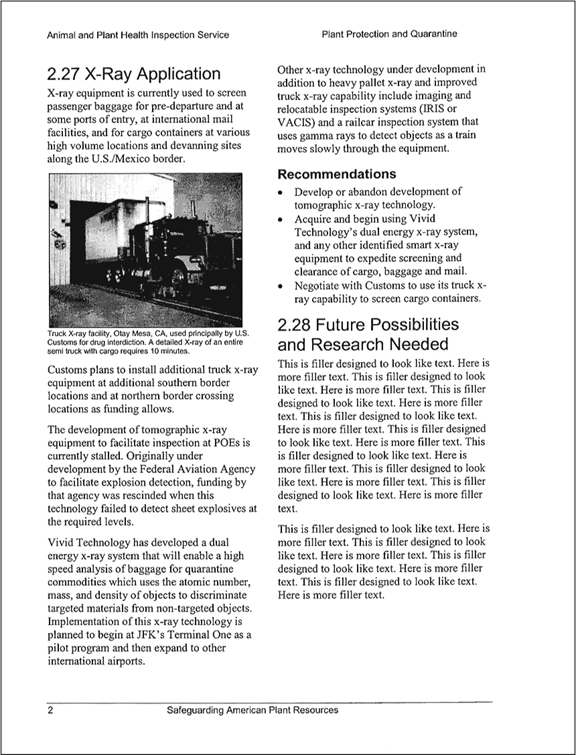
1. Sample memo with sample page design:
TO: Charlotte McQuarrie
FROM: [your name]
DATE: April 20, 2016
SUBJECT: Page Design for Recommendation Report
This memo describes my page design for the recommendation report on safeguarding American plant resources. First, I describe and justify my design. Next, I ask for your feedback on my page design. Attached are two representative pages.
Page Design and Justification
When working on the page design for the safeguarding report, I tried to create a well-
One color (black). Using only black ink will minimize initial printing costs and make it easy for readers to print the report with their desktop printers.
Standard 8.5 × 11-
inch paper. Using standard-size paper will also minimize initial printing costs and make it easy for readers to print the report with their desktop printers. White space. The design uses white space effectively to separate text from graphics and to set off headings.
Headers and footers. Different designs are used for odd and even pages to accommodate double-
sided printing. Page numbers, report title, and organization name are included. Page numbers. Along with the table of contents and index, page numbers will help readers quickly find the information they seek.
Queuing. The first-
level head is the biggest, and the second- level heads are bigger than the third- level heads. Together these headings create visual distinctions to indicate levels of importance. Two-
column layout. The two-column layout will enable writers to present a lot of information clearly and use narrow or wide graphics without wasting space. Standard typefaces. Arial and Times New Roman are typically included in most software programs and can be reproduced by most printers.
Single-
line spacing. The single-line spacing is legible in this page design and enables writers to include a lot of content on each page. Fewer pages means lower printing and distribution costs. Ragged-
right justification. Ragged right prevents the problem of irregular spacing.New styles. To help writers easily format text, the safeguard template comes with ten new styles in Word covering the following elements: chapter number, heading 1 (H1), heading 2 (H2), heading 3 (H3), normal, bullet list, numbered list, header, footer, and caption.
Action Item
Please review my page design and let me know what changes you would like. Because we committed to emailing the committees the final template no later than April 29, I would like to have your comments and suggestions for revision no later than Tuesday, April 27.
2. Sample report template: