Suggested Responses to Additional Exercises and Cases for Chapter 8: Creating Graphics
Suggested Response to “Evaluating Graphics in a Brochure”
Although responses will vary, the following are brief comments on three of the graphics in the brochure:
Anthony’s Balance Sheet (page 3): This graphic successfully illustrates to readers how their balance sheet should be organized. The simplified visual representation of the sheet helps focus the reader’s attention on desired information.
Sonya and Gabby (page 5): These drawings of women may make the brochure seem too childish for some readers. However, the drawings add some visual interest to the page’s design.
Compound Interest Advantage Line Graph (page 8): This graphic successfully shows changes in savings over time at different interest rates. The scale begins at zero, uses reasonable proportions, and uses horizontal grid lines effectively.
Suggested Response to “Evaluating Graphics in a PowerPoint Presentation”
Responses will vary. The graphics in a PowerPoint presentation should adhere to the principles for effective graphics discussed in the chapter. The most common flaws relating to the use of color and incorporation of graphics with text include using a color combination that provides poor figure-
Suggested Response to “Evaluating Templates in PowerPoint”
Responses will vary depending on which templates students pick. The following comments apply to the “Fireworks” template. The bursting firework graphic may seem too informal for many business presentations. In addition, for some topics the graphic would be inappropriate (for example, the festive connotations of fireworks may hurt the credibility of a speaker addressing a serious topic). Finally, the different-
Suggested Response to “Evaluating Computer Graphics”
Responses will vary depending on which graphics students pick. The following comments apply to the pie chart called “Assets Under Management,” located in Templates/Charts and Graphs/Pie Charts. If ever you needed an example that shows why chartjunk impedes communication, this is the one. If you present this graphic in class, ask students to explain the logic of the sequencing of the slices of the pie.
Suggested Response to “Creating an Organization Chart”
Although responses will vary, an effective organization chart usually includes rectangles to represent positions and a title above the chart. Different colors, box sizes, typefaces, or widths of box lines can be used to distinguish different levels. If space permits, the boxes can contain brief descriptions of positions, duties, or responsibilities.
Suggested Response to “Creating a Drawing of an Object”
Responses will vary. Emphasize to students how audience and purpose dictate the level of detail and the type of line drawing (for example, phantom, cutaway, or exploded view).
Suggested Response to “Creating a Diagram of a Concept”
Responses will vary. The diagram should be appropriate for the stated audience and purpose. Students often comment that they are not good artists. Point out to them that freehand drawings often are used to give an illustrator an idea of what is needed and that the illustrator will produce the final graphic.
Suggested Response to “Creating Graphics for Different Scenarios”
Look for the following features:
arrows or other symbols to suggest the direction in which the disk should be moved
arrows or other symbols to suggest where to look for the serial number
graphics, such as checklists, tables, flowcharts, logic boxes, and logic trees, used in writing about actions
an illustrated checklist of equipment and materials
graphics, such as checklists, tables, flowcharts, logic boxes, and logic trees, used in writing about actions
Suggested Response to “Creating Graphics for a Set of Instructions”
Although responses will vary, successful ones will consider the needs of readers who do not speak English as their primary language. They will demonstrate an understanding that reading patterns and cultural attitudes toward giving instructions differ. They will deemphasize trivial details; avoid culture-
Suggested Response to “Creating Different Graphics from the Same Information”
Although responses will vary, successful responses will identify the most effective graphic based on the graphic’s audience and purpose. Following are two possible graphics for each exercise.
deviation bar graph, table
100-
percent bar graph, line graph pie chart, table
100-
percent bar graph, subdivided bar graph grouped bar graph, line graph
organization chart, table
Suggested Response to “Analyzing Graphics”
Responses will vary. Students may find the numerous guidelines for creating effective graphics in the chapter to be very useful when responding to the questions asked in this exercise.
Suggested Response to “Interviewing a Person Who Makes Graphics”
Responses will vary. This project helps students learn the importance of graphics in communicating technical information. It also introduces students to the types of graphics software and tools used by different professionals.
Suggested Response to “Evaluating Graphics Made in a Spreadsheet Program”
This case calls for students to review the principles related to various sorts of graphics. For instance, the text explains the problem with 3D chartjunk in bar graphs. Students can study the help section related to 3D bar graphs to see whether it provides a discussion of the disadvantages of the design. If it does not (as of this writing, it does not), students can write appropriate advice. Another example: the software does not explain when to use a bar graph as opposed to a line graph. Students can provide this information.
Suggested Response to “Evaluating Graphics on a Website”
There are plenty of graphics on this site, and they are very effective. In “How Web Pages Work,” “Setting the Stage” includes a link to an image of a web server. The structure of the information on the site is also effective: the designer presents a point using text, then presents an example. In some cases, the designer includes both the line of code for a certain web page feature and a link to a visual demonstrating the results of that code. One suggestion for improving the site is to create a bigger border separating the site’s information from the oppressive ads on the right and to relocate the ads in the upper-
Suggested Response to “Evaluating and Revising Graphics”
1. Sample guidelines:
TO: R&D Scientists
FROM: [your name], Documentation Group
DATE: March 9, 2016
SUBJECT: Guidelines for Choosing Effective Graphics
This memo presents guidelines to help you decide which type of graphic to create when using a spreadsheet application. I include a table listing standard graphic types and uses. I also invite you to share with me rough drafts of your graphics.
Choosing an Effective Type of Graphic
There is no simple method for choosing a graphic that works best with your data. However, I describe in the table below how you can select an effective kind of graphic based on what you want to show your readers.
| If you want to | Then consider using a |
| Show the relative values of two or more quantities such as height, size, and amount | Vertical bar graph |
| Show the relative values of two or more quantities such as speed and distance | Horizontal bar graph |
| Compare two or three quantities for each item | Group (or clustered) bar graph |
| Show how a larger quantity is divided into its various components and the relative effect that each component has on the whole | Subdivided (or stacked) bar graph |
| Show the relative proportions of the quantities that make up several items | 100- |
| Show how the quantity of an item changes over time | Line graph |
| Show the relative sizes of the parts of a whole | Pie chart |
| Convey large amounts of numerical data | Table |
You might be tempted to select more exotic graphics to display your data. However, I recommend you use graphics with which your readers will be most familiar. Instead of using a cylinder, cone, or pyramid graph, for example, use the more common bar graph.
Getting Feedback on Graphics
I am available to look at drafts of your graphics. If you would like some feedback, please email me copies of your graphics as attachments. In order to better understand how you intend to use a graphic, briefly describe in the body of your email your audience and the purpose for each graphic.
2. Sample memo and revised graphics:
Memorandum
TO: Dana Shapiro
FROM: [your name], Documentation Group
DATE: March 10, 2016
SUBJECT: Feedback on Graphics for Conference Paper
This memo provides my evaluation of the effectiveness of your graphics as well as my suggestions for revision. For each graphic, I discuss its weaknesses and then offer suggestions for improving it. I also offer to review your revisions.
Crash-
You use a number of design elements that hurt comprehension:
three-
dimensional bars visually similar colors for bars
an unclear x-axis label (“1”)
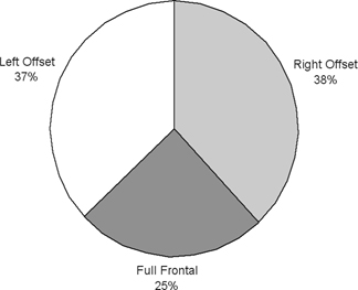
nonspecific title for graphic (“Crash Modes” versus “Percentage of Occupants Involved in Different Frontal Crash Modes”)
Because you want to show the distribution of frontal crashes into three different crash modes, I recommend you use a pie chart to show the relative sizes of the crash modes of frontal crashes:
Injury-
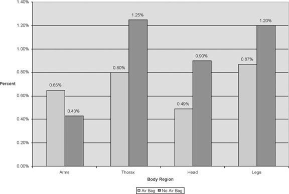
Based on what you want to communicate, you might confuse some readers by mixing a bar graph with a line graph. The bars appropriately show serious-
Because you want to compare two quantities (air bag vs. no air bag) of each item (serious-
Moderate-
You use a type of graphic that hurts comprehension, an exploded, three-
Because you want to communicate the scope of the problem by showing the average number of injuries occurring annually, a three-
| Injury Type | Number of Moderate Injuries |
| Hip | 2,153 |
| Femur | 1,657 |
| Knee | 5,928 |
| Tibia | 2,051 |
| Foot/ankle | 5,880 |
| Total | 17,669 |
Action Item
If you have questions about my feedback, let me know. Also, I would be glad to take a look at your revised graphics.