Chapter 11.

11.1 Chapter 11: Genre Talk

Click to enlarge the images and view the book excerpt from Wear No Evil: How to Change the World with Your Wardrobe by Greta Eagan and the “The Cost of Fast Fashion” infographic by artist and designer Sandra Negron. Both documents argue against the trend of “fast fashion.” Check your understanding of genre by answering the following questions. Then “submit” your work.
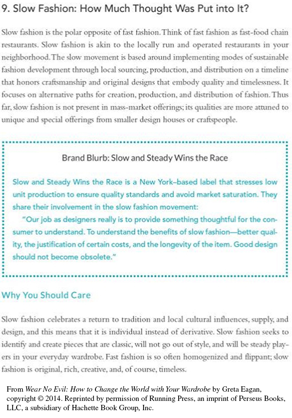
The text reads as follows:  Heading: 9. Slow Fashion: How Much Thought Was Put into It? Text: Slow fashion is the polar opposite of fast fashion. Think of fast fashion as fast-food chain restaurants. Slow fashion is akin to the locally run and operated restaurants in your neighborhood. The slow movement is based around implementing modes of sustainable fashion development through local soucing, production, and distribution on a timeline that honors craftsmanship and original designs that embody quality and timelessness. It focuses on alternative paths for creation, production, and distribution of fashion. Thus far, slow fashion is not present in mass-market offerings; its qualities are more attuned to unique and special offerings from smaller design houses or craftspeople. Next is boxed text that reads as follows: Box heading: Brand Blurb: Slow and Steady Wins the Race Box text: Slow and Steady Wins the Race is a New York–based label that stresses low unit production to ensure quality standards and avoid market saturation. They share their involvement in the slow fashion movement. Our job as designers really is to provide something thoughtful for the consumer to understand. To understand the benefits of slow fashion—better quality, the justification of certain costs, and the longevity of the item. Good design should not become obsolete. The main text continues as follows: Heading: Why You Should Care Text: Slow fashion celebrates a return to tradition and local cultural influences, supply, and design, and this means that it is individual instead of derivative. Slow fashion seeks to identify and create pieces that are classic, will not go out of style, and will be steady players in your everyday wardrobe. Fast fashion is so often homogenized and flippant; slow fashion is original, rich, creative, and, of course, timeless.

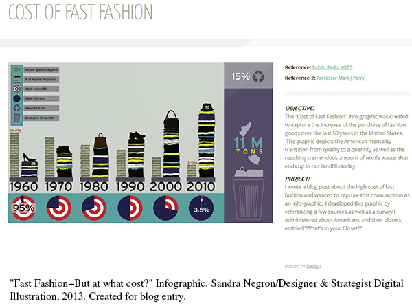
This infographic includes information for each decade from 1960 to 2010. For each decade, it shows the following information, which is described in the key on the left: -Income spent on Apparel (in percent) -# of Apparel Purchases -Made in the USA (in percent) -Made Overseas (in percent) It also includes two statistics for the whole infographic: -Recycled in US (in percent) -Ends up in US landfills The top part of the infographic shows income spent and number of apparel purchases in an illustrated bar graph. (Income is represented by a bar drawn as a stack of money; number of apparel purchases is represented by another bar drawn as a stack of clothing.) Each decade (1960, 1970, 1980, 1990, 2000, and 2010) has two bars showing the two sets of data. The highest income spent was in 1960, at 10.4%. The lowest income spent was in 2010 at 3.5%. The other decades vary, but in general, show a gradual decrease per decade. The bottom part of the infographic shows a set of circle graphs (one per decade) showing the data for Made in the USA vs. Made Overseas. In 1960, 95% was Made in the USA, 5% Overseas. By 2010, only 3.5% was Made in the USA, and 96.5% Overseas. The remaining decades show the gradual decrease of Made in the USA and the resulting increase of Made Overseas. In 1970, about 75% was Made in the USA, 25% Overseas; in 1980, about 62.5% was Made in the USA, 37.5% Overseas; in 1990 it was about 50/50; and in 2000, only 37.5% was Made in the USA, 62.5% Overseas. (The 2000 graph shows the opposite of the 1980 graph.) On the right side of the infographic it shows the following statistics: -Recycled in the US: 15% -Ends up in US landfills: 11 M tons Beside the infographic on the right is the following text: Reference: Public Radio KQED Reference 2: Professor Mark J. Perry Objective: The Cost of Fast Fashion info-graphic was created to capture the increase of the purchase of fashion goods over the last 50 years in the United States. The graphic depicts the American mentality transition from quality to quantity as well as the resulting tremendous amount of textile waste that ends up in our landfills today. Project: I wrote a blog post about the high cost of fast fashion and wanted to capture this consumption as an info-graphic. I developed this graphic by referencing a few sources as well as a survey I administered about Americans and their closets entitled What's in your Closet?

The text reads as follows: Heading: 9. Slow Fashion: How Much Thought Was Put into It? Text: Slow fashion is the polar opposite of fast fashion. Think of fast fashion as fast-food chain restaurants. Slow fashion is akin to the locally run and operated restaurants in your neighborhood. The slow movement is based around implementing modes of sustainable fashion development through local soucing, production, and distribution on a timeline that honors craftsmanship and original designs that embody quality and timelessness. It focuses on alternative paths for creation, production, and distribution of fashion. Thus far, slow fashion is not present in mass-market offerings; its qualities are more attuned to unique and special offerings from smaller design houses or craftspeople. Next is boxed text that reads as follows: Box heading: Brand Blurb: Slow and Steady Wins the Race Box text: Slow and Steady Wins the Race is a New York–based label that stresses low unit production to ensure quality standards and avoid market saturation. They share their involvement in the slow fashion movement. Our job as designers really is to provide something thoughtful for the consumer to understand. To understand the benefits of slow fashion—better quality, the justification of certain costs, and the longevity of the item. Good design should not become obsolete. The main text continues as follows: Heading: Why You Should Care Text: Slow fashion celebrates a return to tradition and local cultural influences, supply, and design, and this means that it is individual instead of derivative. Slow fashion seeks to identify and create pieces that are classic, will not go out of style, and will be steady players in your everyday wardrobe. Fast fashion is so often homogenized and flippant; slow fashion is original, rich, creative, and, of course, timeless.
This infographic includes information for each decade from 1960 to 2010. For each decade, it shows the following information, which is described in the key on the left: -Income spent on Apparel (in percent) -# of Apparel Purchases -Made in the USA (in percent) -Made Overseas (in percent) It also includes two statistics for the whole infographic: -Recycled in US (in percent) -Ends up in US landfills The top part of the infographic shows income spent and number of apparel purchases in an illustrated bar graph. (Income is represented by a bar drawn as a stack of money; number of apparel purchases is represented by another bar drawn as a stack of clothing.) Each decade (1960, 1970, 1980, 1990, 2000, and 2010) has two bars showing the two sets of data. The highest income spent was in 1960, at 10.4%. The lowest income spent was in 2010 at 3.5%. The other decades vary, but in general, show a gradual decrease per decade. The bottom part of the infographic shows a set of circle graphs (one per decade) showing the data for Made in the USA vs. Made Overseas. In 1960, 95% was Made in the USA, 5% Overseas. By 2010, only 3.5% was Made in the USA, and 96.5% Overseas. The remaining decades show the gradual decrease of Made in the USA and the resulting increase of Made Overseas. In 1970, about 75% was Made in the USA, 25% Overseas; in 1980, about 62.5% was Made in the USA, 37.5% Overseas; in 1990 it was about 50/50; and in 2000, only 37.5% was Made in the USA, 62.5% Overseas. (The 2000 graph shows the opposite of the 1980 graph.) On the right side of the infographic it shows the following statistics: -Recycled in the US: 15% -Ends up in US landfills: 11 M tons Beside the infographic on the right is the following text: Reference: Public Radio KQED Reference 2: Professor Mark J. Perry Objective: The Cost of Fast Fashion info-graphic was created to capture the increase of the purchase of fashion goods over the last 50 years in the United States. The graphic depicts the American mentality transition from quality to quantity as well as the resulting tremendous amount of textile waste that ends up in our landfills today. Project: I wrote a blog post about the high cost of fast fashion and wanted to capture this consumption as an info-graphic. I developed this graphic by referencing a few sources as well as a survey I administered about Americans and their closets entitled What's in your Closet?

Question

ywbGW6cmjP9vSDJicDyPM7Ks9vlD73k/+1tXmc85BK/7lEICCOqIDw/LTz+7Y9QgVtr7Z/dibiWNsqk4PqvIwc1i+gYF9hIeVl/X61yq8xyNicsb6Y6NMZuil9fN8bczJQ6AdXuM8P/55ZenUZozNuZ3rwP1GeGGQJp780LJCYxeJiA2Ol2AwmiqXeVphNOSTFA7mCanhWMi9YL9WrC5aSn6AP77pm471TirRLc7GPedkRPu2tPuXPFM9ljz/6TqP/CPTwwSW55dQ53aUpH9Tg==
Sorry. That is incorrect. The book excerpt shown here does not contain photographs, but it does use colored borders. For more help with design elements, see Chapter 18, “Use design elements effectively.” Sorry. That is incorrect. The book excerpt shown here does not contain bulleted lists, but it does use colored borders. For more help with design elements, see Chapter 18, “Use design elements effectively.” Correct. That is correct. The book excerpt shown here uses colored borders to draw attention to important information. For more help with design elements, see Chapter 18, “Use design elements effectively.” Sorry. That is incorrect. The book excerpt shown here does not contain captions, but it does use colored borders. For more help with design elements, see Chapter 18, “Use design elements effectively.”

Question

kXlFM757DCzUYH4S27O0mEA6NyzE3SgDhPkuThEcxgXXovutzKMUEy/5Z7crVXoLqq2C6l7mI4r1ftVPOAlRyU+16QnCprXJd7BobGmhTydTeZ2xEyvAdzCwDz2tY6md+AyGqq/DvGWrwVLyt4PM5dpBAqXvDIMQ32p/7IsCfscgPnIeoEOOV5sEsekRJkRgCmyK+t4M8k2f1snx6ffvTtJHuWyoYTDSdZEbV4x65xzjZzsV3h+0OSR1MZeUZ3EYyJtfSKFhQqdaCFA3weRt3uV2lh6r1zuuNw2JxGxPvxPd0fS/RB9P8HsMzHISXmH92bcMx6AJQoc1VQg6r7sgxJ3p9O0xTPbEVHmtoq8arUyUgWD25k3WG8KxmU3GfDVsX94CQQm6EgbnrpRUn7h7TXcKYgKRZUwJ8cSD5Ygj55vYhQjgGem9XFrGH82ro2io/UfbbkifKT+tOU+WcBbxsn91fay7XOKpWlx12x4eVdmFowhmlAkv2hSgH8k/JwS8uHXs3eXHXc1e5gPiBoW4Yu+KIIOi1O/wpfoV5XMyyMPOzRH/B+8RMRHZo7sezoA030CoG/pRNUYfSgEswAnSrLsm2WkFezB2FCqACDmOY1s0QCOTwcm7yvTpgbZA0GOF916hIfKr+P+afxBLYJi3B7duAyZvJhrOhqXxZA==
Sorry. That is incorrect. The infographic indicates that Americans spent 10.4% of their income on apparel purchases in 1960. It does not indicate how much was spent in dollars. For more help with infographics, see Chapter 7, “What kinds of documents are used to inform?” Correct. That is correct. In the upper right, the infographic lists Public Radio KQED and Professor Mark J. Perry as references that the writer consulted in writing her document. For more help with infographics, see Chapter 7, “What kinds of documents are used to inform?” Sorry. That is incorrect. The infographic provides a figure for the total percentage of apparel that is recycled in the U.S., but it does not break down that statistic by individual states. For more help with infographics, see Chapter 7, “What kinds of documents are used to inform?” Sorry. That is incorrect. According to the infographic, the amount of apparel produced in the United States dropped severely between 1960 and 2010—from 95% to 3.5%. For more help with infographics, see Chapter 7, “What kinds of documents are used to inform?”

Question

7rRhO36PPZjy0ZmYf4vkbV0sCGQAOvCfU1+6JZBzAZOuCt8fzLAhSZLpwUD5uu1cFo/NOW6UyJ+n8NpW7kJGOo3mF8gIQVHsGFZrev8uqfCmqgnJ5lBHkZFGAL4gwyKHlQkowSRtxPkwMOrcfUDJxExFN9t7HKiLPZZJO6F42cDOeFNbz4973r0+6oU+ehB5weGFXxUYdIXzHwmyq4xysRglGCL/Dk3uPaz0oyIZkQe8xpojC+pOsdUucd8E4oHbDTNUdxLC3thECudRKpOyucxo0IVTz/1hFNheoh8HtZulxwvBcprQrNeq5yQ4mO2AItfLb24jDLO4cwRYNBNzgSWuzYu+gK5Rl7dvgznmee/RrE5We5J3UyqauMrsf/eVp4k/Muff7pbCeSGyA0iPw7EqTToFRN1ciMufLmJes08uD2bFwC23pPoAqZQQ0pyeupGhPsMOPFg8nebzJ7tyffQCaAxkEqqISRP2Dqk9XGs=
Sorry. That is incorrect. In the upper left corner, there is a legend explaining the symbols used in the infographic. For more help with infographics, see Chapter 7, “What kinds of documents are used to inform?” Sorry. That is incorrect. To the right of the infographic, the writer explains the objectives of her writing project. For more help with infographics, see Chapter 7, “What kinds of documents are used to inform?” Sorry. That is incorrect. The infographic does present information in the form of a chart, using columns to record how many apparel purchases individuals made each decade and what percentage of their income they spent on those purchases from 1960 and 2010. It uses a pie chart to illustrate what percentage of apparel was manufactured in the United States during those years. For more help with infographics, see Chapter 7, “What kinds of documents are used to inform?” Correct. That is correct. The infographic illustrates the sharp decline in apparel produced in the U.S., but it does not specify where apparel is being manufactured instead. For more help with infographics, see Chapter 7, “What kinds of documents are used to inform?”