Visuals as Aids to Clarity: Maps, Graphs, and Pie Charts
Maps were part of the argument in the debate over drilling in the Arctic National Wildlife Refuge.
Advocates of drilling argued that it would take place only in a tiny area. Their map showed Alaska, with an indication (in gray) of the much smaller part of Alaska that was the Refuge, and a further indication (cross-hatched) of what the advocates emphasized was a minuscule part of the Refuge.
Opponents showed maps indicating the path of migrating caribou and the roads that would have to be constructed across the Refuge to get to the area where the drilling would take place.
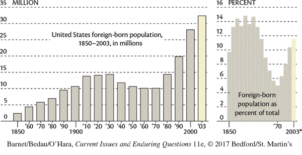
Graphs, tables, and pie charts usually present quantitative data in visual form, helping writers to clarify dry statistical assertions. For instance, a line graph may illustrate how many immigrants came to the United States in each decade of the last century.
A bar graph (with bars running either horizontally or vertically) offers similar information. In the Coming to America graph, we can see at a glance that, say, the second bar on the lower left is almost double the length of the first, indicating that the number of immigrants almost doubled between 1850 and 1860.
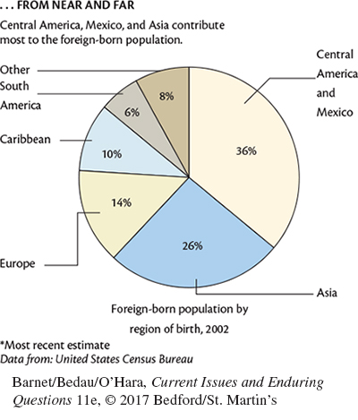
A pie chart is a circle divided into wedges so that we can see, literally, how a whole comprises its parts. We can see, for instance, that of an entire pie representing the regions of foreign-born U.S. immigrants, 36 percent were born in Central America and Mexico, 26 percent in Asia, 14 percent in Europe, and so on.
A CHECKLIST FOR CHARTS AND GRAPHS
Is the source authoritative?
Is the source cited?
Will the chart or graph be intelligible to the intended audience?
Is the caption, if any, clear and helpful?
Because maps, charts, and graphs offer empirical data to support arguments, they communicate a high degree of reliability and tend to be convincing. “Numbers don’t lie,” it is sometimes said, and to some extent this is true. It’s difficult to spin a fact like 1 + 1 = 2. However, as Charles Seife (whose essay on video games we reprint in Chapter 22) notes in his book, Proofiness, numbers are cold facts, but the measurements that numbers actually chart aren’t always so clear or free from bias and manipulation. Consider two examples of advertising claims that Seife cites — one for a L’Oréal mascara offering “twelve times more impact,” and another for a new and improved Vaseline product that “delivers 70% more moisture in every drop.” Such measurements sound good but remain relatively meaningless. (How was eyelash “impact” measured? What is a percentage value of moisture?)
Another way in which data can be relatively meaningless is by addressing only part of the question at stake. In 2013, a Mayo Clinic study found that drinking coffee regularly lowered participants’ risk of the liver disease known as primary sclerosing cholangitis (PSC). But PSC is already listed as a “rare disease” by the Centers for Disease Control and Prevention, affecting fewer than 1 in 2,000 people. So even if drinking coffee lowered the risk of PSC by 25 percent, a person’s chances would improve only slightly from .0005 percent chance to .0004 percent chance — hardly a change at all, and hardly a rationale for drinking more coffee. Yet, statistical information showing a 25 percent reduction in PSC sounds significant, even more so when provided under a headline proclaiming “Drinking coffee helps prevent liver disease.”
Consider other uses of numbers that Seife shows in his book to constitute “proofiness” (his title and word to describe the misuse of numbers as evidence):
In 2006, George W. Bush declared No Child Left Behind a success in his State of the Union Address: “[B]ecause we acted,” he said, “students are performing better in reading and math.” (True, fourth to eighth graders showed improved scores, but other grade levels declined. In addition, fourth- to eighth-grade reading and math scores had been improving at an unchanged rate both before and after the NCLB legislation.)
In 2000, the New York Times reported “Researchers Link Bad Debt to Bad Health” (the “dark side of the economic boom”). The researchers claimed that debt causes more illness, but in doing so they committed the correlation-causation fallacy: Just because two phenomena are correlated does not mean they are causally related. (Example: More people wear shorts in the summer and more people eat ice cream in the summer than during other seasons, but wearing shorts does not cause higher ice cream consumption.)
Finally, consider the following graph showing that eating Quaker Oats decreases cholesterol levels after just four weeks of daily servings. The bar graph suggests that cholesterol levels will plummet. But a careful look at the graph reveals that the vertical axis doesn’t begin at zero. In this case, a relatively small change has been (mis)represented as much bigger than it actually is.
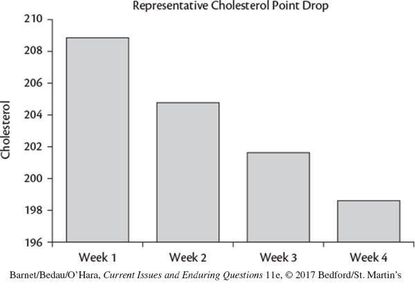
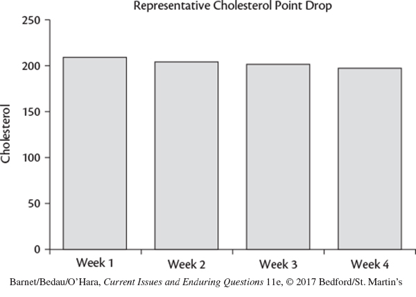
A more accurate representation of cholesterol levels after four weeks of eating Quaker Oats, using a graph that starts at zero, would look more like the second graph — showing essentially unchanged levels.
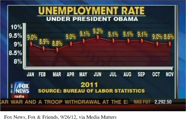
Here is another example showing unemployment rates during the Obama presidency. Note that here, too, the vertical axis doesn’t start at zero, making the “rise” appear more dramatic than it actually was in reality.