Format for Brochures
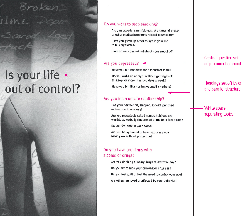
Although workplace brochures do not follow a specific format, artists and designers aim to attract readers’ attention by making important elements prominent. Consider Figure 17.7, for example, which shows two of six panels of a student-designed brochure. The image of the mannequin on the brochure’s cover immediately draws the eye, but the pattern of light guides readers to the central question: “Is your life out of control?” Other words on the left panel (such as “broken,” “stuck,” “lost,” and “depressed”) serve as a suggestive backdrop, but there is no mistaking the main message.
For more on parallel structure, see B2 in the Quick Editing Guide.
Providing a prominent element helps your readers focus on what you or your organization thinks is most important. First ask, “What is the main message I want to get across?” Then think of ways to give that message prominence. For example, you might want to surround one large headline by significant space, as in the left panel of the brochure. Note in the right panel how the headings — all questions, parallel in form — appear in color, separated by white space so the breaks between topics are clear. The inside panels of the brochure respond to these questions, pointing readers toward helpful resources.