Brochures and Presentation Visuals
For more on understanding visuals, see Ch. 14.
When you design a workplace brochure, presentation slide, or other visual document, you write the text and also direct a reader’s attention using tools such as type options, lists, white space, headings, repetition, and color.
Format for Brochures
Although workplace brochures do not follow a specific format, artists and designers aim to attract readers’ attention by making important elements prominent. Consider Figure 17.6, for example, which shows the opening page of a government brochure about federal student aid. The picture of the smiling young man immediately draws the eye, as do the large headlines above and below his picture: “Funding Your Education” and “Federal Student Aid.” Additionally, bold, colored type attracts attention to key questions (“What is federal student aid?” and “Who gets federal student aid?”), which are then answered. Overall, these prominent elements make the purpose of the brochure clear.

For more on parallel structure, see section B in the Quick Editing Guide.
Also note that the key questions are in parallel form, providing consistency and coherence, and the question/answer pairings are separated by white space so the breaks between topics are clear.
Format for Presentation Visuals
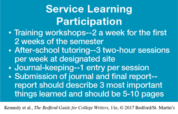
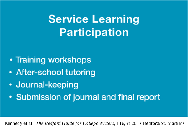
Effective use of space is important in visuals—such as PowerPoint or other presentation slides. Providing ample space and limiting the text on each slide helps readers absorb your major points. The slide in Figure 17.7 for recruiting service learning participants has too much text, making it hard to read and potentially distracting. In contrast, Figure 17.8 has less text and more open space, making each point easier to read. Its bullets highlight the main points, meant only to summarize major issues and themes. The type sizes for the slides are large enough to be viewed: 44 points for the heading and 32 points for the body.


The “white space” without text in these slides is actually blue. Some public-speaking experts believe that black type on a white background can be too stark; instead, they recommend a dark blue background with yellow or white type. Others believe that black on white is fine and may be what the audience is used to. Presentation software makes it easy to experiment with these options or to use your employer’s templates.
In addition to designing slides effectively, keep the following advice in mind as you prepare and deliver a presentation:
It is a good idea to save backup copies of your slides in case your original file is lost or corrupted. E-mail the file to yourself or copy it onto a jump drive. If it contains animation or videos, consider copying it onto a disk.
Slides shouldn’t simply repeat the spoken content of a presentation. Instead, they should provide information to support or offer fresh insights into the speaker’s points. For example, a speaker discussing a company’s sales growth over a five-year period might show a bar chart that makes the extent of this growth instantly clear.
Similarly, speakers shouldn’t read from their slides, an approach that can bore the audience quickly. Again, slides should be seen as engaging support for a presentation, not as a teleprompter for the speaker.