Descriptive Statistics: Summarizing Data
Have you ever had to describe a live music performance to a friend who missed the show? If so, you know that you had to answer questions about the band’s performance, such as, “Did they play a long set? Did the singer talk to the crowd at all?” Perhaps you’ve also had to answer the question, “What were people in the crowd like?”
How would you answer this last question? “Well, they were … tall. They all faced the stage. They seemed to enjoy clapping.” Of course, this is not the kind of information your friend is looking for. She is probably interested in knowing who the crowd was—
Let’s imagine you decide to answer her question in terms of how old the crowd was. Without even realizing it, you may quickly try to compute some descriptive statistics. In other words, you might try to summarize what the crowd was like by using numbers to describe its characteristics. You come up with an average age—
In providing these statistics, you are relying on memory and intuition. But to answer this question scientifically, you need to be more precise. You need to adopt the systematic methods psychologists and other scientific researchers use to summarize the characteristics of groups of people. Some of these methods are described below.
Tabular Summaries: Frequency Distributions
Preview Question
Question
 What tabular methods do researchers use to organize and summarize data?
Imagine that in anticipation of your friend’s request for information, you had decided to systematically collect data about the age of all the people at the show by asking a sample of 30 individuals to state their age as they walked through the door (let’s just assume they told the truth).
Here are your data: 28, 32, 30, 30, 32, 30, 30, 28, 35, 29, 29, 30, 32, 30, 31, 25, 29, 32, 29, 29, 27, 27, 31, 34, 28, 30, 31, 33, 31, and 26.
How can you make sense of these data so that you can easily describe them to your friend? The first thing you might do is organize them into a frequency distribution table. Instead of listing every single age, you might order them from lowest to highest in one column. Then in a column to the right of that, note how often that score occurs, as shown in Table A-
A-
| Frequency Distribution Table | |
|---|---|
|
Age |
Frequency |
|
25 |
1 |
|
26 |
1 |
|
27 |
2 |
|
28 |
3 |
|
29 |
5 |
|
30 |
7 |
|
31 |
4 |
|
32 |
4 |
|
33 |
1 |
|
34 |
1 |
|
35 |
1 |
Presenting these data in a table should help summarize the crowd’s age. You might begin by scanning the frequency column for the age that best describes the center of the distribution; here, the most frequently occurring age is 30. You might then proceed by determining just how descriptive the age 30 is of the rest of the crowd by comparing its frequency to the frequencies of the other ages. Notice that only two people were younger than 27 and that only three people were older than 32. Later, you’ll read about some handy statistics you can use to depict the most typical score and for determining just how typical that score is. But first, let’s look at some graphical methods for depicting a distribution of scores in a sample. Throughout the chapter, you will see the term distribution used to refer to a set of scores that can be described by the frequency of each score.
WHAT DO YOU KNOW?…
Pictures of Data: Histograms and Polygons
Preview Question
Question
What graphical methods do researchers use to organize and summarize data?
Often the easiest way to depict how scores are distributed is to draw a frequency distribution graph. For instance, you might create what’s called a histogram, a frequency distribution graph in which each bar represents the frequency of scores at a particular interval. Figure A-
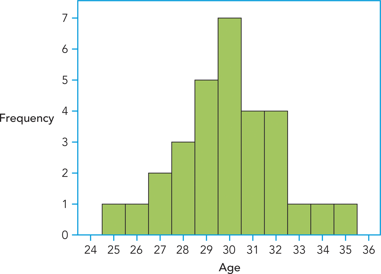
Age is depicted on the horizontal or x-axis, and the frequency of each of these ages is depicted on the vertical or y-axis. You can find the frequency of any given age by locating the top of its bar on the y-axis. Try this yourself by determining how many individuals were 29. By describing the data with a histogram, you can immediately see how scores are distributed. Our histogram shows that most of the concert attendees were between the ages of 27 and 32; that the most frequently occurring age was 30; and that none of the concert attendees were younger than 25 or older than 35. You can also tell by “eyeballing” the data that, because the ages taper off as they get farther away from 30, 30 is a fairly typical or representative age. By the way, did you find that five people were 29?
Some researchers prefer frequency polygons to histograms. Frequency polygons provide the same information as histograms, but with dots and lines rather than with bars. As you can see in Figure A-
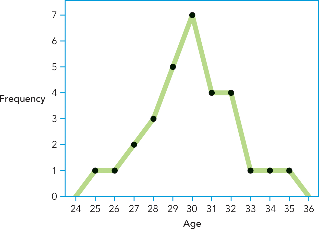
One of the benefits of depicting data in a frequency distribution graph is that you can get a better sense of the shape of the distribution, which is information you will need to find the most representative score. Many psychological variables are distributed symmetrically in the population; if you cut a symmetrical distribution in half, half its scores are above the midpoint and half the scores are below, and you will see that the halves are mirror images. How symmetrical are the age data? Not perfectly symmetrical, but they are close.
WHAT DO YOU KNOW?…
Question A.2
According to the frequency histogram (Figure A-
Central Tendency: Mean, Median, and Mode
Preview Question
Question
What statistical measures do researchers use to find the most representative score of a distribution?
Creating tables and graphs to describe data is useful but time-
The mean is the average score, which is calculated by adding up all the scores in the distribution and dividing the sum by the number of scores in the distribution. More succinctly, the formula is

where
ΣX is shorthand for the “sum all the values of X.” For example, for the data in Table A-
A-
| Summation X |
|---|
| X |
|
1 |
|
ΣX = 27 |
The median is a measure of central tendency that tells you what the middle-
The mode is the most frequently occurring score in a series of data. It is especially easy to spot when you’ve organized your data in a frequency distribution graph because it will always correspond to the highest bar in a histogram or the highest point in a frequency polygon. For the age data in Table A-
WHAT DO YOU KNOW?…
Question A.3
Here are data describing the number of doctor visits this year for six people: 3, 2, 2, 1, 2, 2. Find the mean, median, and mode.
Shapes of Distributions: Normal, Skewed, and Symmetrical
Preview Question
Question
When is it appropriate to use the mean, median, or mode as a measure of central tendency?
So far, you have learned that (1) the goal of descriptive statistics is to summarize data and that (2) you can summarize data by creating tables or graphs. You have also seen that it is faster to describe data by using three measures of central tendency: the mean, median, and mode. But why do you need three measures of central tendency? To answer this question, you will need a little background.
Take another look at Table A-
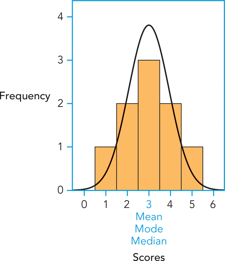
It is not always the case that the mean, median, and mode are equally good indicators of the most representative score. Take a look at Figure A-
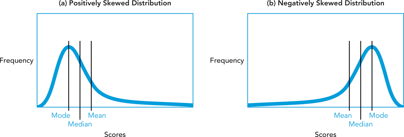
In any skewed distribution, the three measures of central tendency are no longer equal to each other. Which one will do the best job representing a skewed distribution, then? In normal distributions, the mean is desirable because it takes into account all scores in the distribution. In a skewed distribution, however, it can be strongly affected by extreme scores. To illustrate, consider the following data, representing scores on a recent exam:
80, 80, 90, 90, 90, 100, 100
The mean of this dataset is equal to 90, a very representative score. What if we add an extreme score—
30, 80, 80, 90, 90, 90, 100, 100
The mean would now be 82.5, which is not very representative. Our mean was “pulled” by the extreme score.
If you were to rely on the mean to describe this distribution, you would be led to believe that the class did not perform nearly as well on this exam as they actually did, because the mean was influenced by one very extreme score.
In the case of skewed distributions, you should use the median. The median is not influenced by extreme scores; it simply tells us the midpoint of the distribution. You might also describe the distribution using the mode because it simply describes the most frequently occurring score. In this case, the median and mode are better descriptors of this distribution of scores than is the mean.
WHAT DO YOU KNOW?…
Question A.4
What are the median and mode of our skewed distribution of scores?
Variability: Range and Standard Deviation
Preview Question
Question
What statistical measures do researchers use to describe the variability of a distribution?
Now that you can answer the question of which score is most representative of a distribution, let’s turn to a new question: How representative is a given score? Take a look at the two distributions in Figure A-
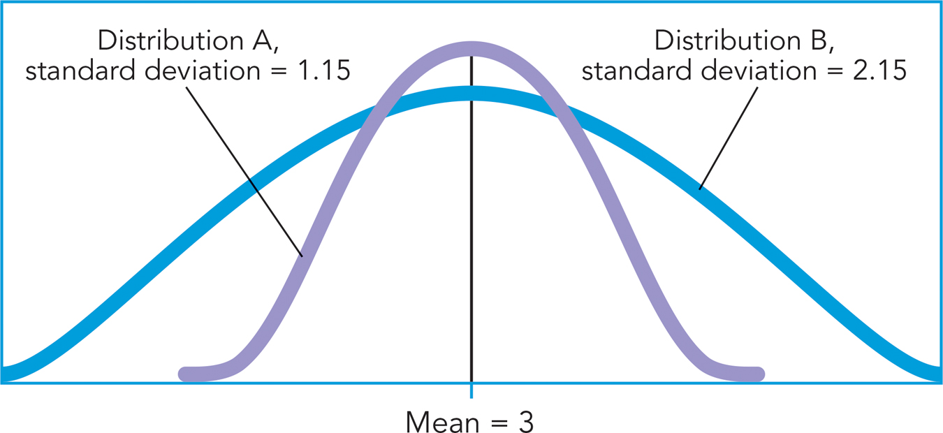
The range is the difference between the highest and lowest score in a distribution; you find it by subtracting the lowest score from the highest score. For example, the range for the age data in Table A-
An advantage of the range is its simplicity; however, this simplicity comes at the cost of information—
3 3 3 3 3 3 3 3 3 3 3 3 3 3 12
1 1 2 2 3 3 4 4 5 6 7 8 9 9 10
How comfortable are you with the idea that these two datasets are functionally the same in their variability? If you said “not very,” it was probably because you recognized that in the first set most of the scores are 3s; that is, there’s hardly any variability. However, in the second set, most of the scores differ from each other. Clearly, you need an index of variability that takes into account how different the scores are from one another. The standard deviation accomplishes this.
The standard deviation is a measure of variability that tells you how far, on average, any score is from the mean (see Chapter 2). The mean serves as an anchor because in a normal distribution, it is the most representative score. The standard deviation tells you just how representative the mean is by measuring how much, on average, you can expect any score to differ from it. Note that “standard” and “average” mean the same thing in this context. The advantage of the standard deviation over the range is that it gives a sense of just how accurately the mean represents the distribution of scores.
Examining the method for calculating it will help you understand why the standard deviation is an index of the representativeness of scores. Look at the data in column 1 of Table A-
A-
| Calculating the Squared Deviations from the Mean | ||
|---|---|---|
|
X |
X − μ |
(X − μ)2 |
|
5 4 4 3 3 3 2 2 1 |
5 − 3 = 2 4 − 3 = 1 4 − 3 = 1 3 − 3 = 0 3 − 3 = 0 3 − 3 = 0 2 − 3 = −1 2 − 3 = −1 1 − 3 = −2 |
22 = 4 12 = 1 12 = 1 02 = 0 02 = 0 02 = 0 12 = 1 12 = 1 22 = 4 |
|
ΣX = 27 N = 9 μ = 3 |
Σ(X − μ) = 0 N = 9 Σ(X − μ)/N = 0 |
Σ(X − μ)2 = 12 N = 9 Σ(X − μ)2/N = 1.33 |
The summation sign in the next operation, Σ(X − μ), at the bottom of column 2, tells you to sum the deviations you just calculated. Before you find that sum, though, take a moment to look over the deviation scores. You can see that the smallest absolute distance between the scores and the mean is 0 and that the largest absolute distance is 2. At the outset, you know that the standard (average) deviation won’t be greater than 2.
As you can see at the bottom of column 2, when we sum our deviation scores we find that Σ(X − μ) = 0. This is because the distances above the mean, which is the center of our distribution, equal the distances below our mean in the distribution. Does this suggest that the standard deviation is 0 and that there is no variability around the mean? Of course not; you know this isn’t true because the scores do, in fact, differ from each other. You can remedy this situation by squaring each of the deviation scores, as shown in Column 3. The scores are squared for a reason you may remember from high school math: The product of two negative numbers is always positive. This step brings us closer to finding the standard deviation. You’ll see that the sum of these squared deviations is 12. Now divide these squared deviations by N, the number of scores, to get a value called the variance:
12/9 = 1.33
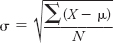
Because you got this value by squaring the deviations, you’ll need to take the square root to get it back into its original units:  . The standard deviation (symbolized by the Greek lowercase sigma, σ) is 1.15, which means that, on average, the scores deviate from the mean by 1.15 points. Earlier in our computations, you predicted that the average deviation would fall somewhere between 0 and 2. This is correct! For the record, the formula for the standard deviation is
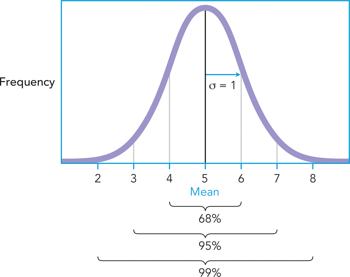
So, what does it mean to have a standard deviation of 1.15? Earlier you read that the standard deviation is a measure of how accurately the mean represents a given distribution. To illustrate this idea, take a look back at Figure A-
An interesting characteristic of normal distributions is that almost all scores tend to fall within 3 standard deviations of the mean. Thus, if the mean of a distribution was 5 and its standard deviation was 1, you could figure out that most (about 99%) of its scores will fall between 2 and 8, as long as the distribution is normal. In fact, the empirical rule tells you approximately how the scores will be distributed as you get farther away from the mean. As Figure A-
WHAT DO YOU KNOW?…
Question A.5
Without doing any calculations, figure out the standard deviation for this distribution: 1, 1, 1, 1, 1.
Question A.6
A distribution of scores has a mean of 5. Its highest score is 7 and its lowest score is 3. Why can’t the standard deviation be greater than 2?
Question A.7
A distribution of scores is normal and has a mean of 5 and a standard deviation of 1. According to the empirical rule, what proportion of scores will fall between 4 and 6, 3 and 7, and 2 and 8?
Using the Mean and Standard Deviation to Make Comparisons: z-scores
Preview Question
Question
How do statistics enable researchers to compare scores from different distributions?
As far as measures of variability go, the standard deviation is useful because it tells you how far scores are from the mean, on average, and thus provides an index of how representative the mean is. Why should you care about the variability of distributions? A little context might help. Imagine you’re a student who took a test worth 100 points and you would like to know how well you did relative to your peers. Will the mean alone be informative? Sure: If the mean were 75 and you got an 85, you would be 10 points above the mean, which is certainly a nice place to be. The standard deviation additionally tells you just how far above the mean you are. To illustrate, take a look at Figure A-
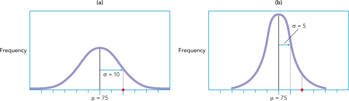
In distribution (a), the standard deviation is 10, while in distribution (b), the standard deviation is 5. Take a look at where your score of 85 is relative to the mean in both distributions. For which distribution should you be happier with your performance? You should be happier with your performance in distribution (b), because your score would be farther above the mean, signifying that you had outperformed almost all your classmates because your score is 2 standard deviations above the mean.
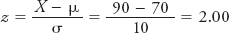
Simply put, the mean acts as an anchor against which you can compare scores and the standard deviation tells you how far the scores are from that anchor. Here are some more examples. If you got an 80 on an exam for which the mean was 70 and the standard deviation was 10, how far would you be from the mean? One standard deviation. If you got a 90, how far would you be from the mean? Two standard deviations. If you got an 84.30, how far would you be from the mean? Maybe it’s time to introduce a formula that will enable you to very quickly calculate how far, in standard deviation units, a given score is from the mean. The formula below enables you to calculate what’s called a z-score, a statistic that tells you how far a given score is from the mean, in standard units. Saying that your exam score is 2 standard deviations from the mean is synonymous with saying that you have a z-score of 2 on the exam.
The beauty of the z-score is that it provides two valuable pieces of information: (1) how far a given score is from the mean in standard units, and (2) whether that score is above or below the mean. A positive z-score indicates that a score is above the mean, whereas a negative z-score indicates that a score is below the mean. For example, if instead of getting a 90 on the above exam, you had received a 60, your z-score of −1.00 would very quickly tell you that you are 1 standard deviation below the mean.
Perhaps an even greater beauty of z-scores is that they enable you to compare scores from two different distributions—
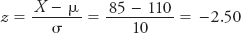
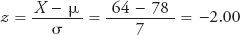
If he had paid 64 euros in a market in which the average price is 78 euros and the standard deviation was 7 euros, his z-score would be
Given that your price is 2.50 standard deviations below the mean, whereas your cousin’s is only 2 standard deviations below, we can conclude that you, in fact, got the better deal.
WHAT DO YOU KNOW?…
Question A.8
You like to tease your aunt, who is older than you, about how much faster than her you ran a recent 5K race. You ran it at a rate of 9 minutes per mile, whereas she ran it in 10 minutes per mile. In your age group, the mean rate was a 10-
What are your respective z-scores?
Given these z-scores, are you justified in teasing her?
a. Your respective z -scores are 1. b. Given that your z-scores are the same, you are not justified in teasing her, because you run at the same rate, relative to your age groups.
Correlations
Preview Question
Question
How do researchers determine whether variables are correlated?
Sometimes researchers are interested in the extent to which two variables are related; in other words, they are interested in whether a correlation exists between them. Variables are said to be correlated if a change in the value of one of them is accompanied by a change in the value of another. For instance, as children age, there is a corresponding increase in their height. As people eat more junk food, there is typically a corresponding increase in weight (and decrease in energy and other health-
A-
| Calculating the Sum of the Cross- |
||
|---|---|---|
|
Person |
Hours Studied (X) |
GPA (Y) |
|
Candace |
8 |
3.8 |
|
Denise |
2 |
2 |
|
Joaquin |
2 |
2.3 |
|
Jon |
7 |
3.4 |
|
Milford |
5 |
2.4 |
|
Rachel |
5 |
2.5 |
|
Shawna |
1 |
1.7 |
|
Leroi |
9 |
3.7 |
|
Jeanine |
6 |
3.2 |
|
Marisol |
10 |
4 |
|
Lee |
2 |
1.5 |
|
Rashid |
9 |
3.9 |
|
Sunny |
3 |
2.6 |
|
Flora |
6 |
3 |
|
Kris |
4 |
2.9 |
|
Denis |
11 |
3.9 |
It is difficult to get a sense of the relation between the two variables based on a quick glance at the data alone, so you might construct a scatterplot: a graph that plots the values for two variables (see Figure A-
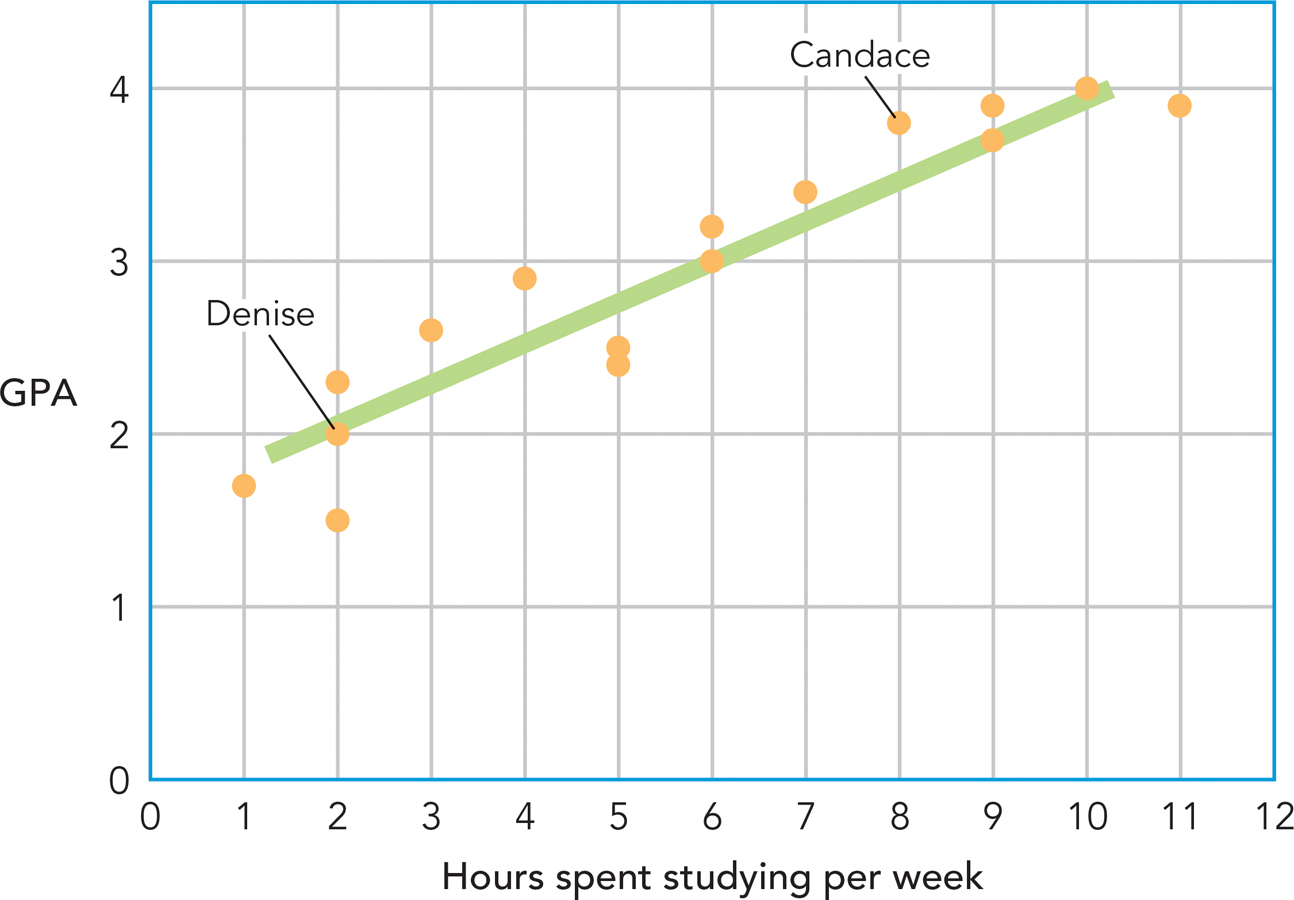
The number of hours spent studying is depicted on the x-axis of the scatterplot, and individuals’ GPAs are depicted on the y-axis. The scatterplot enables us to see the point at which each of these scores intersect. For instance, you can see that Candace, who spent 8 hours per week studying, has a GPA of 3.8, whereas her classmate Denise, who spent only 2 hours per week studying, has a GPA of 2.0.
So what does this scatterplot tell you about the relation between these variables? Take a look at the pattern of the data: It doesn’t seem random, does it? It seems to cluster around a line. In fact, when two variables are correlated, they are said to have a linear relationship—
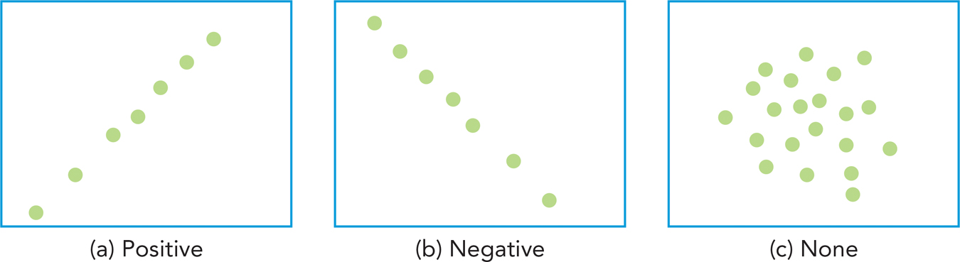
Researchers distinguish between correlations that are positive and negative. When there is a positive correlation between two variables, an increase in one of the variables corresponds to an increase in the other—
When there is a negative correlation between two variables, an increase in one of the variables corresponds to a decrease in the other—
In a correlation between two variables, one variable can be designated the predictor variable and the other as the criterion variable. The predictor variable is used to predict the value of the criterion variable. In the caffeine and jitteriness example, caffeine was the predictor variable and jitteriness was the criterion variable.
Instead of continuously constructing scatterplots to detect relationships between variables, researchers calculate a correlation coefficient: a figure that indicates the strength and direction of the relationship between variables. The formula for the correlation coefficient (also known as r) is as follows:
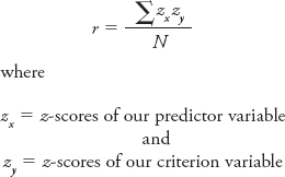
Take a moment to reflect on why it would be necessary to convert raw scores into z-scores to calculate the correlation between any two variables. Here’s a hint: In the preceding example, you were interested in the relation between hours spent studying and GPA—
Once you’ve standardized your scores, you need to find the cross-
A-
| Calculating the Sum of the Cross- |
|||||
|---|---|---|---|---|---|
|
Person |
Hours Studied (X) |
GPA (Y) |
zx |
zy |
zx zy |
|
Candace |
8 |
3.8 |
0.75 |
1.07 |
0.80 |
|
Denise |
2 |
2 |
−1.15 |
−1.13 |
1.30 |
|
Joaquin |
2 |
2.3 |
−1.15 |
−0.76 |
0.88 |
|
Jon |
7 |
3.4 |
0.44 |
0.58 |
0.25 |
|
Milford |
5 |
2.4 |
−0.20 |
−0.64 |
0.13 |
|
Rachel |
5 |
2.5 |
−0.20 |
−0.52 |
0.10 |
|
Shawna |
1 |
1.7 |
−1.46 |
−1.50 |
2.19 |
|
Leroi |
9 |
3.7 |
1.07 |
0.95 |
1.01 |
|
Jeanine |
6 |
3.2 |
0.12 |
0.34 |
0.04 |
|
Marisol |
10 |
4 |
1.38 |
1.31 |
1.82 |
|
Lee |
2 |
1.5 |
−1.15 |
−1.74 |
2.00 |
|
Rashid |
9 |
3.9 |
1.07 |
1.19 |
1.27 |
|
Sunny |
3 |
2.6 |
−0.83 |
−0.40 |
0.33 |
|
Flora |
6 |
3 |
0.12 |
0.09 |
0.01 |
|
Kris |
4 |
2.9 |
−0.51 |
−0.03 |
0.02 |
|
Denis |
11 |
3.9 |
1.70 |
1.19 |
2.02 |
|
Σ zxzy = 14.16 |
|||||
It would help to know how to interpret a correlation coefficient. A correlation coefficient has two parts: sign and magnitude. Sign, sometimes known as direction, indicates whether the correlation is positive or negative (above, we talked about the difference between a positive relation [time studying and GPA] and a negative relation [number of textbooks bought and amount of money]). Magnitude is an indication of the strength of the relationship; it can range from 0 to 1.00. A correlation coefficient of 1.00 would indicate that two variables are perfectly positively correlated; you would expect, for instance, that the temperature at which a pot roast is cooked is nearly perfectly correlated with the time it takes to reach a safe eating temperature.
The scatterplot in Figure A-
The scatterplot in Figure A-
Rarely will you find that two variables are perfectly correlated because there are usually several factors that determine an individual’s score on some outcome. For instance, the correlation coefficient for the relationship between how many hours one spends studying for an exam and one’s exam score is very high (.89, in our example)— but it’s not perfect because many other factors, including how one studies, could also predict one’s exam score.
WHAT DO YOU KNOW?…
Question A.9
Match the correlations on the left with the most plausible correlation coefficient on the right.
1. Highest educational degree received and salary at first job 2. Number of times the letter T appears in one’s name and GPA 3. In one hour, time spent checking email and amount of time remaining to study for exam | .67 −.90 .04 |