Strategies
Brainstorm a list of potential social issues involving people with geographical areas. For example, do you think there’s a connection between the average household income and EPA hazardous waste projects? Or between a U.S. state’s teen pregnancy rate and whether the state voted Democratic or Republican in the last election? Or the rate of gun ownership in a community compared to violent crime?
Generate many possibilities because you may discover that you can’t find the data you need for some of them (or that the data you need requires you to send off for print materials that may take weeks to arrive or cost more than you’re willing to spend).
As you develop your map, you may reach a dead end or you may realize that the data you’ve gathered does not make the type of argument you were interested in making. Referring back to your notes may be a way for you to try out different options. Map making of this type is, figuratively speaking, an exploratory process: You’ll probably change your mind about exactly what argument you’re making while you’re in the process of making the map. (In other words, it’s okay to go into map making with some goal in mind, but if you want to act ethically, you need to remain open to rethinking your preconceptions while you work. Don’t reject evidence that contradicts your original ideas and don’t force data to support things that seem false.)
Don’t forget that you’re going to be using data to make a geographical (map-
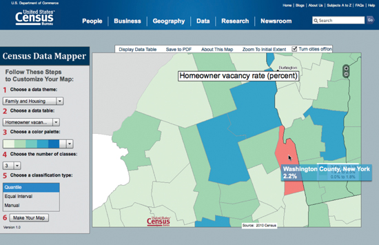
Mapping sites such as Google Maps, MapQuest, or Yahoo! Maps can usually provide you with the actual map you need to use, but locating sources for the statistical, social data you need can be slightly more complicated. Government sources on the Web are one likely place to look: The U.S. government publishes extensive amounts of data, including census reports as well as disease statistics, literacy rates, voting histories, and more. The U.S. Census data shown in the maps in the Overview section can also be drilled down into and customized to allow more detailed analysis. Homeowner vacancy rates can be shown at county levels, divided into different levels, and colored to allow easier scanning. As with the earlier example, this data might be connected to crime rate, property value, tax rate, or some other dataset. Some starting points are listed in the Background Texts section at the end of this assignment.
•U.S. Census Bureau, Census Data Mapper, census.gov/
Use an image-
As you’re adding data to the map, be sure to follow general graphic design guidelines: Choose colors that contrast so that your data is easily seen. Choose fonts (including font type, color, and size) that show up well and seem appropriate to your purpose.
Don’t forget to add a legend to the map, a small box in a relatively empty corner of the map that tells viewers what the map is and what the different things on the map mean: “Red numbers indicate infant deaths. Yellow dots show locations of 24-
Finally, write a short (1,000-
- what argument your map is making,
- how you found the data for your map,
- what things your map leaves out (including data that you wish you could have located, but couldn’t), and
- how convincing you think your map is.