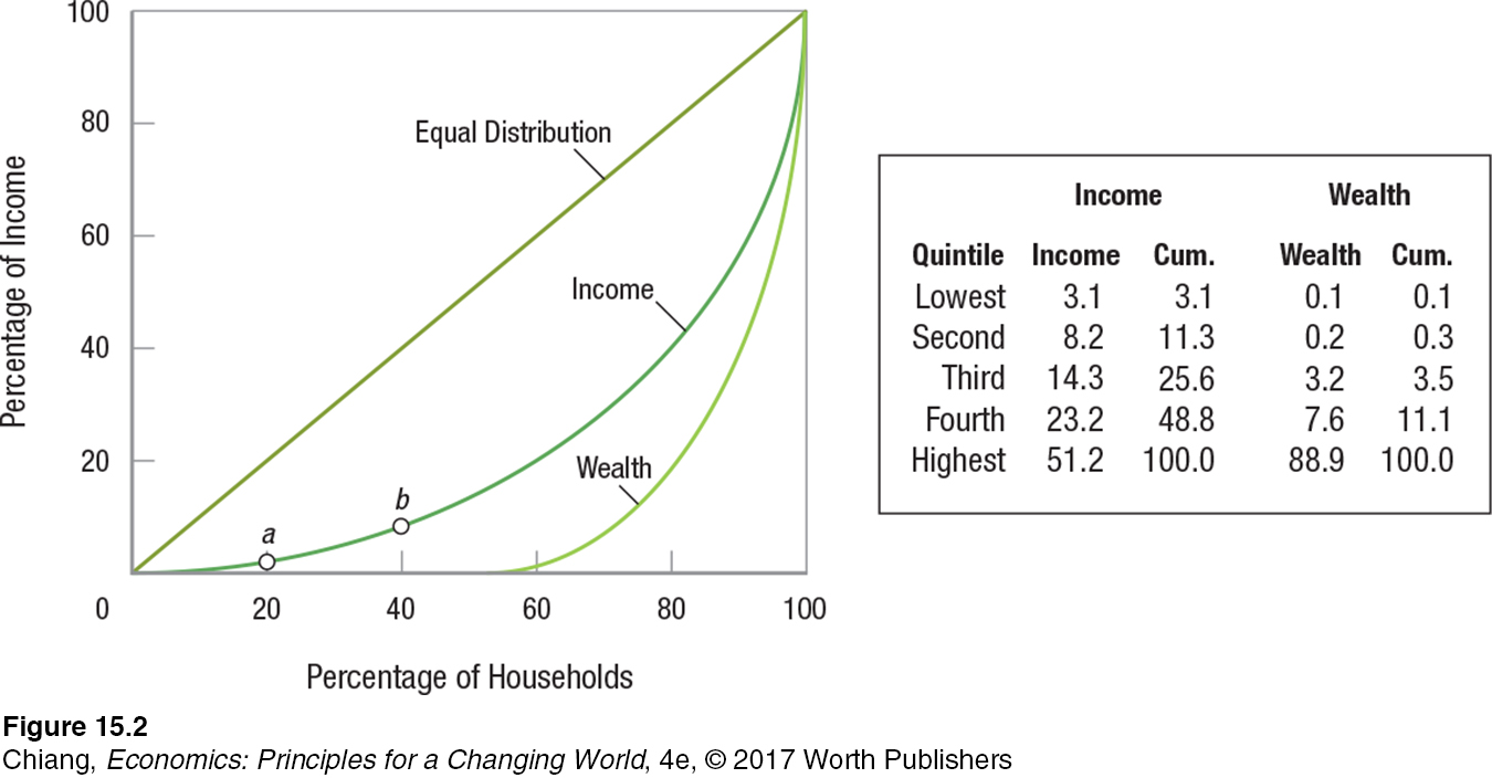
FIGURE 2 LORENZ CURVES
 The graph shows the most recent Lorenz curves for income and wealth in the United States. The quintile distribution of income, found in the second column of the accompanying table, is cumulated in the third column and then plotted as a Lorenz curve. Notice how wealth is much more unequally distributed than income.
Data from the U.S. Census Bureau.

