Analyzing Visual Texts as Arguments
Printed Pages 136-140In this section, we’ll focus on how to analyze visual texts that present arguments. A visual argument can be an advertisement, a political cartoon, a photograph, a bumper sticker, a T-shirt, a hat, a Web page, or even a piece of fine art. Yet the tools to analyze argument—identifying the claims, analyzing the way evidence is used, thinking critically about the artist’s assumptions, examining how the piece is structured, considering appeals to ethos, pathos, and logos—are fairly similar for both visual and written arguments.
Although the tools that artists use to make their arguments are primarily visual strategies, such as the placement of figures and objects and the use of color, the process of analysis is the same as with any text: look carefully, take note of every detail, make connections about your observations, and draw conclusions. Again, as with any written text, it’s important to know what occasioned the visual image and, if possible, who the artist intended as his or her audience.
Following is a checklist to use with any visual text:
- Where did the visual first appear? Who is the audience? Who is the speaker or artist? Does this person have political or organizational affiliations that are important to understanding the text?
- What do you notice first? Where is your eye drawn? What is your overall first impression?
- What topic does the visual address or raise? What claim does the visual make about that topic?
- Does the text tell or suggest a narrative or story? If so, what is the point?
- What aspects of the image evoke emotions? Look especially at color, light and dark, shadow, realistic versus distorted or caricatured figures, and visual allusions.
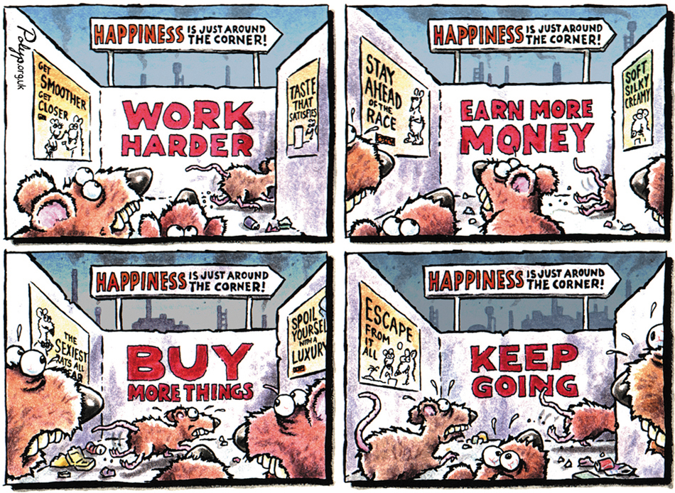
Let’s use this checklist to analyze a four-frame cartoon entitled Rat Race that appeared on the United Kingdom Web site polyp.org.uk.

- Where did the visual first appear? Who is the audience? Who is the speaker? Does this person have political or organizational affiliations that are important to understanding the text? This cartoon first appeared in Ethical Consumer magazine, a publication whose mission is to provide information to consumers about products and brands that are socially and environmentally responsible. The magazine has an obvious bias against buying products for the sake of status rather than of necessity and against companies or organizations motivated primarily by profit. The readers of Ethical Consumer are likely to be practical or even frugal, to frown on materialism, and to be skeptical of big business.
- What do you notice first? Where is your eye drawn? What is your overall first impression? Although there’s quite a bit going on in these frames, your eye is probably drawn most immediately to the written text that is in bold: WORK HARDER / EARN MORE MONEY / BUY MORE THINGS / KEEP GOING. Since the written text appears in the same place within each frame, it also might be seen as a way to structure the piece.
- What topic does the visual address or raise? Does the visual make a claim about that topic? With rats racing all over the place within frames and from frame to frame, clearly the topic is the rat race—an allusion to the well-known expression. Even at this early stage of analysis, the artist’s claim that the rat race is a never-ending cycle of working to earn money to buy material possessions becomes pretty clear.
- Does the text tell or suggest a narrative or story? If so, what is the point? The frames constitute a story, a narrative: the key “characters” are rats that seem to be caught in a maze; the idea of a trap is emphasized by the rats’ bodies appearing in pieces, fragmented, with only one example of a whole body being in the picture. The sign at the top (“Happiness is just around the corner!”) is repeated in each frame, a slogan that seems to cheer the rats on and keep them on task.
- What aspects of the image evoke emotions? Look especially at color, shades of light and dark, shadow, realistic versus distorted or caricatured figures, and visual allusions. You might feel a range of emotions being evoked. First of all, it’s hard not to see something comic about the bug-eyed rats with human expressions who are frantically running from or toward something, though it’s not clear what. Red usually evokes alarm. The background is a little more subtle, but the closer you look, the world beyond the “maze” goes from lighter to darker shades us the frames progress, suggesting a workday, the morning-until-night routine. That background does not have any trees or natural shapes but, rather, industrial-looking smokestacks and buildings. The rats themselves are caricatures, distortions with huge heads and eyes. They are depicted as looking at the signs or maybe watching one another; however, there’s no contact between or among them. We’ve already noted the overarching allusion to “the rat race,” a common expression people use to refer to a situation that involves ceaseless activity with little meaning. In addition, the signs on the walls of each frame remind us of advertisements that entice us to buy things or acquire luxuries. They’re promises of a better physical appearance or lifestyle.
- What claim does the visual make about the issue(s) it addresses? Let’s take stock of what we have observed thus far and connect some of those observations. We have exaggerated images of rats in a maze working to make money to buy things that require them to continue working to make money to pay for those things and the next things that promise happiness. The red color and the exaggerated characteristics of the rats signal a fevered urgency that the cartoon’s overall message mocks. The rats live crowded, frantic lives driven by the pursuit of material goods and fueled by ads, slogans, and other external stimuli. It’s true that we are making an inferential leap, but given all these specifics, we can fairly conclude that the artist’s claim is one of value: “The rat race just isn’t worth it!” Or, to state it more formally, “the constant striving to make money in order to spend money can never bring satisfaction, only more striving.”
If we think about this analysis in the terms of argument we have used throughout this chapter, each of the four frames might be thought of as a paragraph. In each one, the artist refutes a counterargument: happiness is just around the corner if you work harder, if you earn more money, if you buy more things, if you keep going. These slogans become assertions that the drawings refute as the rats become increasingly frantic within the confines of the maze and as day turns to night. The argument seems to be organized inductively because as each slogan (assertion) is refuted by the images of the rats, who are anything but happy as they face yet another “corner,” the viewer draws the conclusion that the rat race is thankless, useless, and never a route to happiness.
Photographs are another type of visual text that can make powerful arguments. How often do we look at the photograph on the front page of a newspaper or news site before we read the lead story? The photo in that case may greatly influence how we read the written text by shaping our attitude toward the piece or even by leading us to form conclusions before reading so much as a single word.
In fact, photographic images carry additional power because they seem “real,” authentic images of truth frozen in time. No political cartoon has ever claimed to be “reality.” But it is important to understand that while photographs may be more “real” than a drawing, they nevertheless are artificial. The photographer must decide how to light a scene, what to focus on, when to take the picture, what to put inside the frame and outside of it, and how to compose the shot in order to convey the desired meaning. Unfortunately, combining the power of the photographic image has at times resulted in the irresistible temptation to pose or construct an image to make a point. But even if the image is not doctored, a photograph is constructed to tell a story, evoke emotions, and make a strong argument.
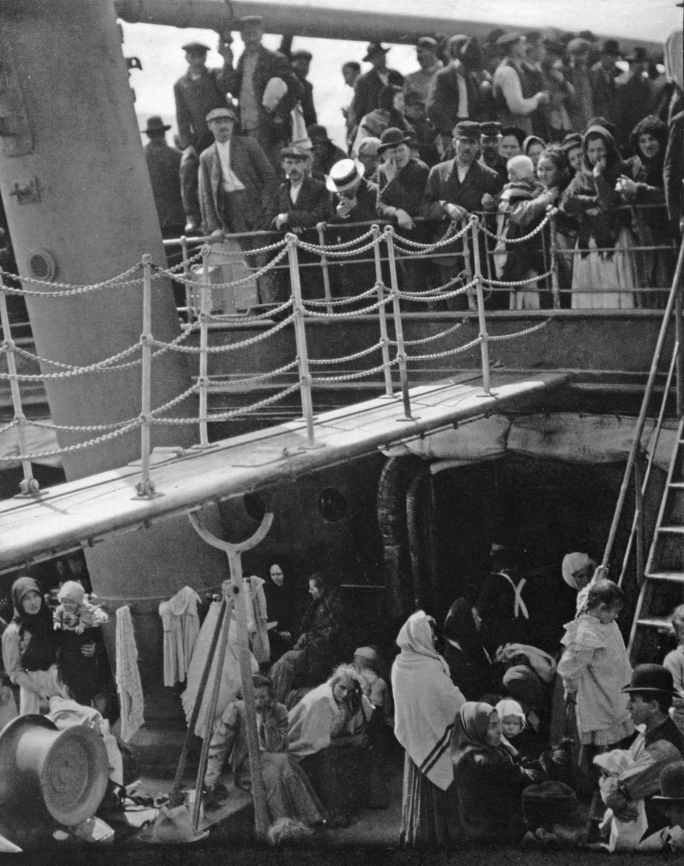
Let’s examine an iconic photograph called The Steerage, taken in 1907 by photographer Alfred Stieglitz (see the next page). We might start with a definition of steerage, which is the cheapest accommodation on a passenger ship—originally the compartments containing the steering apparatus. Stieglitz did not take the photograph for a particular publication because by this point he was already a highly regarded artist who championed the relatively new medium of photography as an art form. The context is the early twentieth century, when immigration to the United States was at a high point. The photograph depicts the wealthier classes aboard ship on the deck above the poorer classes, who are housed in the steerage. Notice how your eye is immediately drawn to the empty gangway that separates the two groups. This point of focus raises the issue of separation, even segregation.
This time, instead of going through the checklist step-by-step as we did with Rat Race, let’s just think about how the style of this photo might be seen as evidence used to make its claim. In what ways might that gangway be symbolic? Why would Stieglitz choose the moment when it is empty? What story is this photograph telling? Note the similarities and differences between the two groups depicted. Stieglitz juxtaposes them. Some differences, such as dress, are stark; yet what similarities do you see? How does Stieglitz want his audience—his viewers—to experience the people in this scene? Why do you suppose we see the group in the top more straight on, face-to-face, while the people in the lower level in many instances have their backs to us? Think about the time period, and ask yourself what cultural values the viewers—those who frequent art galleries and are familiar with artists of the day—bring to this image. Granted, the technology did not make color photos an option, but notice the many shades of light and dark, the shadows, the highlighted areas: What mood does this moment frozen in time suggest? How does the evocation of mood add to the pathos of the scene? What claim—or claims—is Stieglitz making through this visual image?
