Develop a Consistent Design
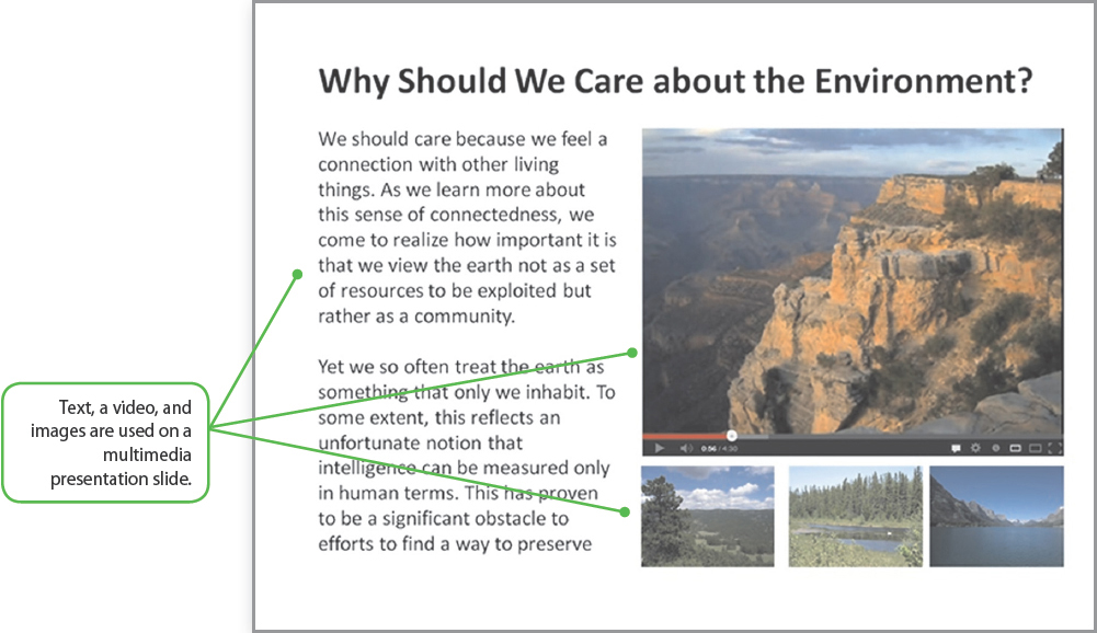
If your multimodal essay uses pages, ensure that they are designed in a way that helps your readers view each page as part of a larger essay. If you’ve watched a Power-Point presentation, you’ve probably seen this idea in action. Even though each page might have radically different content — a bulleted list of information on one page, a video on another, and an image on yet another — they use the same color scheme, headers and footers, fonts, and background colors.

Regardless of the composing tool you choose, you can ensure a sense of continuity across your essay by using a consistent color scheme and font scheme, using background images consistently (or not at all), and placing recurring information, such as page numbers and navigation tools (see the following section), in the same place on each page. You can view how this is accomplished in the example multimodal essay.