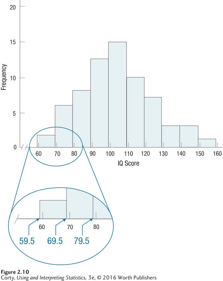
Figure 2.21 Figure 2.10 Histogram Showing Grouped Frequency Distribution of IQ Scores for 68 Sixth Graders (Interval Width = 10) Histograms graph the frequency of continuous variables, so the bars touch each other. Note that the bars are as wide as the real limits of each interval, not the apparent limits. This is highlighted in the enlarged section of the graph.