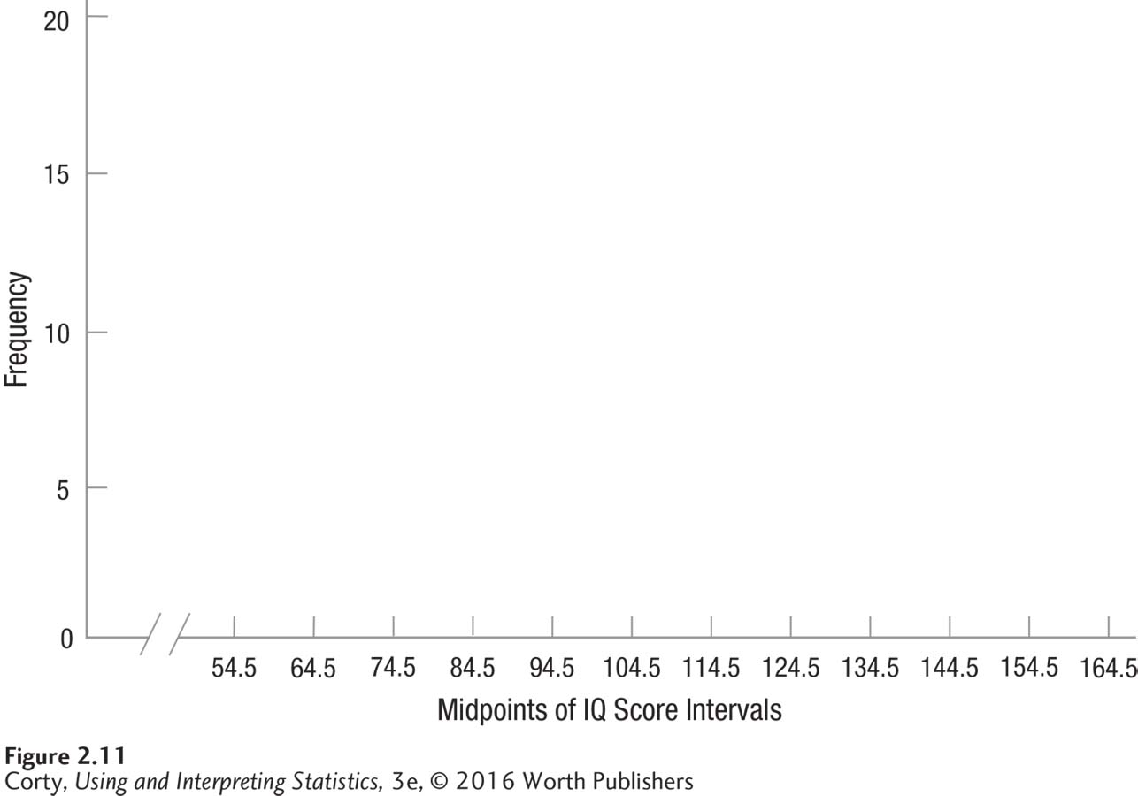
Figure 2.22 Figure 2.11 Template for Frequency Polygon Showing Grouped Frequency Distribution of IQ Scores for 68 Sixth Graders (Interval Width = 10) This “empty” graph shows how a frequency polygon should be set up. Frequency is marked on the Y-axis and midpoints of the IQ intervals on the X-axis. Both axes are clearly labeled and the graph is wider than tall.