2.1 Frequency Distributions
Frequency distributions can be made for nominal-, ordinal-, interval-, or ratio-level data. A frequency distribution is an intuitive way to organize and reduce data. A frequency distribution is simply a count of how often the values of a variable occur in a set of data. For example, to tell someone how many boys and girls are in a class is to make a frequency distribution.
Ungrouped vs. Grouped Frequency Distributions
There are two different types of frequency distribution tables, ungrouped and grouped. An ungrouped frequency distribution table is a count of how often each value of a variable occurs in a data set. In a grouped frequency distribution table, the frequency counts are for adjacent groupings of values, or intervals, of the variable.
Ungrouped frequency distributions are used when the values a variable can take are limited. For example, if students were surveyed about how many children were in their families, a limited number of responses would exist. Students would most commonly report that there were one, two, or three kids in their families. Almost no one would report ten or more kids. An ungrouped frequency distribution for data like these would be compact, taking up maybe a half-dozen lines on one page, and could be viewed easily.
Now if the same students were surveyed about the size of their high school graduating classes, it would be a very different frequency distribution. The survey would yield answers ranging from 1 (homeschooled) to 500 or more students. If one listed each value separately, it would take many lines and could run to multiple pages. This would be hard to view and not a good summary of the data. In this case, it would make sense to group answers together in intervals (fewer than 100 in the class, 100 to 199 in the class, etc.) to make a more compact presentation.
Grouped frequency distributions should be used when the variable has a large number of values and it is acceptable to lose information by collapsing the values into intervals. If the variable has a large number of values but it is important to retain information about all the unique values, then one should use an ungrouped frequency distribution.
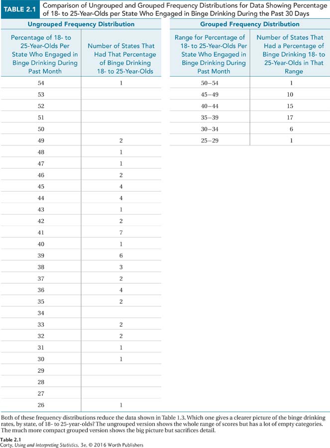
Table 2.1 shows both an ungrouped frequency distribution and a grouped frequency distribution for the binge drinking data from Chapter 1. Note the size of the ungrouped frequency distribution and the many gaps in it. There is too much detail to get a clear picture of the data. Compare that to the compactness of the grouped frequency distribution, which reduces the data to a greater degree and does a better job summarizing and describing it.
Ungrouped Frequency Distributions
Here are some data regarding how many children are in the families of 31 students. Nine of the 31 reported being in one-child families, 14 families had two children, 5 had three, 2 had four, and 1 had six. An ungrouped frequency distribution table for these data can be seen in Table 2.2 on page 42.
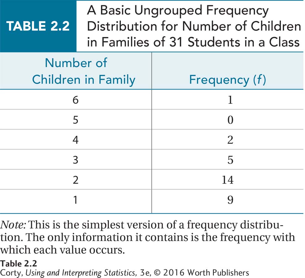
There are a number of things to note about Table 2.2:
This is a basic, no-frills frequency distribution. It just provides the values that the variable takes and how often each value occurs. That’s it.
There is a title! All tables need to have titles that clearly describe the information the table contains.
The columns are labeled.
The abbreviation for frequency is f.
The table is “upside down,” with the largest value of the variable (six children per family) at the top and the smallest value (one child per family) at the bottom. Why the table is arranged this way will become clear in a moment when cumulative frequencies are introduced.
There is no value in the table that indicates how many students were in the class, so that information was placed in the title. The sample size, N, is commonly reported in tables and graphs.
There was one value (five children per family) that did not exist in the class. But, this is included anyway with a frequency of zero. Include zero frequency values because that shows breaks in the data set.
Table 2.2 is a basic ungrouped frequency distribution. Table 2.3 is one with more bells and whistles. This more complex ungrouped frequency distribution has three new columns. The first, cumulative frequency, tells how many cases in a data set have a given value or a lower value. For example, there are 23 people who have two or fewer children in their family and 28 who have three or fewer.
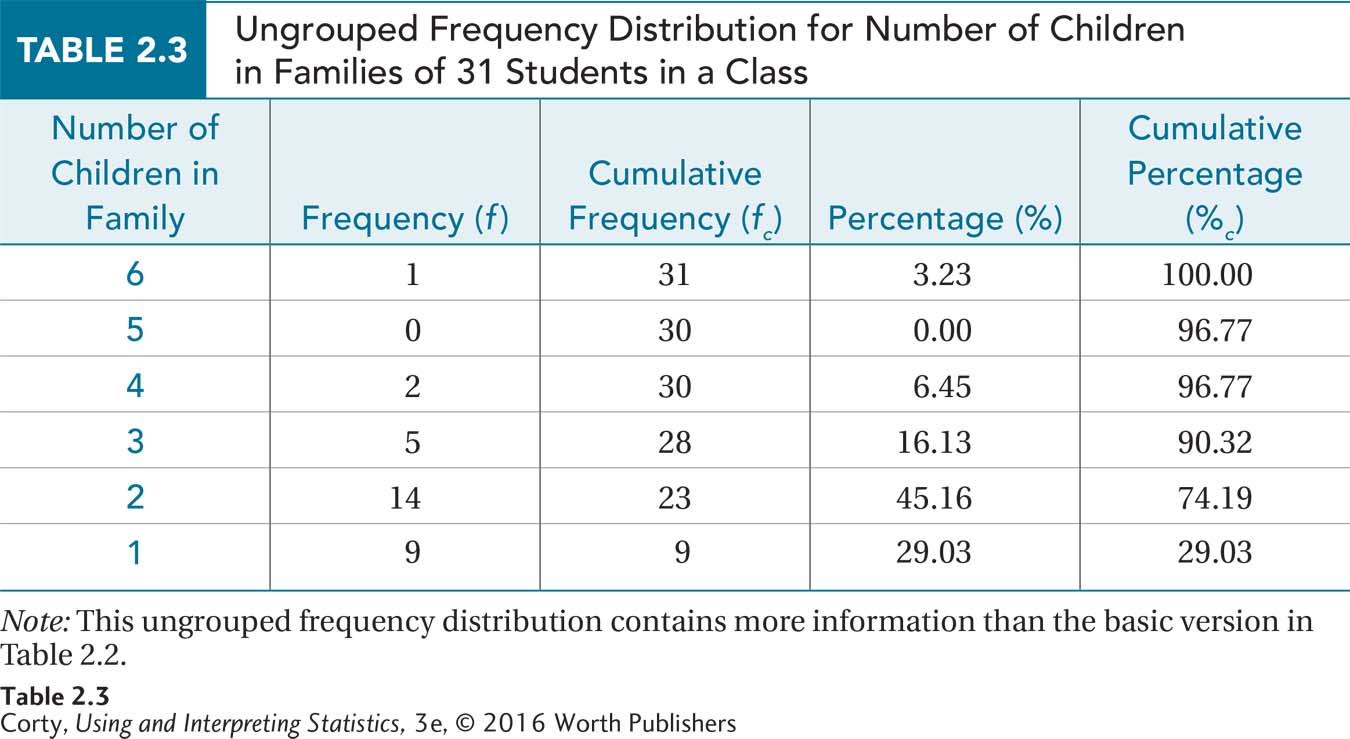
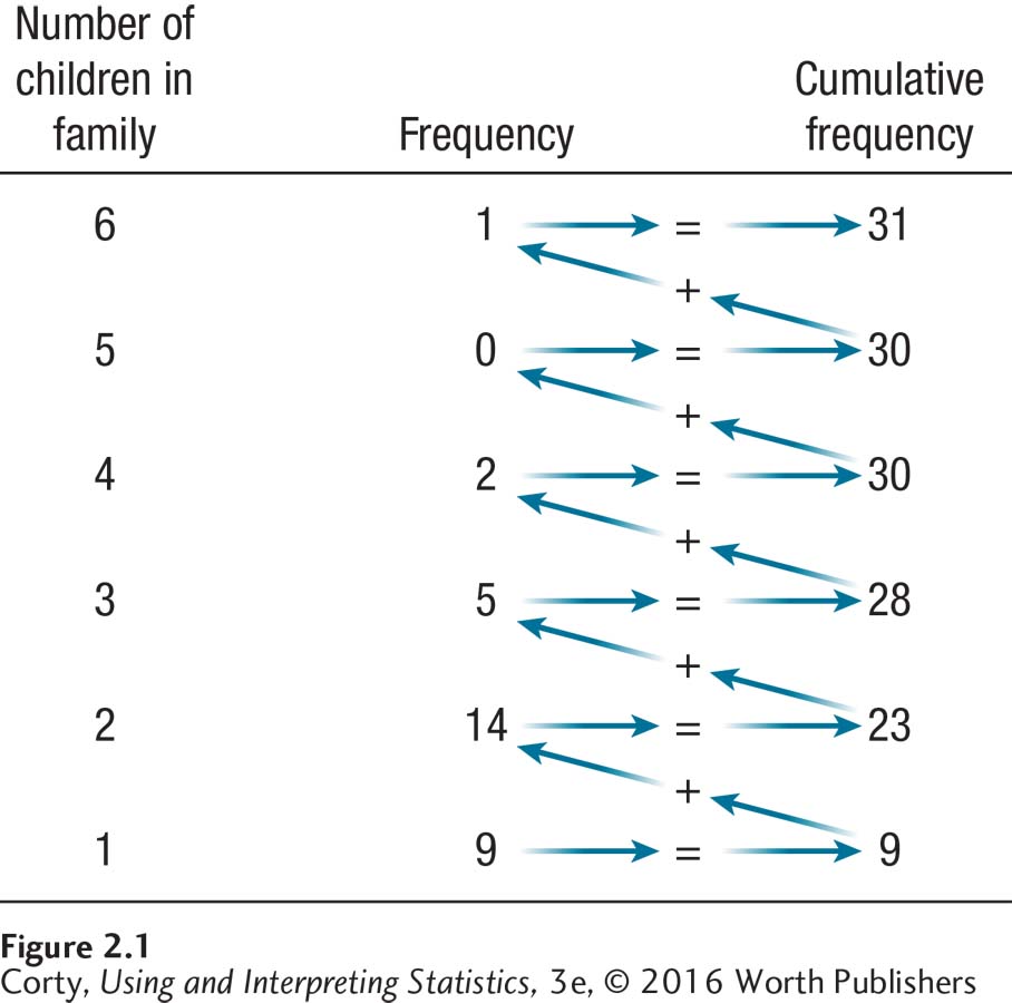
A cumulative frequency, abbreviated fc, is calculated by adding up all the frequencies at or below a given row. It is easier to visualize this than to make it into a formula. Look at Figure 2.1 and note how the cumulative frequencies stair-step up. For the first row, the frequency and the cumulative frequency are the same, 9. Moving up one step, add the frequency at this level, 14, to the cumulative frequency from the level below, 9, to get the cumulative frequency of 23 for this level. Then repeat the process—add the frequency at the new level to the cumulative frequency from one step down—to get the next cumulative frequency.
There are a few other things one should know about cumulative frequencies:
Frequency distributions are organized upside down, with the biggest value the variable can take on the top row. This is because of cumulative frequency, the number of cases at or below a given value. In this table, the row for six children in the family is the top row and the row for one child in the family is the bottom row.
The cumulative frequency for the top row should be the same as the total number of cases, N, in the data set. If they don’t match, something is wrong.
Cumulative frequencies can only be calculated for data that have an order, data where the numbers tell direction. This means that cumulative frequencies can be calculated for ordinal-, interval-, or ratio-level data, but not for nominal data.
If one has nominal data, one needs to organize the data in some logical fashion to fit one’s intended purpose. For example, one could make a frequency distribution for the nominal variable of choice of college major. To draw attention to the relative popularity of majors, it could be organized by ascending or descending frequency.
Cumulative frequencies can only be calculated for data that have an order, data where the numbers tell direction.
The other new columns in Table 2.3 take information that is already there, frequency and cumulative frequency, and present it as percentages. Percentages are a way of transforming scores to put them in context. To see how this works, imagine that a psychologist said that two of the clients he treated in the last year experienced major depression. Does he specialize in the treatment of depression? The answer depends on how many total clients he treated in the last year. If he offered therapy to four patients, then half of them, or 50%, were depressed. If he treated 100 cases, then only 2% were depressed. Whether the psychologist is a depression specialist depends on what percentage of his practice is devoted to treating that illness. Percentages put scores in context.
The percentage column, abbreviated %, takes the information in the frequency column and turns it into percentages. Equation 2.1 shows that this is done by dividing a frequency by the total number of cases in the data set and then multiplying the quotient by 100.
Equation 2.1 Formula for Calculating Frequency Percentage (%) for a Frequency Distribution
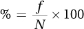
where % = frequency percentage
f = frequency
N = total number of cases
For example, in the third row where the frequency is 5, one would calculate
This means, in plain language, that 16.13% of the students come from families with three children.
The final column, abbreviated %c, gives the cumulative percentage, the percentage of cases with scores at or below a given level. The cumulative percentage is a restatement of the information in the cumulative frequency column in percentage format. For example, in the second row from the bottom of Table 2.3, it is readily apparent that just over 74% of the students come from one-child or two-child families.
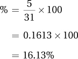
Equation 2.2 Formula for Calculating Cumulative Percentage (%c) for a Frequency Distribution
where %c = cumulative percentage
fc = cumulative frequency
N = total number of cases
The formula for cumulative percentage is given in Equation 2.2. To find %c for a given row in a frequency distribution table, one divides the row’s cumulative frequency by the total number of cases and then multiplies the quotient by 100. In the second to last row of Table 2.3, where the cumulative frequency is 23, one would calculate
Note that the cumulative percentage for the top row should equal 100%.
Grouped Frequency Distributions
Ungrouped frequency distributions work well in two conditions: (1) when the variable takes a limited set of values, or (2) when one wants to document all the values a variable can take. If one were classifying semester status of students in college, there is a limited number of options (1st, 2nd, 3rd, etc.) and an ungrouped frequency distribution would work well. There are many more options for the number of credit hours a student has completed, and an ungrouped frequency distribution for this variable would only make sense if it were important to keep track of how many students had 15 hours vs. 16 hours vs. 17 hours, and so forth.
When dealing with a variable that has a large range, like number of credit hours, a grouped frequency distribution makes more sense. In a grouped frequency distribution, one finds the frequency with which a variable occurs over a range of values. In the credit hours example, one might count how many students have completed from 0 to 14 hours, or from 15 to 29 hours, and so forth. These ranges are called intervals or bins and are abbreviated with a lowercase i.
Grouped frequency distributions work best when there is an order to the values a variable can take, that is, when the variable is measured at the ordinal, interval, or ratio level. Nominal data can be grouped if there is some logical categorization. For example, imagine that a psychologist collected detailed information about the diagnoses of her patients—whether they had major depression, dysthymia, bipolar disorder, obsessive-compulsive disorder, phobias, generalized anxiety disorder, alcoholism, heroin addiction. These responses could be grouped into categories of mood disorders, anxiety disorders, and substance abuse disorders.
For variables that are measured at the ordinal level or higher, the first step is to decide how many intervals to include in a grouped frequency distribution. There needs to be a balance between the amount of detail presented and the number of intervals. There shouldn’t be so few intervals that one can’t see important details in the data set, and there shouldn’t be so many intervals that the big picture is lost in the details. A rule of thumb is to use psychology’s magic number, 7 ± 2, and have from five to nine intervals. But, that’s just a rule of thumb—if fewer than five intervals or more than nine intervals do a better job of communication, that’s fine. The other thing to keep in mind is convention. It is common to make intervals that are 5, 10, 20, 25, or 100 units wide.
Table 2.4 displays data we’ll use to make a grouped frequency distribution. These numbers represent the number of property crimes that occur in a state for every thousand people who live in that state. They are organized from low (17 crimes per 1,000) to high (44 crimes per 1,000) to make it easy to construct a grouped frequency distribution.
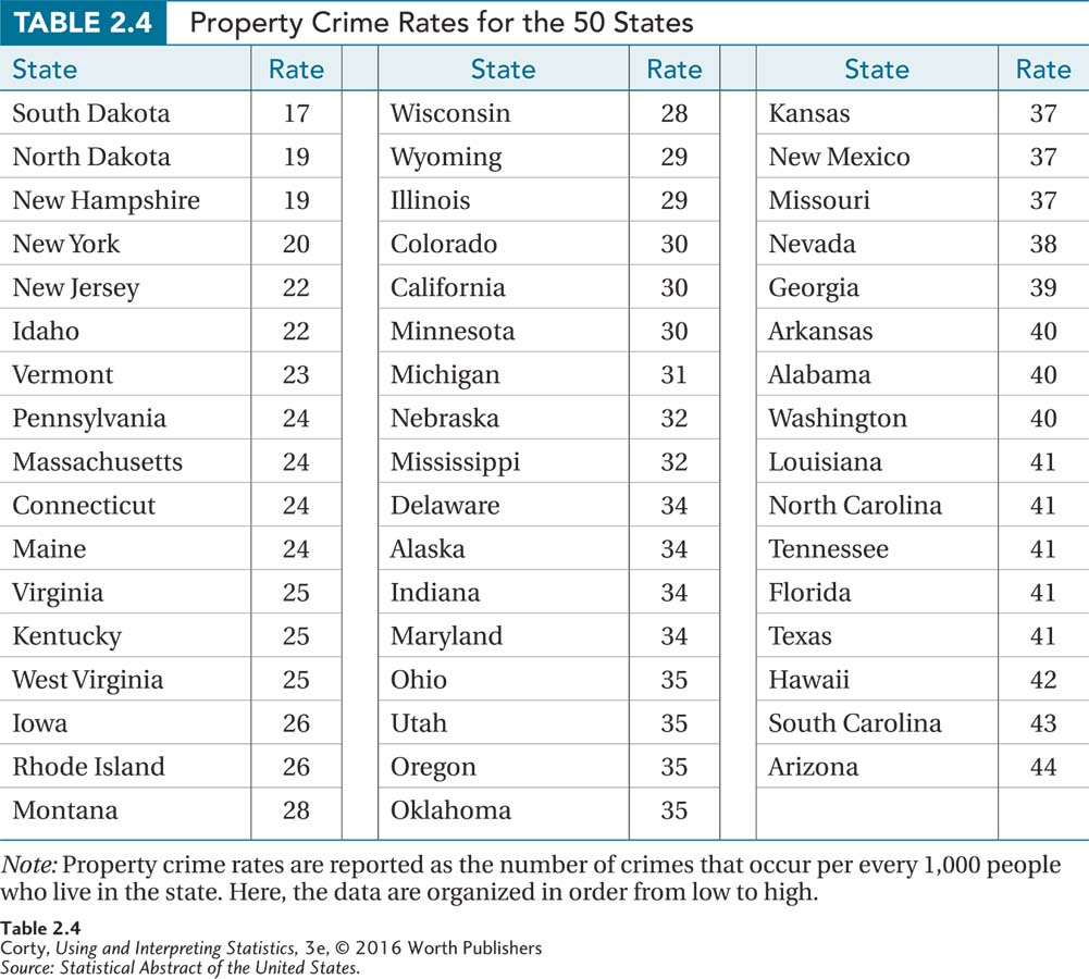
The first task is to decide how many intervals to include. One needs to have intervals that will capture all data and that don’t overlap. One option is to have 10-point-wide intervals—one for the values in the 10s, one for the 20s, the 30s, and the 40s. But that means only four intervals and so few intervals would lose too much detail. Instead, it makes sense here to opt for 5-point-wide intervals. Note that the first interval starts at 15, not 17, because starting an interval at a multiple of 5 is a convention commonly followed. The first interval is 15–19. (If you don’t believe it is five points wide, count it off on your fingers.)
There’s one other thing to mention—all intervals should be the same width so that the frequency in one interval can be compared to the frequency in another. So, there will be six intervals, ranging from 15–19 on the bottom row to 40–44 on the top. Table 2.5 shows what a completed grouped frequency distribution looks like for these state crime data.
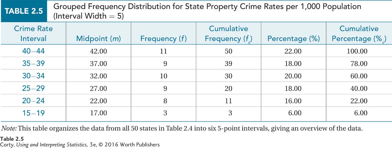
As with an ungrouped frequency distribution, a grouped frequency distribution has a title, labeled columns, and is upside down. A grouped frequency distribution also presents the same information—frequency, cumulative frequency, percentage, and cumulative percentage. This grouped frequency distribution does have one new column, m, which gives information about the midpoint of each interval. The midpoint is just what it sounds like, the middle point of the interval. One can verify that the midpoint of the first interval is 17.00 by counting through the interval, 15–19, on one’s fingers. Or, find the average of 15 and 19, the endpoints of the interval
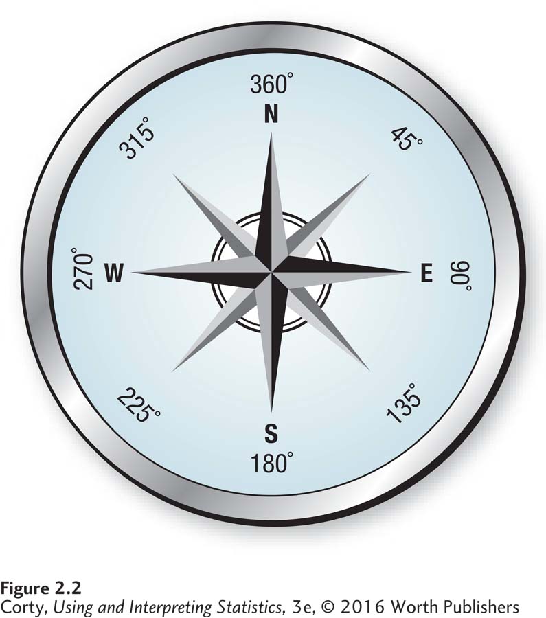
There are two reasons for having a midpoint. First, the midpoint is, in a sense, a summary of the interval. Imagine a compass drawn as a circle with only four headings—north, east, south, and west (see Figure 2.2). North is at the top, labeled 360°, east is to the right, labeled 90°, and so on. If Sharon were heading off to the right at exactly 90°, one would say that she was heading east. But when else would one say she was heading east? If the only options were to say a person was heading north, east, south, or west, one would say “east” when that person was heading anywhere from 45° to 135°. East is the midpoint of that interval 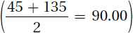 , a summary of the direction for all the points in that interval.
There’s another reason for having a midpoint. Suppose a grouped frequency distribution, like that in Table 2.5, was the only information one had. There was no access to the original data. One would know that there are three cases in the 15–19 interval, but their specific values wouldn’t be known. Were they all 15s? All 19s? Spread throughout the interval? Statisticians have developed the convention that when the exact value for a case is unknown, it is assigned the value of the midpoint of the interval within which it falls.
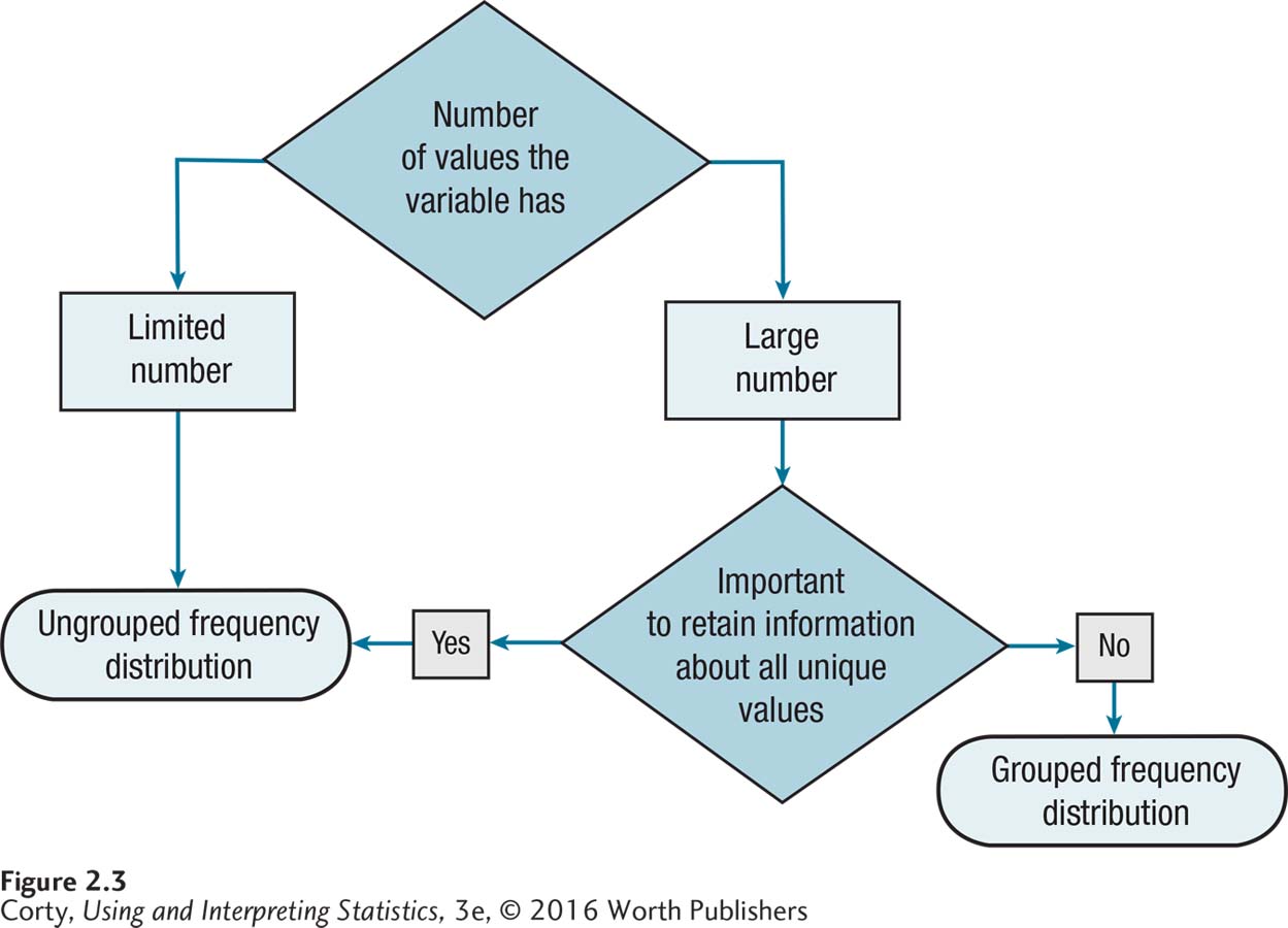
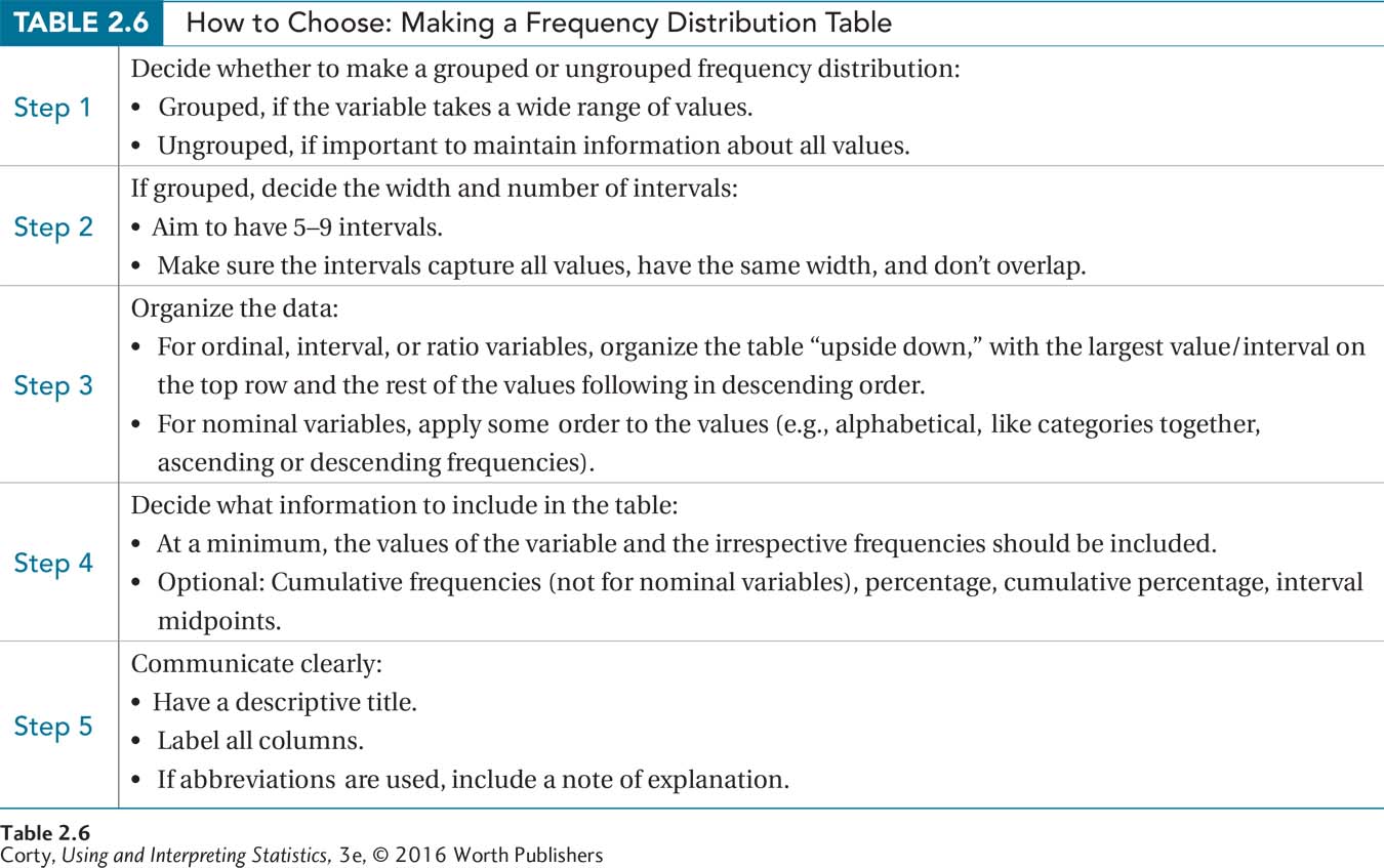
A lot of material was covered in this section, so here are some summaries. Figure 2.3 is a flowchart that leads one through the process of deciding whether to make an ungrouped or a grouped frequency distribution. Table 2.6 summarizes what material to include when making a table.
Worked Example 2.1
For practice making a frequency distribution table, imagine a school district that wanted to get a better picture of the intelligence of its students. It hired a psychologist to administer IQ tests to a random sample of sixth-grade students. Now the district needs a summary of the results.
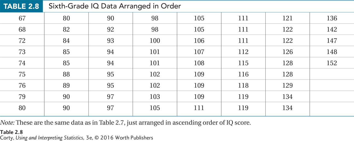
Table 2.7 shows the raw data for the students tested. The first thing to note is that there is a lot of data—four columns of 15 and one of 8, so N = 68. The second thing to note is that a wide range of IQ scores exists, from the 60s to the 150s. Given the wide range of scores and given that it doesn’t seem necessary to maintain information about all the unique scores, a grouped frequency distribution is a more sensible option than an ungrouped frequency distribution to summarize the data.
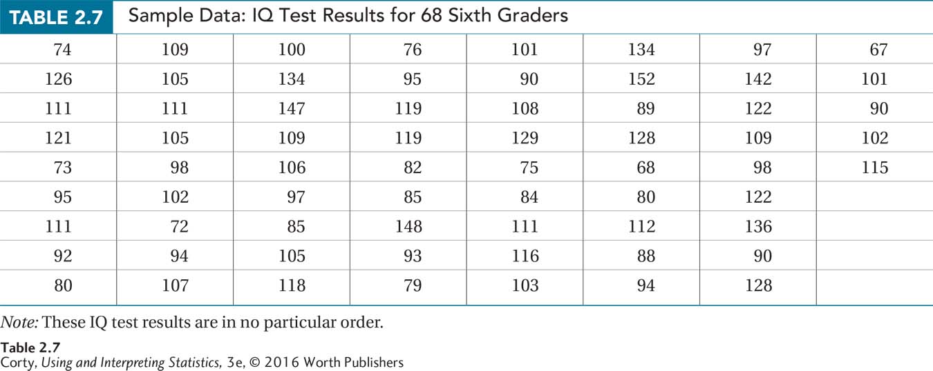
The first step in making a grouped frequency distribution is organizing the data. Table 2.8 shows the data arranged in ascending order.
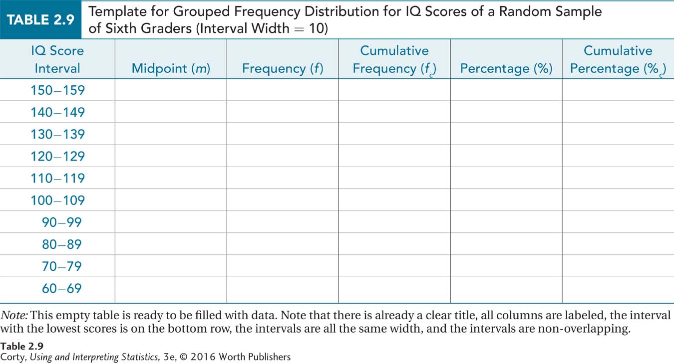
The next decision is how many intervals to have and/or how wide they should be. The range of scores is from 67 to 152. Grouping scores by tens into 60s, 70s, 80s, and so on seems like a reasonable approach. That would mean having 10 intervals, more than the five-to-nine-intervals rule of thumb suggests. But, it is not many more and having an interval width (10) that is familiar is important.
Next, one needs to decide what information to put into the frequency distribution. The bare minimum is the interval and the frequency, but tables are more useful if they also include cumulative frequency, percentage, and cumulative percentage. Table 2.9 shows a table, empty except for title, column labels, and interval information. Note that the intervals appear in the reverse order they did in Table 2.8. And, note that there are enough non-overlapping intervals so that each value falls in one, and only one, interval.
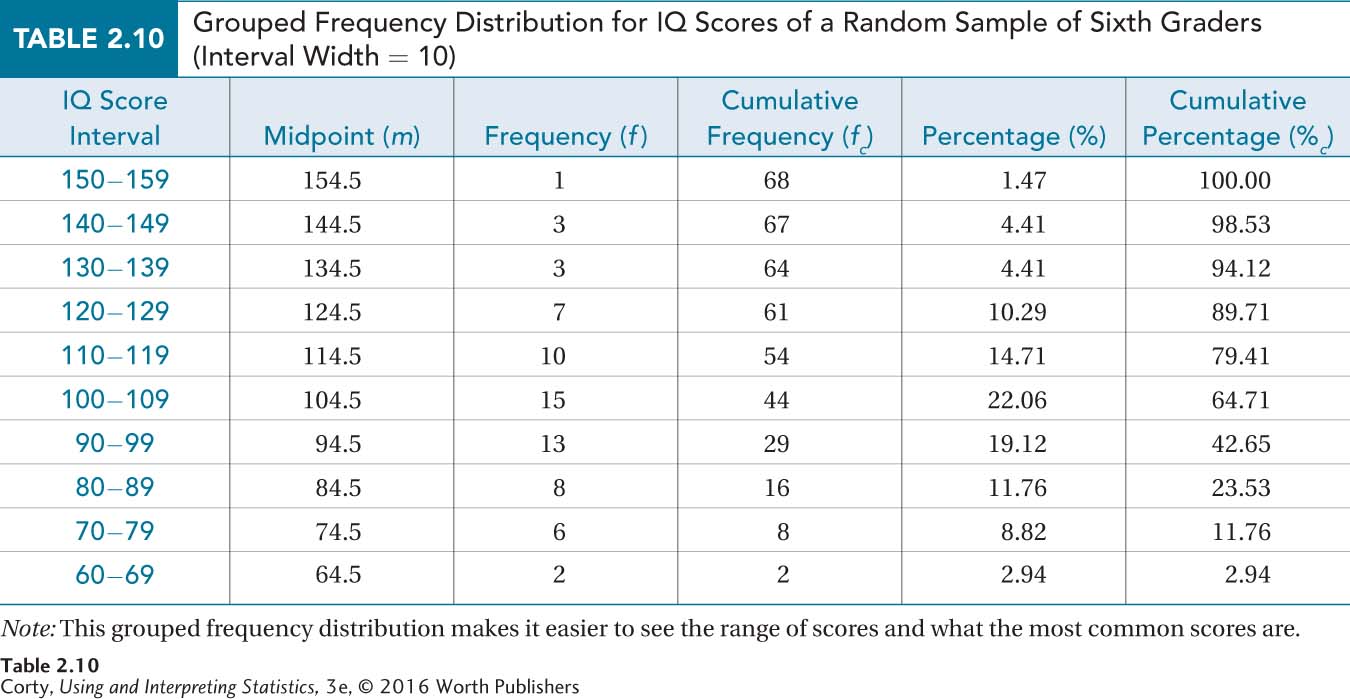
The completed table, Table 2.10, will provide the school district with a good descriptive summary of the intelligence of its sixth graders. It shows the range of scores, from the 60s to the 150s, and the most common scores, from 90 to 119.
Practice Problems 2.1
Review Your Knowledge
2.01 Under what conditions should an ungrouped frequency distribution be made? A grouped frequency distribution?
2.02 What information does a cumulative frequency provide?
2.03 How should a frequency distribution be organized for a nominal variable like type of religion?
2.04 How many intervals should a grouped frequency distribution have?
2.05 What is the formula to calculate a midpoint for an interval in a grouped frequency distribution?
Apply Your Knowledge
2.06 An exercise physiologist has first-year college students exercise and then measures how many minutes it takes for their heart rates to return to normal. Make an ungrouped frequency distribution that shows frequency, cumulative frequency, percentage, and cumulative percentage for the following data:
1, 3, 7, 2, 8, 12, 11, 3, 5, 6, 7, 4, 14, 8, 2, 3, 5, 8, 11, 10, 9, 8, 4, 3, 2, 3, 4, 2, 6, and 7
2.07 Below are final grades, in order, from an upper-level psychology class. Make a grouped frequency distribution to show the distribution of grades. Use an interval width of 10 and start the lowest interval at 50. Be sure to include midpoint, frequency, cumulative frequency, percentage, and cumulative percentage for the data:
53, 54, 56, 59, 60, 60, 60, 62, 63, 63, 66, 67, 67, 70, 70, 70, 71, 72, 73, 74, 74, 75, 75, 77, 77, 77, 78, 79, 79, 80, 80, 81, 81, 81, 81, 81, 83, 83, 84, 84, 85, 85, 85, 85, 86, 86, 87, 87, 88, 91, 91, 92, 93, 94, 96, 98, 98, 99