4.2 The Normal Distribution
 StatClips: The Normal DistributionVideo on LaunchPad
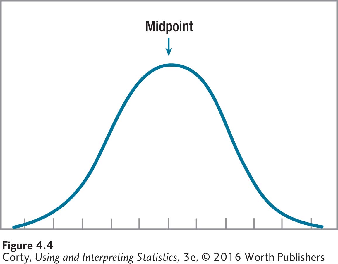
Now that calculating and interpreting z scores have been covered, it is time to explore the normal distribution. The normal distribution (often called the bell curve) is a specific symmetrical distribution whose highest point occurs in the middle and whose frequencies decrease as the values on the X-axis move away from the midpoint. An example of a normal distribution is shown in Figure 4.4.
There are several things to note about the shape of a normal distribution:
The frequencies decrease as the curve moves away from the midpoint, so the midpoint is the mode.
The distribution is symmetric, so the midpoint is the median—half the cases fall above the midpoint and half fall below it.
The fact that the distribution is symmetrical also means that the midpoint is the mean. It is the spot that balances the deviation scores.
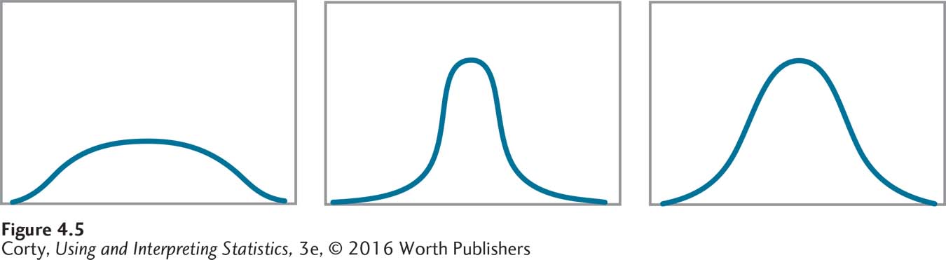
Figure 4.5 shows a variety of bell-shaped curves that meet these criteria, but not all of them are normal distributions. There’s another criterion that must be met for a bell-shaped curve to be considered a normal distribution: a specific percentage of cases has to fall in each region of the curve.
In Figure 4.6, the regions under the normal curve are marked off in z score units. In the normal distribution, 34.13% of the cases fall from the mean to 1 standard deviation above the mean, 13.59% in the next standard deviation, and decreasing percentages in subsequent standard deviations. Because the normal distribution is symmetrical, the same percentages fall in the equivalent regions below the mean. Figure 4.7 shows the percentages of cases that fall in each standard deviation unit of the normal distribution as the curve moves away from the mean.
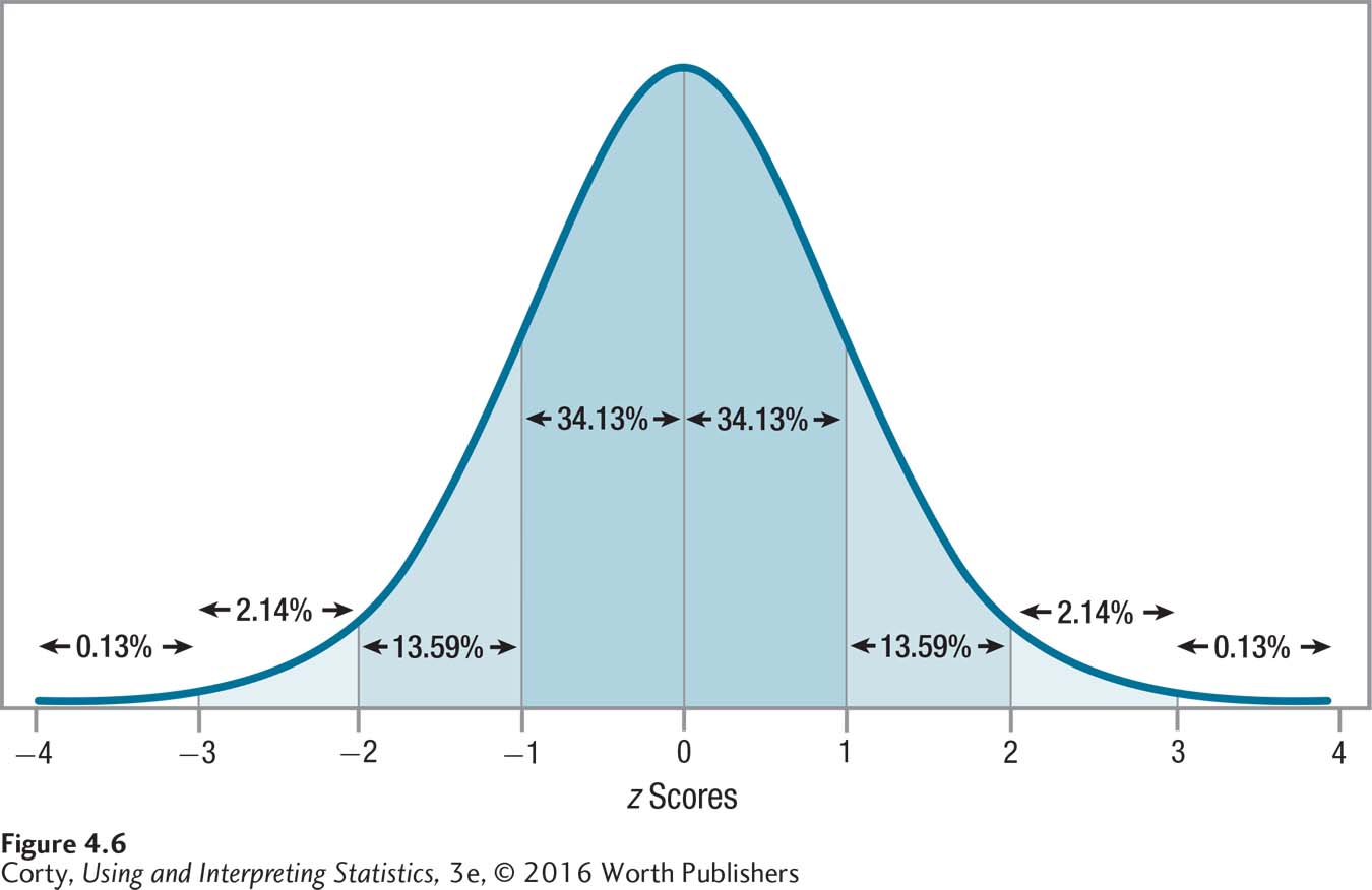
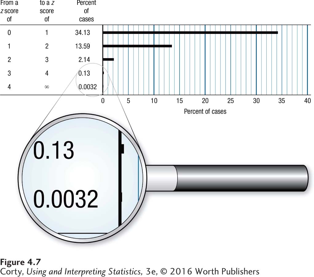
One important thing to note in Figure 4.7 is how quickly the percentage of cases in a standard deviation drops off as the curve moves away from the mean. The first standard deviation contains about 34% of the cases, the next about 14%, then about 2% in the third, and only about 0.1% in the fourth standard deviation. This distribution has an important implication for where the majority of cases fall:
About two-thirds of the cases fall within 1 standard deviation of the mean. That’s from 1 standard deviation below the mean to 1 standard deviation above it, from z = –1.00 to z = 1.00. (The exact percentage of cases that falls in this region is 68.26%.)
About 95% of the cases fall within 2 standard deviations of the mean, from z = –2.00 to z = 2.00. (The exact percentage is 95.44%.)
More than 99% of the cases fall within 3 standard deviations, from z = –3.00 to z = 3.00. In fact, close to 100% of the cases—almost all—fall within 3 standard deviations of the mean. (The exact percentage is 99.73%.)
It is rare, in a normal distribution, for a case to have a score that is more than 3 standard deviations away from the mean. In practical terms, these scores don’t happen, so when graphing a normal distribution, setting up the z scores on the X-axis so they range from –3.00 to z = 3.00 is usually sufficient.
Here’s a simplified version of the normal distribution. Look at Figure 4.8 and note the three numbers: 34, 14, and 2. These are the approximate percentages of cases that fall in each standard deviation as the curve moves away from the mean:
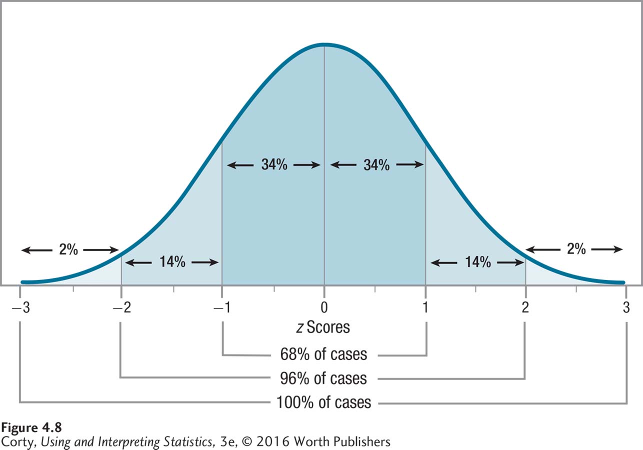
≈34% of cases fall from the mean to 1 standard deviation above it. The same is true for the area from the mean to 1 standard deviation below it. (This symbol, ≈, means approximately.)
Page 117≈14% of cases fall from 1 standard deviation above the mean to 2 standard deviations above it. Ditto for the area from 1 standard deviation below to 2 standard deviations below.
≈2% of cases fall from 2 standard deviations above the mean to 3 standard deviations above it. Again, ditto for the same area below the mean.
Here’s a real example of how scores only range from 3 standard deviations below the mean to 3 standard deviations above it. Think of the SAT where subtests have a mean of 500 and a standard deviation of 100. A z score of –3.00 is a raw score of 200 on a subtest. This can be calculated using Equation 4.3:
X = 500 + (–3.00 × 100)
= 500 + (–300.0000)
= 500 – 300.0000
= 200.0000
= 200.00
A z score of 3.00 is a raw score of 800 on a subtest. This can be calculated using Equation 4.3:
X = 500 + (3.00 × 100)
= 500 + 300.0000
= 800.0000
= 800.00
This means that almost all scores on SAT subtests should range from 200 to 800. And that is how the SAT is scored. No one receives a score lower than a 200 or higher than an 800 on an SAT subtest.
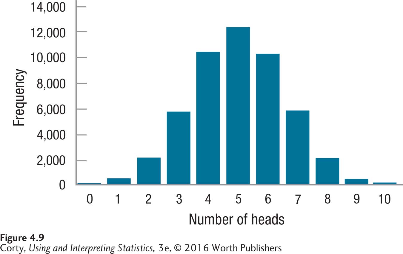
The normal distribution is called “normal” because it is a naturally occurring distribution that occurs as a result of random processes. For example, consider taking 10 coins, tossing them, and counting how many turn up heads. It could be anywhere from 0 to 10. The most likely outcome is 5 heads and the least likely outcome is either 10 heads or no heads. If one tossed the 10 coins thousands of times and graphed the frequency distribution, it would approximate a normal distribution (see Figure 4.9).
Psychologists don’t care that much about coins, but they do care about variables like intelligence, conscientiousness, openness to experience, neuroticism, agreeableness, and extroversion. It is often assumed that these psychological variables (and most other psychological variables) are normally distributed. Here’s an example that shows how helpful this assumption is:
It is often assumed that psychological variables are normally distributed.
If 34.13% of the cases fall from the mean to a standard deviation above the mean, and
if intelligence is normally distributed, and
if intelligence has a mean of 100 and a standard deviation of 15,
then 34.13% of people have IQs that fall in the range from 100 to 115, from the mean to 1 standard deviation above it.
If a person were picked at random, there’s a 34.13% chance that he or she would have an IQ that falls in the range from 100 to 115. That’s true as long as intelligence is normally distributed.
Finding percentages using the normal distribution wouldn’t be useful if the percentages were only known for each whole standard deviation. Luckily, the normal curve has been sliced into small segments and the area in each segment has been calculated. Appendix Table 1, called a z score table, contains this information. A small piece of it is shown in Table 4.2.
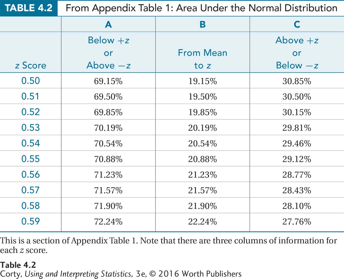
There are a number of things to note about this z score table:
It is organized by z scores to two decimal places. Each row is for a z score that differs by 0.01 from the row above or below.
There are no negative z scores listed. Because the normal distribution is symmetrical, the same row can be used whether looking up the area under the curve for z = 0.50 or –0.50.
The columns report the percentage of area under the curve that falls in different sections. This is the same as the percentage of cases that have scores in that region.
Page 119The percentages reported are always greater than 0%. In any region of the normal distribution, there is always some percentage of cases that fall in it. Sometimes the percentage is very small, but it is always greater than zero.
The percentages reported can’t be greater than 100%. In any region, there can’t be more than 100% of the cases.
There are three columns, A, B, and C, each containing information about the percentage of cases that fall in a different section of the normal distribution. For each row in the table, there are three different views for each z score.
Column A
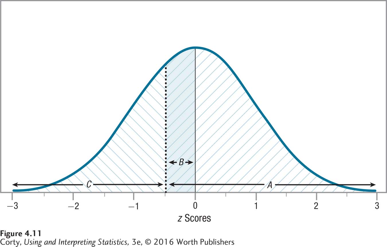
For a positive z score, column A tells the percentage of cases that have scores at or below that value. A positive z score falls above the midpoint, so the area below a positive z score also includes the 50% of cases that fall below the midpoint. This means the area below a positive z score will always be greater than 50% as it includes both the 50% of cases that fall below the mean, and an additional percentage that falls above the mean. Look at Figure 4.10, where A marks the area from the bottom of the curve to a z score of 0.50. This area is shaded / / / and it should be apparent that it covers more than 50% of the area under the curve. According to column A in Appendix Table 1, the exact percentage of cases that fall in the region below a z score of 0.50 is 69.15%.
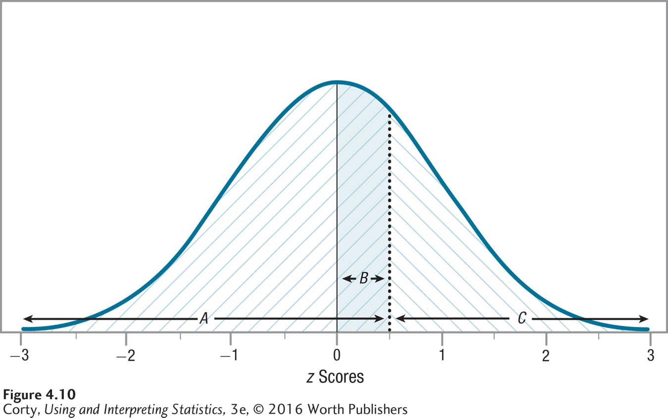
Because the normal distribution is symmetric, column A also tells the percentage of cases that fall at or above a negative z score. Figure 4.11 marks off area A for z = –0.50. Now compare Figure 4.10 to Figure 4.11, which are mirror images of each other: the same areas are marked off, just on different sides of the normal distribution. So, 69.15% of cases fall at or above a z score of –0.50.
Column B
In Appendix Table 1, column B tells the percentage of cases that fall from the mean to a z score, whether positive or negative. This value can never be greater than 50% because it can’t include more than half of the normal distribution. Figures 4.10 and 4.11 show the shaded area B for a z score of ±0.50. Looking in Table 4.2, one can see that this area captures 19.15% of the normal distribution.
Column C
Column C tells the percentage of cases that fall at or above a positive z score. Because of the symmetrical nature of the normal distribution, column C also tells the percentage of cases that fall at or below a negative z score. Look at Figures 4.10 and 4.11, which show area C, marked \ \ \, for a z score of ±0.50. It should be apparent that area C values will always be less than 50%. The z score table in Appendix Table 1 shows that the exact value is 30.85% for the percentage of cases that fall above a z score of 0.50 or below a z score of –0.50.
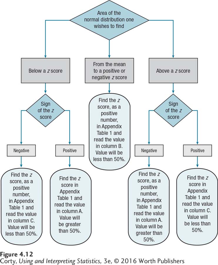
There are three questions that the z score table in Appendix Table 1 can be used directly to answer about a normal distribution:
What percentage of cases fall above a z score?
What percentage of cases fall from the mean to a z score?
What percentage of cases fall below a z score?
Figure 4.12 is a flowchart that walks through using the z score table in Appendix Table 1 to answer those questions.
Here’s an example of the first question: “What is the percentage of cases in a normal distribution that have scores above a z score of –2.30?” Before turning to the flowchart in Figure 4.12, it is helpful to make a quick sketch of the area one is trying to find. Figure 4.13 is a normal distribution, where the X-axis is marked from z = –3 to z = 3. A vertical line is drawn at z = –2.30, and the area to the right of the line all the way to the far right side of the distribution is shaded in. That’s the area above a z score of –2.30. The percentage of cases that fall in this shaded in area is greater than 50% and is probably fairly close to 100%.
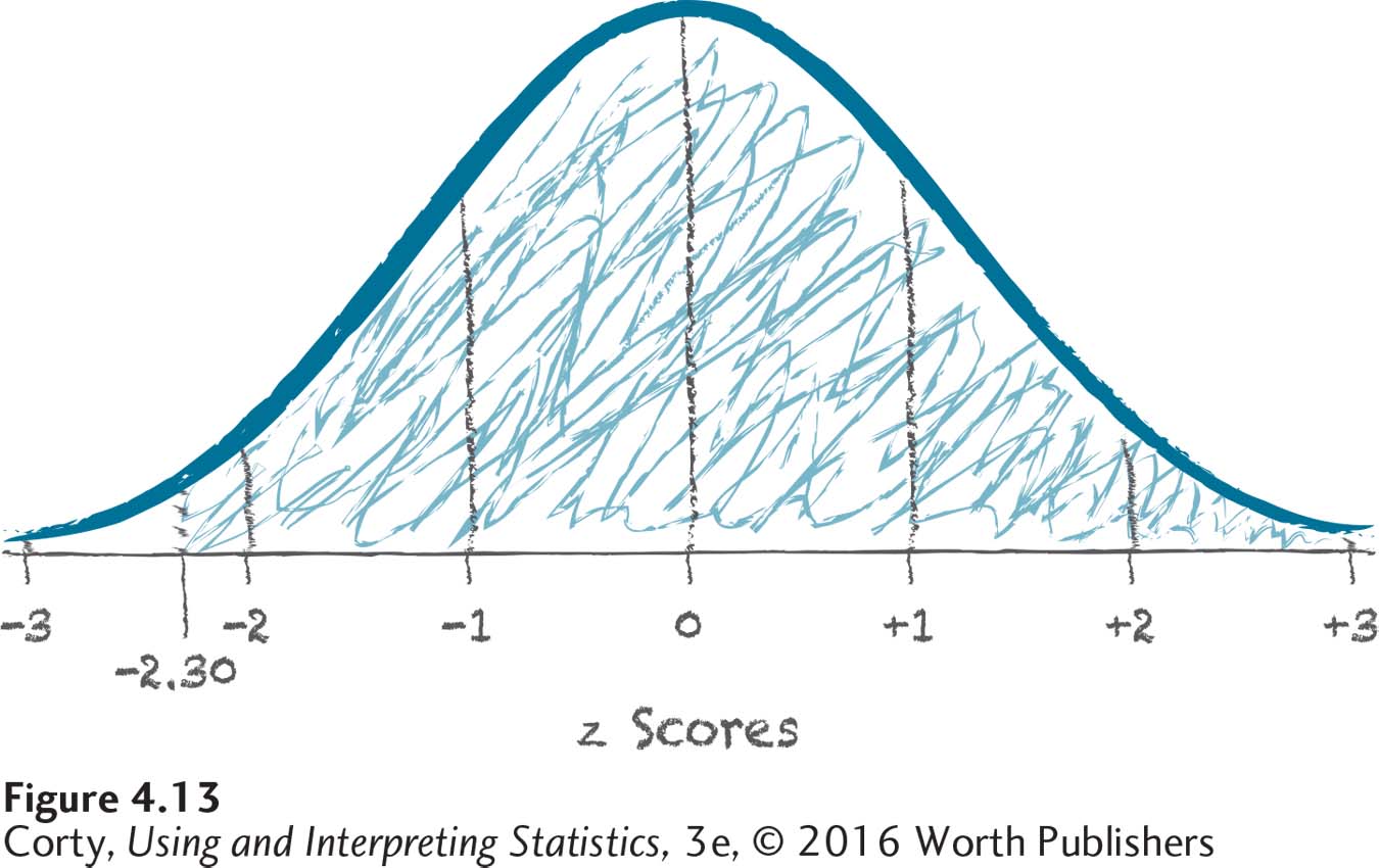
Now, turn to the flowchart in Figure 4.12. It directs one to use column A of the z score table to find the exact answer. Turn to Appendix Table 1 and go down the column of z scores to 2.30. Then look in column A, which tells the area above a negative z score, to find the value of 98.93%. And that’s the answer: 98.93% of cases in a normal distribution fall above a z score of –2.30.
The second type of problem involves finding the area from the mean to a z score. For example, what’s the area from the mean to a z score of 1.50?
Start with a sketch. In Figure 4.14, there’s a normal curve. The X-axis is labeled with z scores from –3 to +3, and each standard deviation unit is marked with the approximate percentages (34, 14, or 2) that fall in it. There’s a line at z = 1.50, and the area from z = 0.00 to z = 1.50 is shaded in. Inspection of this figure shows that the area being looked for will be greater than 34% but less than 48%.
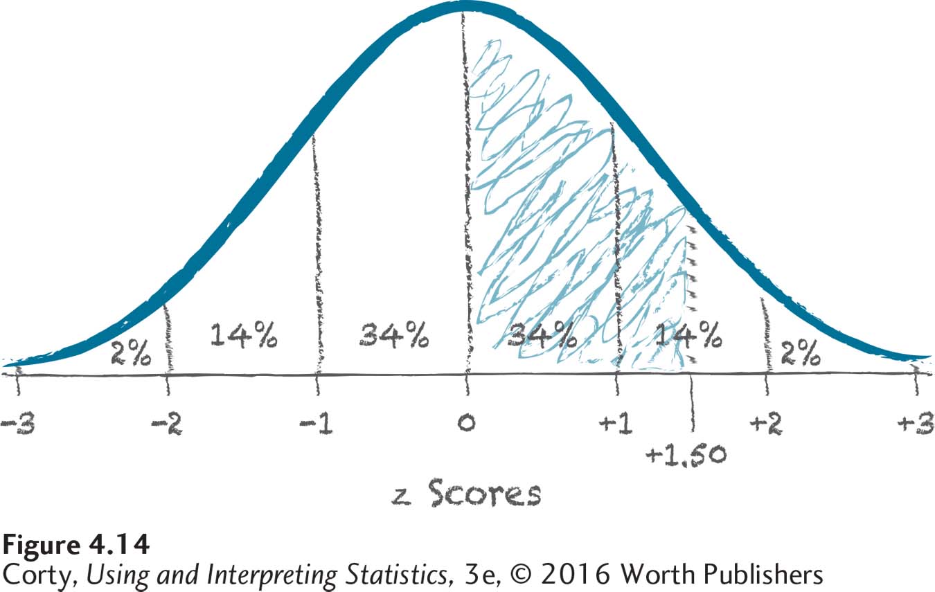
To find the exact answer, use the flowchart in Figure 4.12: the answer can be found in column B of the z score table. The flowchart also indicates that the answer will be less than 50% (which is consistent with what was found in Figure 4.14). Finally, turn to the intersection of the row for z = 1.50 and column B in Appendix Table 1 for the answer: 43.32%. In a normal distribution, 43.32% of the cases fall from the mean to 1.50 standard deviations above it.
The third type of question asks one to find the area below a z score. For example, what is the area below a z score of –0.75?
As always, start with a sketch. Figure 4.15 shows a normal distribution, filled in with the approximate areas in each standard deviation. There’s a vertical line at –0.75, and the area to the left of this line (the area below this z score) is shaded in. That’s the area to be found. This area will be larger than 16% because it includes the bottom 2%, the next 14%, and then some more.
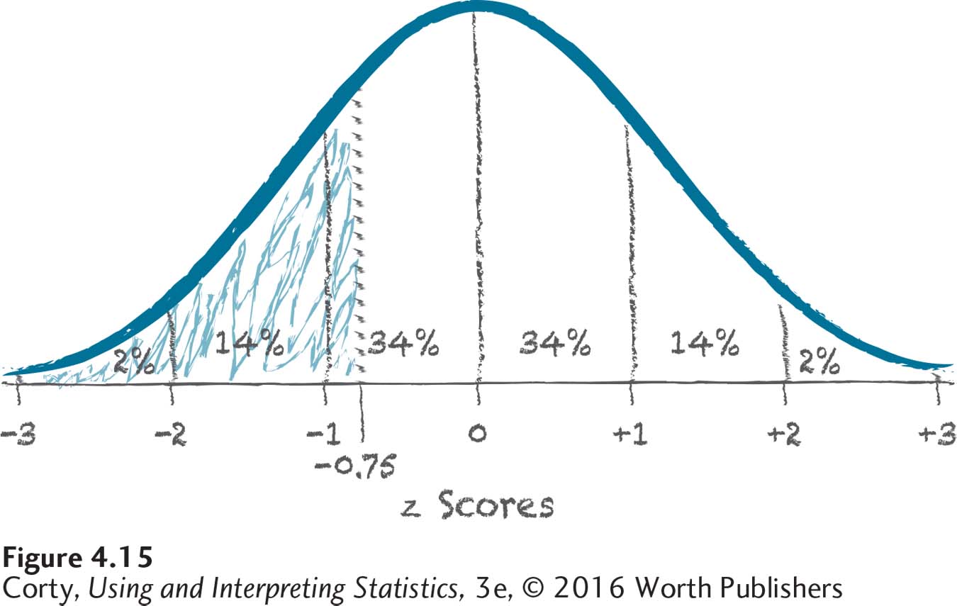
To find the exact answer, turn to the flowchart in Figure 4.12. The flowchart says to use column C to find the z score (a positive number) in Appendix Table 1. Looking at the intersection of the row where z = 0.75 and column C, we see that the answer is 22.66%. In a normal distribution, 22.66% of the scores are lower than a z score of –0.75.
After some practice finding the area under the normal distribution curve, we will move on to two new ways to use z scores and the normal curve. One, percentile ranks, is a new way to describe a person’s performance. The other, probability, underpins how statistical tests work.
Worked Example 4.2
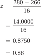
Here’s some practice finding the area under the normal distribution using a real-life example. The expected length of a pregnancy from the day of ovulation to childbirth is 266 days, with a standard deviation of 16 days. Assuming that the length of pregnancy is normally distributed, what percentage of women give birth at least two weeks later than average? Two weeks is equivalent to 14 days, so the question is asking for the percentage of women who deliver their babies on day 280 or later.
The first step is to transform 280 into a z score:
Next, make a sketch to isolate the area we’re looking for. In Figure 4.16, the area above a z score of 0.88 is shaded in. This area will be less than 50%. The area includes the distance from 2 standard deviations above the mean to 3 standard deviations above it (2%), the distance from 1 standard deviation above the mean to 2 standard deviations above it (14%), and then a little bit more. The area will be a bit more than 16%.
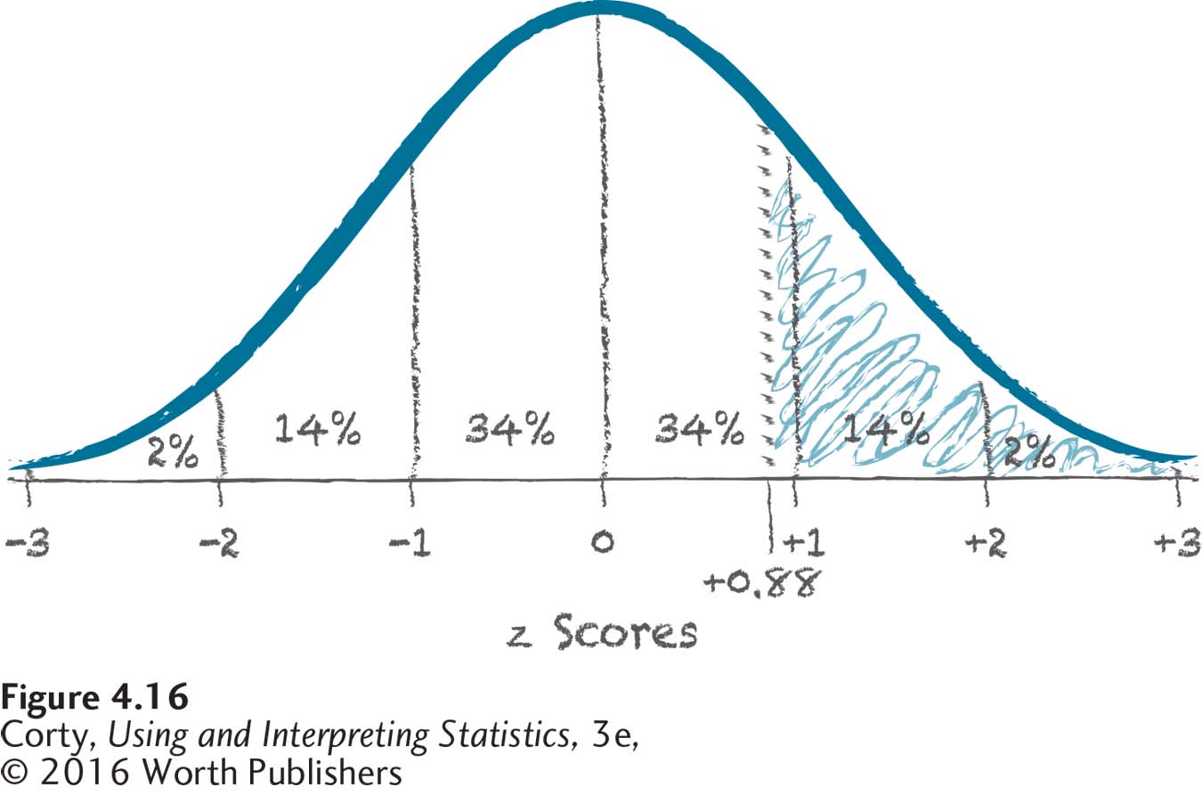
The area being looked for is the area above a z score. Consulting Figure 4.12, it is clear that the answer may be found in column C of Appendix Table 1. There, a z score of 0.88 has the corresponding value of 18.94%. And that’s the conclusion—almost 19% of pregnant women deliver two weeks or more later than the average length of pregnancy.
Practice Problems 4.2
Review Your Knowledge
4.06 Describe the shape of a normal distribution.
4.07 What measure of central tendency is the midpoint of a normal distribution?
4.08 What do numbers 34, 14, and 2 represent in a normal curve?
Apply Your Knowledge
4.09 What percentage of area in a normal distribution falls at or above a z score of –1.33?
4.10 What percentage of area in a normal distribution falls at or above a z score of 2.67?
4.11 What percentage of area in a normal distribution falls from the mean to a z score of –0.85?