Preferences and Indifference Curves
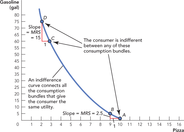
Consider a particular consumption bundle, say, bundle A in Figure 25.7. Now let’s find all the bundles that the consumer regards as just as good as bundle A. If bundle A is just as good as bundle B, we say the consumer is indifferent between bundle A and bundle B, or equivalently, we say that bundle A and bundle B give the consumer an equal amount of utility. An indifference curve connects all the bundles that give the consumer an equal amount of utility and so we have drawn an indifference curve in Figure 25.7 showing all the consumption bundles that give an equal amount of utility to bundle A.

The marginal rate of substitution (MRS) is the rate at which the consumer is willing to trade one good for another and remain indifferent. The MRS is equal to the slope of the indifference curve at that point.
The indifference curve in Figure 25.7 is curved inward. Let’s explain why this is a plausible shape for indifference curves. Notice that bundle A has 10 pizzas and 0 gallons of gas—that’s an awful lot of pizza and not so much gas, or at least not so much gasoline. Since the consumer has a lot of pizza at bundle A, he probably would be willing to give up a pizza to get just a few gallons of gasoline, say, 2.5 gallons for 1 pizza, which would place the consumer at bundle B. The number of gallons per pizza that the consumer requires to remain indifferent is called the marginal rate of substitution (MRS) and is given by the slope of the indifference curve (noting once again, that we have dropped the negative sign).
But now consider bundle C. At bundle C, the consumer has fewer pizzas and more gas than at bundle A, so to remain indifferent, the consumer now requires 15 additional gallons of gasoline to give up 1 pizza. As the consumer gives up more pizza and gets more gasoline, pizza becomes more valuable and gasoline less valuable, so the consumer requires more and more gasoline in return for the same number of pizzas. Graphically, what this behavior implies is an indifference curve that is curved inward.
473
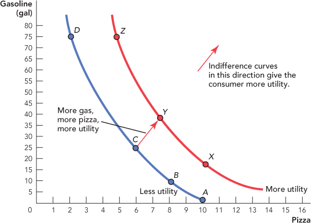
In Figure 25.8, we illustrate a second indifference curve showing all the consumption bundles that have the same utility as consumption bundle Y. What is the relationship between the ABCD indifference curve and the XYZ indifference curve? Compare consumption bundles C and Y. Consumption bundle Y has more gasoline and more pizza than consumption bundle C, so we can say for sure that consumption bundle Y has higher utility or is more preferred than consumption bundle C. But how does consumption bundle C compare with consumption bundle Z (which has more gasoline but fewer pizzas) or consumption bundle X (which has more pizzas but less gasoline)? We know that bundle Y is preferred to C but we also know that the consumer is indifferent between X, Y, and Z, so it follows that bundles X and Z are also preferred to bundle C. In fact, through a similar argument, we can say that any consumption bundle on XYZ is preferred to any consumption bundle on ABCD. This means that indifference curves toward the northeast of the diagram give the consumer more utility, so the consumer wants to be as far to the northeast as possible.

CHECK YOURSELF
Question 25.4
 Use an argument similar to the one we used in the last paragraph to show that (1) indifference curves can never cross and (2) indifference curves must have a negative slope.