Data Graphs
As well as expressing ideas, graphs can also be used to illustrate data. For example, GDP can be broken down according to the national spending identity into these components: Consumption, Investment, Government Purchases, and Net Exports (Exports minus Imports), that is, GDP = Y = C + I + G + NX. U.S. GDP for 2007 is shown in Table A.1.
TABLE A.1 U.S. GDP 2007 (in billions of dollars)
|
Category |
GDP |
|---|---|
|
Consumption |
9,710.2 |
|
Investment |
2,130.4 |
|
Government |
2,674.8 |
|
Net Exports |
–707.8 |
|
GDP (Total) |
13,807.6 |
|
Source: Bureau of Economic Analysis |
|
A-5
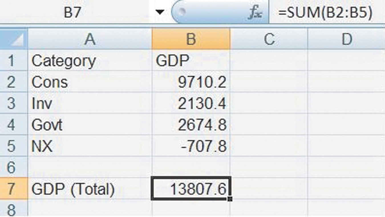
If you type the components into Excel, as shown in Figure A.5, you can use the sum function to check that the components do add up to GDP.
Highlighting the data in columns A and B and clicking Insert > Column > Clustered Column and (with a few modifications to add axis titles and to make the graph look pretty), we have the graph on the left side of Figure A.6.
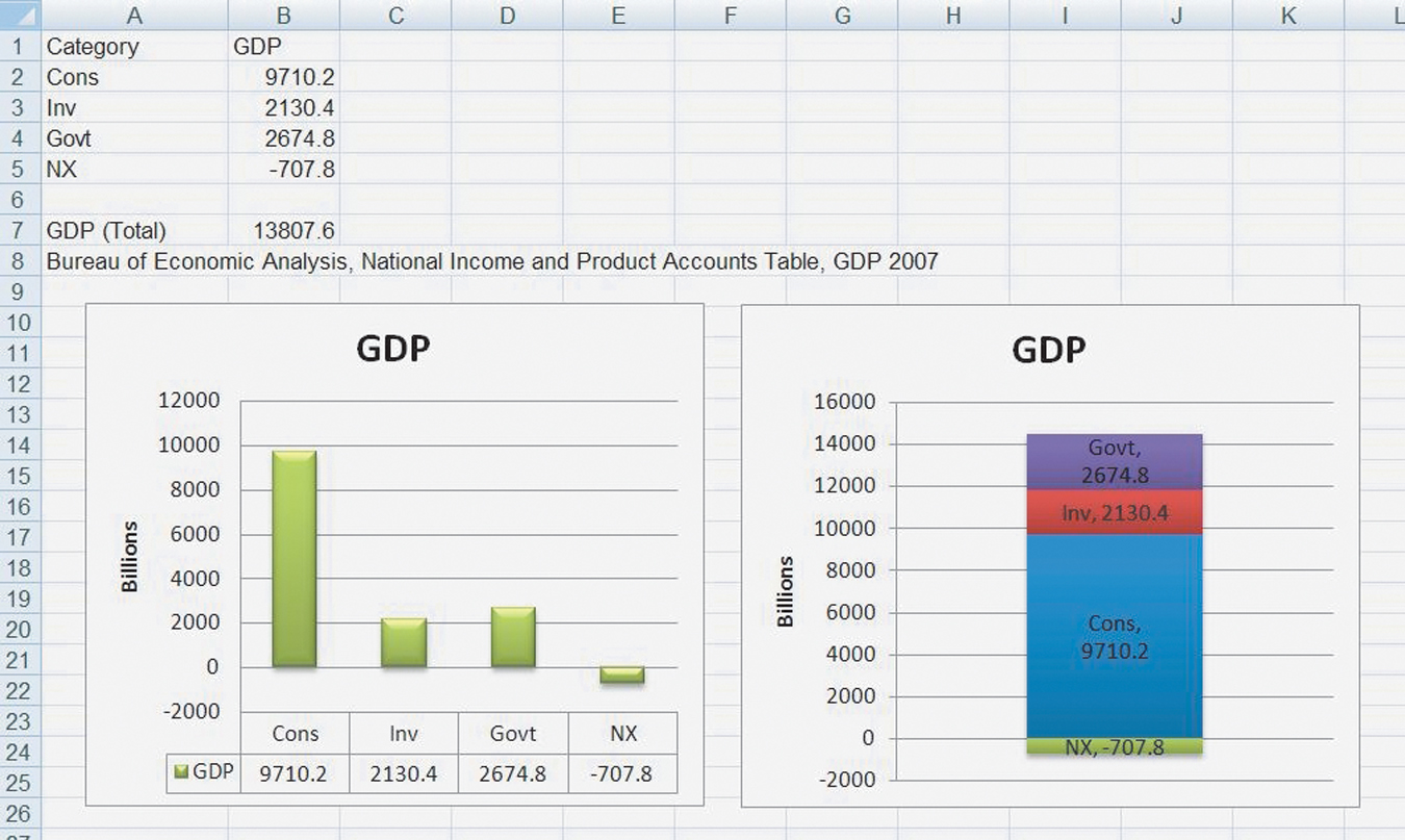
The graph on the right side of Figure A.6 shows exactly the same data only on the right side we chose Stacked Column (and we switched the rows and columns). Sometimes one visualization of the data is more revealing than another so it’s a good idea to experiment a little bit with alternative ways of presenting the same data. But please don’t get carried away with adding 3D effects or other chart junk. Always keep the focus on the data, not on the special effects.
A-6
In this book, we explain the economics of stocks, bonds, and other investments. A lot of financial data is available for free on the web. We used Yahoo! Finance, for example, to download data for the value of the S&P 500 Index on the first trading day of the month from 1950 to the end of2000. The data is graphed in Figure A.7.
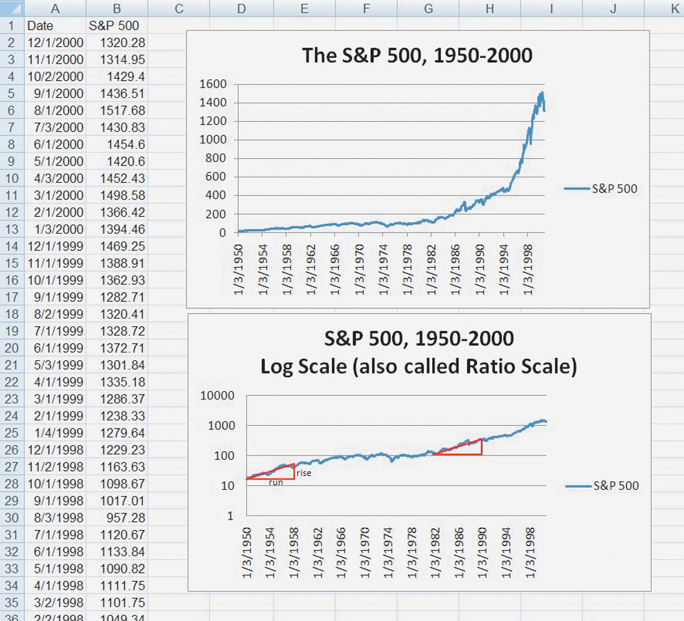
To graph the S&P 500 data, we used a line graph. The top graph in Figure A.7 shows the data graphed in the “normal” way with equal distances on the vertical axis indicating equal changes in the index. That’s not necessarily the best way to graph the data, however, because a quick look at the top figure suggests that stock prices were rising faster over time. In other words, the graph looks pretty flat between 1950 and approximately 1980, after which it shoots up. The appearance of faster growth, however, is mostly an illusion. The problem is that when the S&P 500 was at the level of 100, as it was around 1968, a 10 percent increase moves the index to 110, or an increase of 10 points. But when the index is at the level of 1,000, as it was around 1998, a 10 percent increase moves the index to 1,100, or an increase of 100 points. Thus, the same percentage increase looks much larger in 1998 than in 1968.
To get a different view of the data, right-click on the vertical axis of the top figure, choose “Format Axis” and click the box labeled “Logarithmic Scale,” which produces the graph in the bottom of Figure A.7 (without the red triangles, which we will explain shortly).
A-7
Notice on the bottom figure that equal distances on the vertical axis now indicate equal percentage increases or ratios. The ratio 100/10, for example, is the same as the ratio 1,000/100. You can now see at a glance that if stock prices move the same vertical distance over the same length of time (as measured by the horizontal distance) then the percentage increase was the same. For example, we have superimposed two identical red triangles to show that the percentage increase in stock prices between 1950 and 1958 was about the same as between 1982 and 1990. The red triangles are identical so over the same 8-year period, given by the horizontal length of the triangle, the run, the S&P 500 rose by the same vertical distance, the rise. Recall that the slope of a line is given by the rise/run. Thus, we can also say that on a ratio graph, equal slopes mean equal percentage growth rates.
The log scale or ratio graph reveals more clearly than our earlier graph that stock prices increased from 1950 to the mid-1960s but were then flat throughout the 1970s and did not begin to rise again until after the recession in 1982. We use ratio graphs for a number of figures throughout this book to better identify patterns in the data.
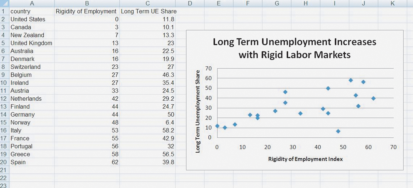
Graphs are also very useful for suggesting possible relationships between two variables. In the macroeconomics section, for example, we present evidence that labor employment laws in much of Western Europe that make it difficult to fire workers also raise the costs of hiring workers. As a result, the percentage of unemployment that is long term in Europe tends to be very high. To show this relationship, we graphed an index called the “rigidity of employment index,” produced by the World Bank. The rigidity of employment index summarizes hiring and firing costs as well as how easy it is for firms to adjust hours of work (e.g., whether there are restrictions on night or weekend hours). A higher index number means that it is more expensive to hire and fire workers and more difficult to adjust hours. We then graphed a country’s rigidity of employment index against the share of a country’s unemployment rate that is long term (lasting more than a year).
The data for this graph are shown in Figure A.8.
A-8
We can do something else of interest with this data. If you right-click on any of the data points in the figure, you will get the option to “Add Trendline.” Clicking on this and then clicking the two boxes “Linear” and “Display Equation on Chart” produces Figure A.9 (absent the red arrow, which we added for clarity).
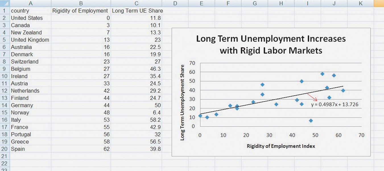
The black line is the linear curve that “best fits” the data. (Best fit in this context is defined statistically; we won’t go into the details here but if you take a statistics class you will learn about ordinary least squares.) Excel also produces for us the equation for the best-fit line, Y = 0.4987 × X + 13.726. Do you remember from high school the formula for a straight line, Y = m × X + b? In this case m, the slope of the line or the rise/run is 0.4987 and b, the intercept, is 13.726. The slope tells us that a 1 unit increase in the rigidity of employment index (a run of 1) increases the share of unemployment that is long term by, on average, 0.4987 percentage points (a rise of 0.4987). Using the equation, you can substitute any value for the index to find a predicted value for the share of long-term unemployment. If the rigidity of employment index is 15, for example, then our prediction for the long-term unemployment share is 21.2065 = 0.4987 × 15 + 13.726 If the index is 55, our prediction for the long-term unemployment share is 41.1545 = 0.4987 × 55 + 13.726.