Graphing Three Variables
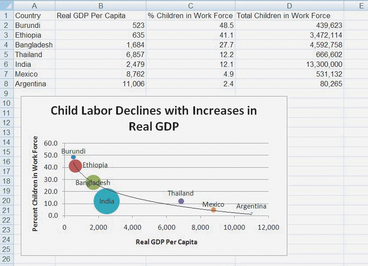
In our international trade chapter, we present evidence that child labor decreases with increases in GDP per capita. Figure A.10 shows a subset of that data. We put our X variable, real GDP per capita, in column B and our Y variable, the percentage of children ages 10—14 in the labor force, in column C. In column D, we have the total number of children in the labor force. In Burundi, a larger fraction (48.5 percent) of the children are in the labor force than in India (12.1 percent), but since Burundi is a small country, the total number of children in the labor force is larger in India. To understand the problem of child labor, it’s important to understand both types of information so we put both types of information on a graph.
FIGURE A.10

Excel’s bubble chart will take data arrayed in three columns and use the third column to set the area of the bubble or data point. In Figure A.10, for example, India has the largest number of children in the labor force and so has the bubble with the largest area. The area of the other bubbles is in relative proportion so Mexico’s bubble is 1/25th the size of India’s bubble because there are 1/25th as many children in the labor force in Mexico as in India. (Unfortunately, Excel doesn’t label the bubbles automatically so we added these by hand.)