Appendix A Questions
Question 22.1
1. We start with a simple idea from algebra: Which of the graphs below have a positive slope and which have a negative slope?
Question 22.2
2. When social scientists talk about social and economic facts, they usually talk about a “positive relationship” or a “negative relationship” instead of “positive slope” or “negative slope.” Based on your knowledge, which of the following pairs of variables tend to have a “positive relationship” (a positive slope when graphed), and which have a negative relationship? (Note: “Negative relationship” and “inverse relationship” mean the same thing. Also, in this question, we’re only talking about correlation, not causation.)
A professional baseball player’s batting average and his annual salary.
A professional golfer’s average score and her average salary.
Page A-12The number of cigarettes a person smokes and her life expectancy.
The size of the car you drive and your probability of surviving a serious accident.
A country’s distance from the equator and how rich its citizens tend to be. (For the answer, see Robert Hall and Charles Jones. 1999. Why Do Some Countries Produce so Much More Output per Worker than Others? Quarterly Journal of Economics. 114: 83-116.)
Question 22.3
3. Let’s convert Klick and Tabarrok’s research on crime into a simple algebra equation. We reported the result as the effect of a 10 percent increase in police on the crime rate in Washington, D.C. In the equation below, fill in the effect of a 1 percent increase in the police on the crime rate:
The percent change in crime = _________ * The percent change in police officers
Question 22.4
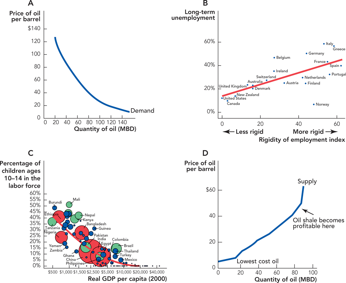
4. Let’s read the child labor graph [A.10] horizontally and then vertically:
According to the trendline, in a typical country with 10 percent of the children in the labor force, what’s the real GDP per person?
According to the trendline, when a country’s GDP per person is $2,000, roughly what percentage of children are in the labor force?
Question 22.5
5. Let’s take another look at the ratio scale, and compare it to a normal scale.
In Figure A.7, which one is presented in ratio scale and which in normal scale?
In the top graph, every time the S&P 500 crosses a horizontal line, how many points did the S&P rise?
In the bottom graph, every time the S&P 500 crosses a horizontal line, how many times higher is the S&P?
Question 22.6
6. As a scientist, you have to plot the following data: The number of bacteria you have in a large petri dish, measured every hour over the course of a week. (Note: E. coli bacteria populations can double every 20 minutes) Should this data be plotted on a ratio scale and why?
Question 22.7
7. Educated people are supposed to point out (correctly) that “correlation isn’t proof of causation.” This is an important fact—which explains why economists, medical doctors, and other researchers spend a lot of time trying to look for proof of causation. But sometimes, correlation is good enough. In the following examples, take the correlation as a true fact, and explain why the correlation is, all by itself, useful for the task presented in each question.
Your task is to decide what brand of car to buy. You know that Brand H usually gets higher quality ratings than Brand C. You don’t know what causes Brand H to get higher
ratings—maybe Brand H hires better workers, maybe Brand H buys better raw materials. All you have is the correlation. Your task is to hire the job applicant who appears to be the smartest. Applicant M has a degree from MIT, and applicant S has a degree from a typical state university. You don’t know what causes MIT graduates to be smarter than typical state university
graduates—maybe they start off smarter before they get to MIT, maybe their professors teach them a lot, maybe having smart classmates for four years gives them constant brain exercise. Your task is to decide which city to move to, and you want to move to the city that is probably the safest. For some strange reason, the only fact you have to help you with your decision is the number of police per person.
Question 22.8
8. If you haven’t practiced in a while, let’s calculate some slopes. In each case, we give two points, and you can use the “rise over run” formula to get the right answer.
Point 1: x = 0, y = 0. Point 2: x = 3, y = 6
Point 1: x = 6, y = –9. Point 2: x = 3, y = 6
Point 1: x = 4, y = 8. Point 2: x = 1, y = 12
Question 22.9
9. We mentioned that a demand curve is a hypothetical relationship: It answers a “what if” question: “What if today’s price of oil rose (or fell), but the average consumer’s income, beliefs about future oil prices, and the prices of everything else in the economy stayed the same?” When some of those other features change, then the demand curve isn’t fixed any more: It shifts up (and right) or left (and down). In Figure A.3, we showed one shift graphically: Let’s make some changes in algebra:
The economy of Perovia has the following demand for oil:
Price = B – M × Quantity
When will B tend to be a larger number:
When population in Perovia is high or when it is low?
When the price of autos in Perovia is high or when it is low?
When Perovian income is high or when it is low?
Question 22.10
10. Using the raw data from this chapter, use Excel to replicate simple versions of any two of our graphs. Figure A.6, Figure A.7, Figure A.9, and Figure A.10 all provide the data you’ll need. If you’re adventurous, feel free to search out the newest GDP data and S&P 500 data on the Bureau of Economic Analysis (BEA) website and Yahoo! Finance, respectively.