CHAPTER 11 APPENDIXUsing Excel to Graph Cost Curves
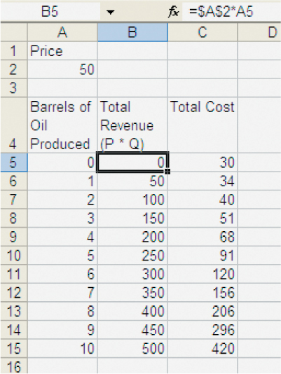
We can use a spreadsheet such as Excel to take some of the drudgery out of graphing and calculating things like marginal revenue and marginal cost. In Figure A11.1, we show some of the data from the chapter on revenues and costs for the oil well. Notice that in cell B5 we show the Excel formula “=$A$2*A5,” which takes the price from cell A2 and multiplies it by the quantity in cell A5 to produce total revenue. We then copy and paste this formula into the remainder of the column. We use the $ sign in $A$2 to tell Excel not to adjust the cell reference when we copy and paste (A5 doesn’t have dollar signs so it is automatically adjusted to A6, A7, etc. when we copy and paste).
FIGURE A11.1

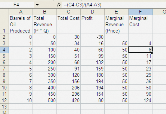
With total revenue and total cost input, it’s easy to create the other data that we need. Profit is just total revenue minus total cost, which in Figure A11.2 we show in column D. Marginal revenue and marginal cost are defined as  and
and  . We show in cell F4 how to implement these formulas in Excel. The formula “= (C4 – C3)/(A4 – A3)” takes the cost of producing 2 barrels of oil from cell C4 and subtracts the cost of producing 1 barrel of oil from C3; we then divide by the increase in the number of barrels as we move from producing 1 to 2 barrels. In this case, MC = (40 – 34)/(2 – 1) = 6. The formula for MR is entered into Excel in a similar manner.
FIGURE A11.2

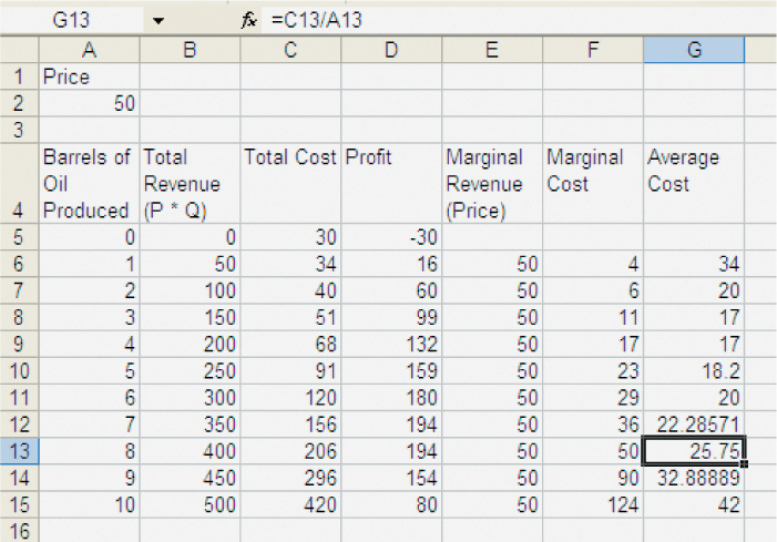
Average cost is  and we show this calculation in Figure A11.3.
FIGURE A11.3

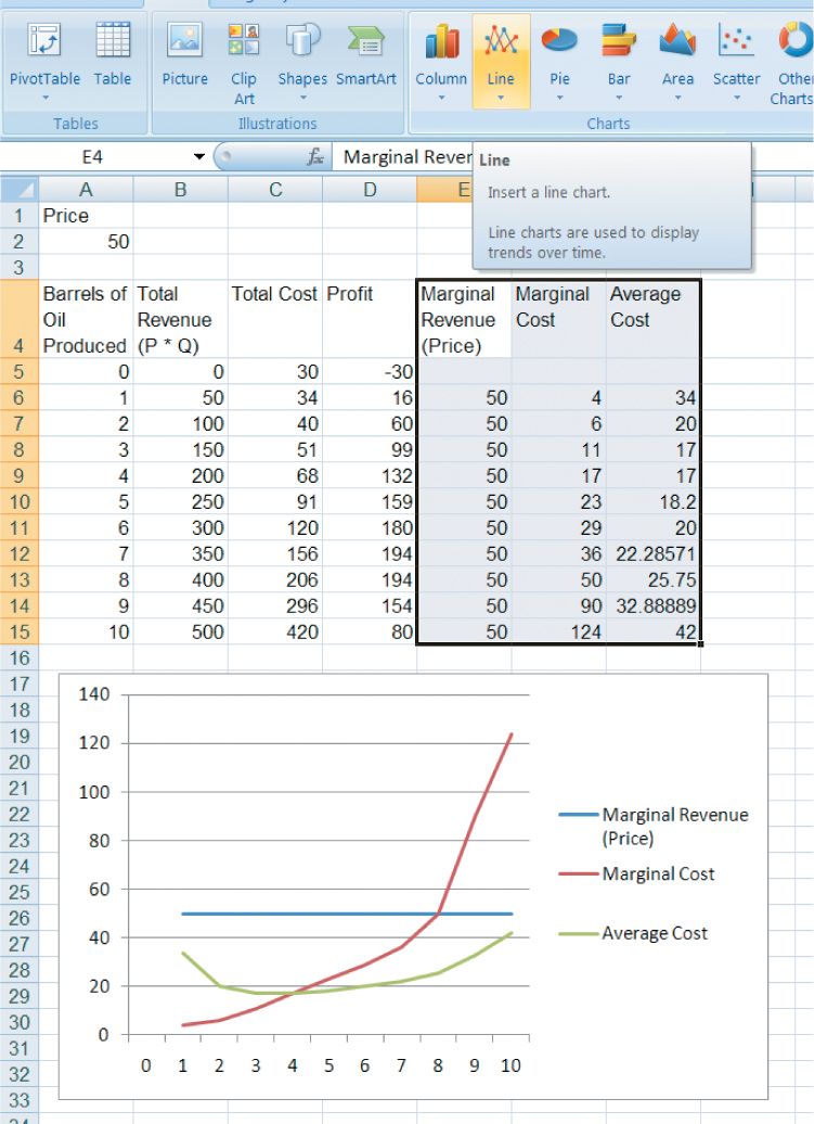
It’s now easy to graph MR, MC, and AC. By highlighting the Marginal Revenue, Marginal Cost, and Average Cost columns, including the labels, and clicking Insert and then Line Chart, we can produce a graph similar to that shown in Figure A11.4 (to get the exact graph, you must also tell Excel to use the barrel numbers in Column 1 on the x-axis—you can do this by clicking on the graph, clicking Select Data, and then Edit, Horizontal (Category) Axis Labels; this is for Excel 2007, Excel 2003 works similarly).
FIGURE A11.4

Remember that the profit-maximizing quantity is found where MR = MC. You can check this by looking at the table. You can see what happens to the profit-maximizing quantity when price changes simply by changing the price in cell A2; the graph will change automatically.