The Supply Curve for Oil
How much oil would oil producers supply to the world market if the price of oil were $5 per barrel? What quantity would be supplied if the price were $20? What quantity if the price were $55? A supply curve for oil answers these questions.
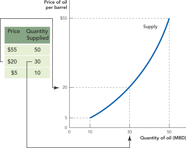
The supply curve for oil is a function showing the quantity of oil that suppliers would be willing and able to sell at different prices, or, more simply, the supply curve shows the quantity supplied at different prices. Figure 3.7 shows a hypothetical supply curve for oil. The price is on the vertical axis and the quantity of oil is on the horizontal axis. The table beside the graph shows how a supply curve can be constructed from a table of prices and quantities supplied.
FIGURE 3.7

The supply curve is a function that shows the quantity supplied at different prices.
The quantity supplied is the amount of a good that sellers are willing and able to sell at a particular price.
The supply curve tells us, for example, that at a price of $20 the quantity supplied is 30 million barrels of oil a day.
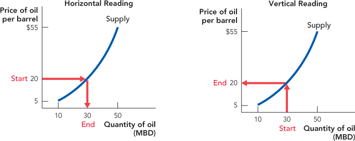
As with demand curves, supply curves can be read in two ways. Read “horizontally,” Figure 3.8 shows that at a price of $20 per barrel suppliers are willing to sell 30 million barrels of oil per day. Read “vertically,” the supply curve tells us that to produce 30 million barrels of oil a day, suppliers must be paid at least $20 per barrel. Thus, the supply curve tells us the maximum quantity that suppliers will supply at different prices or the minimum price at which suppliers will sell different quantities. The two ways of reading a supply curve are equivalent, but some applications are easier to understand with one reading and some with the other so you should be familiar with both.
FIGURE 3.8

Horizontal Reading: At a price of $20 per barrel, suppliers are willing to sell 30 million barrels of oil per day.
Vertical Reading: To produce 30 million barrels of oil a day, suppliers must be paid at least $20 per barrel.
Our hypothetical supply curve is not realistic because we just made up the numbers. But now that we know the technical meaning of a supply curve—a function that shows the quantity that suppliers would be willing and able to sell at different prices—we can easily explain its economic meaning.
Saudi Arabia, the world’s largest oil producer, produces about 10 million barrels of oil per day. Surprisingly, the United States is not far behind, producing nearly 9 million barrels per day. But there is one big difference between Saudi oil and U.S. oil: U.S. oil costs much more to produce. The United States has been producing major quantities of oil since 1901 when, after drilling to a depth of 1,020 feet, mud started to bubble out of an oil well dug in Spindletop, Texas. Minutes later the drill bit exploded into the air and a fountain of oil leapt 150 feet into the sky. It took nine days to cap the well, and in the process a million barrels of oil were spilt. No one had ever seen so much oil. Within months the price of oil dropped from $2 per barrel to just 3 cents per barrel.4
It’s safe to say that the United States will never see another gusher like Spindletop. Today the typical new well in the United States is drilled to a depth of more than 1 mile. Instead of gushing, most of the wells must be pumped or flooded with water to push the oil to the surface.5 All of this makes oil production in the United States much more expensive than it used to be and much more expensive than in Saudi Arabia, where oil is more plentiful than anywhere else in the world.
In Saudi Arabia, lifting a barrel of oil to the surface costs about $2. Costs in Iran and Iraq are only slightly higher. Nigerian and Russian oil can be extracted at a cost of around $5 and $7 per barrel, respectively. Alaskan oil costs around $10 to extract. Oil from Britain’s North Sea costs about $12 to extract. There is more oil in Canada’s tar sands than in all of Iran, but it costs about $22.50 per barrel to get the oil out of the sand.6 In the continental United States, one of the oldest and most developed oil regions in the world, lifting costs are about $27.50. At a price of $40 per barrel, it becomes profitable to “sweat” oil out of Oklahoma oil shale.
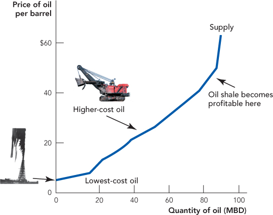
Putting all of this together, we can construct a simple supply curve for oil. At a price of $2 per barrel, the only oil that would be profitable to produce would be oil from the lowest-cost wells in places like Saudi Arabia. As the price of oil rises, oil from Iran and Iraq become profitable. When the price reaches $5, Nigerian and then Russian producers begin to just break even. As the price rises yet further toward $10, Alaskan oil starts to break even and then become profitable. North Sea, Canadian, and then Texan oil fields come online and increase production as the price rises further. At higher prices, it becomes profitable to extract oil using even more exotic technologies or deeper wells in more inhospitable parts of the world. Figure 3.9 illustrates.
FIGURE 3.9

(Bottom: Bettmann/Corbis)
What’s important to understand about Figure 3.9 is that as the price of oil rises, it becomes profitable to produce oil using methods and in regions of the world with higher costs of production. The higher the price of oil, the deeper the wells.
In summary, a supply curve is a function that shows the quantity that suppliers would be willing and able to sell at different prices. The higher the price, the greater the quantity supplied—this is often called the “law of supply.”
