3.1 Graphical Data Descriptions
When we describe a set of data like our movie data, we usually begin by focusing on individual variables. Sometimes our variables are categorical (such as genre); sometimes they are quantitative (such as running time). The type of graph that we use to describe a variable depends on what kind of variable we are describing.
3.1.1 Graphs of Categorical Variables: Bar Graphs
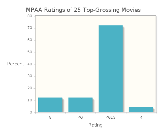
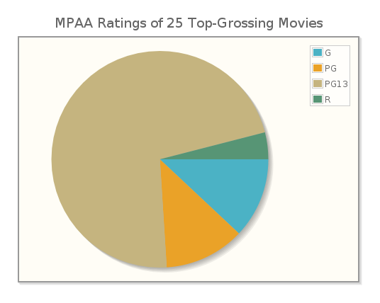
If the measurements we collect are categorical, we first organize them into a frequency distribution or a relative frequency distribution. A frequency distribution displays the possible values for the variable and the counts (frequencies) for each value, while a relative frequency distribution shows the fraction or percent of values falling into each category. If we compile the MPAA ratings of the 25 top-grossing movies as of May 2013, we can organize the data into a table showing both frequencies (counts) and relative frequencies (as decimal fractions).
| Rating | Count | Relative Frequency |
|---|---|---|
| G | 3 | 0.12 |
| PG | 3 | 0.12 |
| PG13 | 18 | 0.72 |
| R | 1 | 0.04 |
A bar graph is the simplest way to display categorical data, and can be used with frequency or relative frequency distributions for any categorical variable. A bar graph uses the heights of bars (where each bar has the same width) to indicate the count or relative frequency of measurements that fall into each category. In this case, the heights of the bars indicate the number of movies of each rating in the list of top-25 grossing movies in the United States.
See the relative frequency bar graph for the movie ratings.
Notice that the relative sizes of the bars remain the same, while the scale on the vertical axis changes.
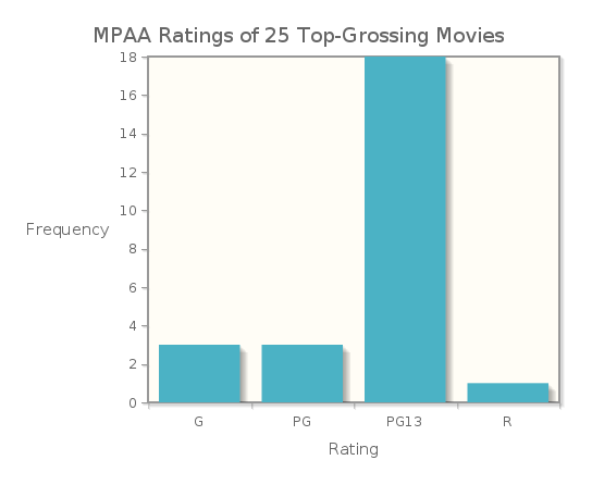
Because the rating data are simple, we probably get a “picture” of this distribution just from the frequency table. However, when there are more categories, a bar graph is a convenient way to visualize the distribution of measurements.
Consider the following 2012 data on the highest education level achieved by Americans aged 35-44:
| Highest Level of Education | Number (in thousands) |
|---|---|
| Less than high school | 2,813 |
| High school | 10,681 |
| Some college (no degree) | 6,686 |
| Associate's degree | 4,301 |
| Bachelor's degree | 8,886 |
| Advanced degree | 4,985 |
Source: United States Census Bureau
Figure 3.2 displays these data.
A bar graph in which the categories are displayed in order of decreasing frequencies is called a Pareto Chart.
See the Pareto Chart for Highest Level of Education for Americans, ages 35-44.
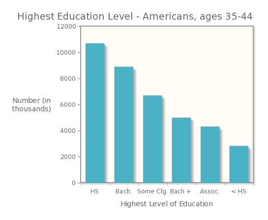
What are the essential features of a bar graph that are displayed here?
- The graph has a title that describes the variable being categorized.
- Categories are displayed on the horizontal axis.
- Categories may appear in any order. They are displayed so that there are spaces between the bars, and each bar has an equal width.
- The frequencies (in this case, the number of Americans) or relative frequencies for the categories are displayed on the vertical axis.
- The vertical axis is marked off uniformly—equal numerical differences correspond to equal spaces on the axis.
Now Try This 3.1
Americans spent $48.9 billion dollars on food, supplies and veterinary care for their pets in 2013. Determine the amount spent on veterinary care, and make a bar graph of this distribution.
| Expenditure | Billions of Dollars |
|---|---|
| Food | 21.5 |
| Supplies | 13.1 |
| Veterinary Care | ? |
Source: USA Today
Make a bar graph of this distribution. After you complete your graph, click here and compare it to the samples below:
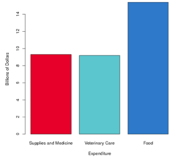
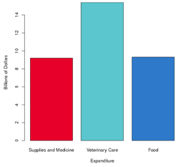
Which one of the graphs above does your graph most resemble?
| A. |
| B. |
| C. |
You are correct. The CrunchIt! bar graph for this distribution is Graph A, as shown below.
You did not select the correct graph. The CrunchIt! bar graph for this distribution is Graph A, as shown below.
Bar graphs are good vehicles for comparing the different values of a categorical variable, and are particularly useful when we want to compare these values over different time periods. In such a case, we can make side-by-side bar graphs, which show the count for each category in each time period.

invisible clear both
Photo Credit: © Krys Bailey / Alamy
invisible clear both
Throughout the world, animal species are threatened by climate change, deforestation, and hunting. Some species have suffered more from such forces than others; Table 3.5 shows the numbers of endangered species in 1996-1998 and 2006 for several types of animals.
| 1996-1998 | 2006 | |
|---|---|---|
| Mammals | 484 | 510 |
| Birds | 403 | 532 |
| Reptiles | 100 | 174 |
| Amphibians | 49 | 1180 |
| Fish | 291 | 491 |
Source: Newsweek
In order to compare the number of endangered animals of various types between the years 1996-1998 and 2006, we can construct a side-by-side bar graph, as shown in Figure 3.3. From the bar graph, it is easy to see that the numbers of endangered species in all these categories has increased, with a phenomenal increase in the number of endangered amphibians over this time period.
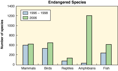
Side-by-side bar graphs allow us to compare two or more distributions. In this case, we have distributions from two different time periods. In other settings, the distributions may come from two different populations or samples; for example, distributions of the types of college degrees awarded to males and to females could be displayed with a side-by-side bar graph.
3.1.2 Graphs of Categorical Variables: Pie Charts
If the categorical data we have consist of all parts of a single whole, and each measurement falls into only one category, then we can also display the data in a pie chart. For the pet spending in Now Try This! 3.1, we can see that we do not have all parts of the whole. Americans’ pet spending in 2013 totaled $55.7 billion, but the spending on the three categories given totaled only $48.9 billion. Therefore, $6.8 billion were spent on other goods or services, including purchasing pets, boarding, and grooming. If we wish to make a pie chart of these data, we can add an “Other” category to our table, and calculate the percentage of total expenditures that each category represents.
| Expenditure | Billions of Dollars | Percent of Total |
|---|---|---|
| Food | 21.5 | 38.6 |
| Supplies | 13.1 | 23.5 |
| Veterinary Care | 14.3 | 25.7 |
| Other | 6.8 | 12.2 |
Figure 3.4 shows the pie chart for this distribution. It was created using the billions of dollars data. We have included the percents in the table so that you can see how they correspond to the sizes of the slices of the pie.
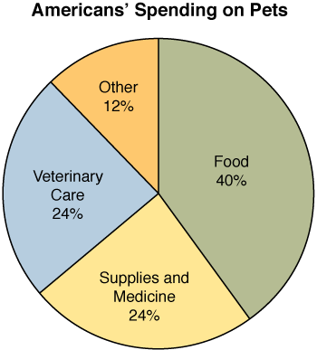
How does this pie chart compare to the correct bar graph in Now Try This! 3.1? Does it provide additional information, or give us a better picture of the spending? Because we calculated the percent for “Other” expenditures, we have, in a sense, the whole picture of expenditures. It is easy to see that this “Other” category represents about half the spending of either veterinary care or supplies and medicine, while food is by far the largest expense. We can clearly see how each part relates to the whole.
If a pie chart is better in this case, why don’t we use one all the time? There are a number of reasons. The pie chart is appropriate only when we have frequencies or relative frequencies for all values of a single categorical variable. It is also not appropriate when we are given data that represents averages calculated from a group of individuals. In addition, when we are dealing with similar-looking segments, it can be hard to judge their relative sizes. Finally, in practice, a pie chart is much harder to construct by hand than a bar graph.
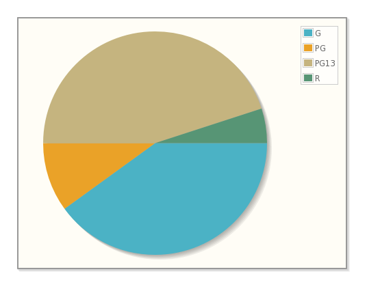
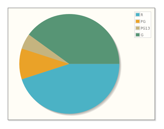
Now Try This 3.2
The accompanying table shows the MPAA Ratings of the 25 Top-Grossing Movies (as of May 2013).
| Rating | Frequency |
|---|---|
| G | 3 |
| PG | 3 |
| PG13 | 18 |
| R | 1 |
Is it appropriate to make a pie chart using these data?
| A. |
| B. |
| C. |
3.1.3 Graphs of Quantitative Data: Histograms
If the data we collect are quantitative rather than categorical, a bit more analysis is required before we create a graph of the data. We have more choices to make when we graph quantitative data, and these choices depend on the characteristics of the data themselves. Are the data discrete or continuous? Is the range of the data large or small? Let’s begin by looking at a set of discrete data, with a small range.
invisible clear both
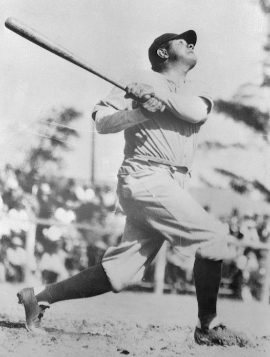
Photo Credit: © Bettmann/CORBIS
invisible clear both
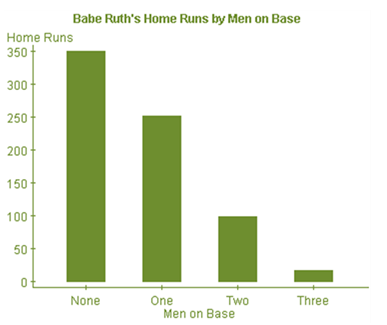
Babe Ruth hit 714 home runs in his career; each home run was hit with 0, 1, 2, or 3 runners on base, as indicated in the accompanying table.
| Men on Base | Home Runs |
|---|---|
| 0 | 349 |
| 1 | 251 |
| 2 | 98 |
| 3 | 16 |
Source: www.baberuthcentral.com
Using a bar to indicate the frequency of each number of men on base gives the accompanying histogram.
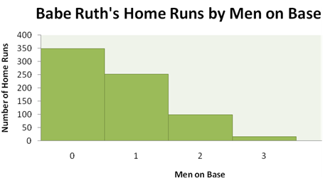
What are the essential features of a histogram that are displayed here?
- The graph has a title that describes the variable being analyzed.
- Values of the quantitative variable are displayed on the horizontal axis.
- The values appear on the horizontal axis in their natural numerical order, with each bar representing an interval of values of the variable. (Here each interval represents a single whole number.)
- Because each bar represents an interval of values, there are no spaces between the bars.
- Each measurement falls into only one interval.
- The counts for the intervals of values are displayed on the vertical axis.
- The vertical axis is marked off uniformly—equal numerical differences correspond to equal spaces on the axis.
Now let’s continue looking at some baseball data, but make things a little more complicated. The accompanying table gives the “winning percentage” for each American League baseball team at a certain point during a season. Even though this value is described as a “percentage,” it is really a decimal fraction of games won out of games played. These data are continuous, since this decimal fraction can be any value between 0 and 1, inclusive (though no team has either lost or won all of its games in a season).
| EAST | CENTRAL | WEST | |||
|---|---|---|---|---|---|
| Boston | .605 | Cleveland | .582 | Los Angeles | .593 |
| New York | .572 | Detroit | .544 | Seattle | .524 |
| Toronto | .497 | Minnesota | .493 | Oakland | .486 |
| Baltimore | .424 | Kansas City | .434 | Texas | .476 |
| Tampa Bay | .418 | Chicago | .425 | ||
Source: Atlanta Journal Constitution
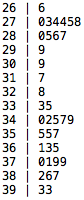
The numbers in this data set range from a low of 0.418 to a high of 0.605. In order to “picture” them in a graph, we must decide on intervals by which to group them. These intervals are typically called “bins.” The trick in creating a good histogram is to find the bin width that is (as Goldilocks would say) “just right.” If the bin width is too small, very few measurements lie in each bin, and the histogram has many short, thin bars. If the bin width is too large, many measurements lie in each bin, and the histogram has only a few tall fat bars.
So let’s try some different widths, and display the resulting histograms. If we start our first bin and 0.400 and make the bin width 0.010, we get the histogram in Figure 3.7.
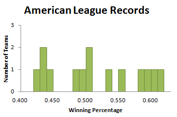
What we see here is the “too small” phenomenon. This is not a good picture of the distribution of team records, because many bins are empty (indicated by the spaces in the histogram), and most of the rest have only one measurement.
With the same starting point, 0.400, but a bin width of 0.075, we obtain Figure 3.8.
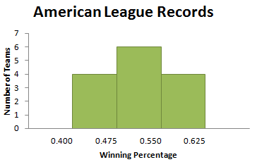
This is the “too big” phenomenon—not many bars, and a similar number of values in each bar. This is also not a good picture of the distribution of team records.
Finally, if we start our first bin at .400 and make the bin width 0.050, we get the histogram in Figure 3.9.
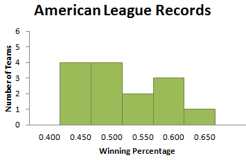
Perhaps not “just right,” but a pretty good picture of how the winning percentages are distributed. There are not a lot of empty bins (in fact, there are none here), nor are there just a few tall bins (the heights of the bars vary from 1 to 4). Would other bin widths work? Certainly. Is there a “magic” bin width that produces the “best” picture? Unfortunately not. Choosing a bin width requires practice. If you try several different bin widths, you will probably find a histogram that seems to give a good picture of your data. This is one of the situations in which statistics is more art than science.
It is important to note that we have to decide where we should display values that fall on a bin boundary, so that each measurement lies in only one bin. Because of our bin choices, none of the winning percentage data fell on a bin boundary. But it is common for this to happen. Each statistical software package handles this in a particular way, assigning a boundary value to either the bin to its left or the one to its right. While the choice may vary with your choice of software, each package handles boundary values in a consistent way. CrunchIt! counts a data value that falls on the boundary in the bin to its left; TI graphing calculators count such a value in the bin to its right.
Now Try This 3.5
The accompanying table gives the average monthly price per gallon of unleaded, regular gasoline in the United States each month from January 2010 through January 2013.

Make a histogram of this data, with the bins starting at $2.60 and a bin width of $0.20.
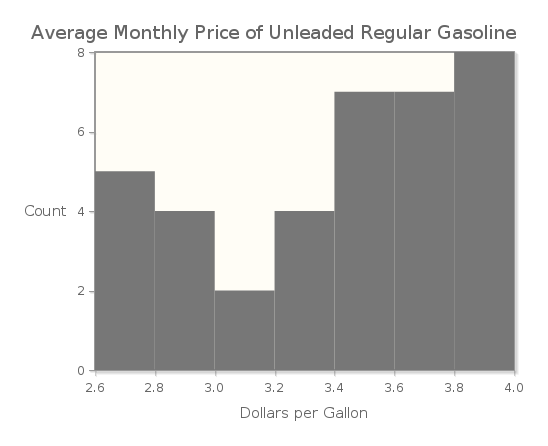
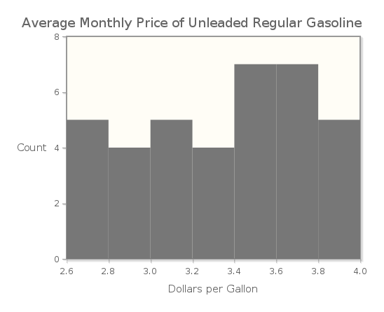
The fewest data values fall into which bin?
| A. |
| B. |
| C. |
| D. |
Correct. The histogram of these data is shown below, and there is only one data value in the bin that starts at $3.00.
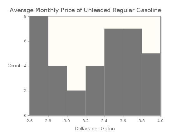
Incorrect. The histogram of these data is shown below, and there is only one data value in the bin that starts at $3.00.
3.1.4 Describing Histograms
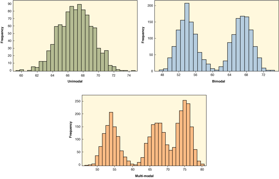
Describing a histogram can give information about the distribution of data values even when the graph itself is not present. When we look at a histogram, we are interested in its shape, its center, the variability of the data (or sometimes referred to as the spread of the data), and whether there are any observations that seem unusual or separated from the rest of the data.
In terms of shape, we assess how many peaks the graph has, and how the graph falls away from these peaks. The peaks are the tall bars in the histogram, and we call the histogram unimodal if there is one tall peak. The graph is bimodal if there are two non-adjacent tall peaks (of roughly equal height), and multi-modal if there are more than two such tall peaks. (These terms derive from the word mode, the measurement that occurs most frequently in the data set.)
If the graph can be divided in half so that the two halves are close to being mirror images, then we call the graph symmetric. When the right tail is longer than the left tail, then we say that the graph is right-skewed. Similarly, if the left tail is longer than the right tail, then we say that the graph is left-skewed.

Photo Credit: NHPA / SuperStock
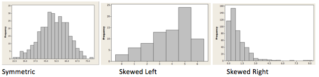
It is important to notice that, for statisticians, skewness describes not where the peak is, but rather the direction in which the graph “tails off.” This is different from (in fact, the opposite of) the way many people use the term “skewed” in every-day conversation.
In terms of center, we look for a value such that about half of the data falls below the value and half is above it. We use the heights of the bars to determine what this value is.
To describe variability, we consider the minimum and maximum values as shown in the graph. We identify unusual data values as potential outliers if they seem outside the overall pattern of the graph. In order to be considered outliers, values should appear quite different from the rest of the data, not just separated by an interval or two from the others.
Consider the histogram of gasoline prices (shown here in Figure 3.12) that we created in CrunchIt! for Now Try This 3.5. We see that this distribution is bimodal, because it has two peaks, one occurring at the interval from $2.60 to less than $2.80, and a second in the interval from $3.60 to less than $3.80. The distribution shows no clear skewness.
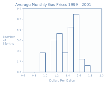
To find the center, we look for the interval that contains the twenty-fourth and twenty-fifth measurements (in size order), because these are the middle measurements in this set of 48 observations (four years of monthly averages). We consider the heights of the bars, beginning on the left. While the horizontal scale is marked off in 20 cent widths, the number of months themselves are whole numbers. The first bar is 7 units tall, the second one is 5 units tall, and the third one is 1 unit tall, and the fourth is 9 units tall. So the first four bars represent the smallest 22 measurements. Since the bar representing the interval $3.40 to $3.60 contains 10 observations, the twenty-fourth and twenty-fifth measurements lie in this interval. So we might say that the center of the distribution is about $3.50, the middle of that interval. In terms of variability, the data values range from about 2.6 ($2.60) to less than 4.0 ($4.00). Because we only have the histogram here, and not the actual data, we cannot say precisely what the smallest and largest data values are.
We should note that the choice of bin width can alter the shape of a histogram somewhat, so these verbal descriptions are not precise characterizations of the distribution’s shape, center, and variability. Further, two people looking at the same histogram may have different descriptions of the histogram, particularly in regard to its shape. More often than not, statistics requires an interpretation of results that may legitimately vary from person to person.
Consider the histogram in Figure 3.13, which displays the distribution of petal length (in centimeters) for a sample of Setosa iris.
The data used to create this histogram is part of a famous data set, published in 1935 by Edgar Anderson. The data set was used by the pioneering statistician R. A. Fisher to develop a model for distinguishing between several Iris species.
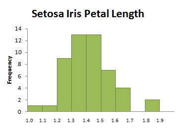
This distribution is not bimodal but in fact it has one broad peak, over the interval from 1.3 to 1.5. Is this distribution symmetric (two very similar “halves”) or slightly right-skewed (falling away from the peak farther to the right than to the left)? It depends entirely on your perspective. Such differences in interpretation happen frequently in statistics, a reality that is not necessarily comforting to a mathematics student trained to find a unique set of solutions to an algebraic equation. Ambiguity is a part of life, and a part of statistics as well. As you continue your study of statistics, keep an open mind about possible interpretations of your data, understanding that another individual may have chosen a different “best” interpretation. In this chapter we will also discuss numerical methods for describing data. These numerical measures can enhance our understanding of a distribution’s properties, even when they do not eliminate ambiguity.
3.1.5 Graphs of Quantitative Data: Stem and Leaf Plots
A stem and leaf plot is another graphical measure for displaying quantitative data. In a stem and leaf plot (often called a stem plot), each numerical value is broken into its “stem” and its “leaf.” The stem consists of all digits except the final digit; the leaf is the final digit. Here again are the monthly gas prices ($/gal) from January 2010 through December 2013.
| Jan | Feb | Mar | Apr | May | June | July | Aug | Sept | Oct | Nov | Dec | |
|---|---|---|---|---|---|---|---|---|---|---|---|---|
| 2010 | 2.71 | 2.64 | 2.77 | 2.84 | 2.83 | 2.73 | 2.72 | 2.73 | 2.70 | 2.80 | 2.85 | 2.99 |
| 2011 | 3.09 | 3.21 | 3.56 | 3.80 | 3.90 | 3.68 | 3.65 | 3.63 | 3.61 | 3.44 | 3.38 | 3.26 |
| 2012 | 3.38 | 3.57 | 3.85 | 3.90 | 3.73 | 3.53 | 3.43 | 3.72 | 3.84 | 3.74 | 3.45 | 3.31 |
| 2013 | 3.31 | 3.67 | 3.71 | 3.57 | 3.61 | 3.62 | 3.59 | 3.57 | 3.53 | 3.34 | 3.24 | 3.27 |
Because this is a reasonably large data set, we will let CrunchIt create the stem and leaf plot for us. So for the first measurement, 2.71 (dollars), the stem will be “27” and the leaf would be "1". Of course, the “27” is not the whole number 27, but rather 2.7. Similarly, for the measurement 3.09, the stem would be “30,” and the leaf would be “9.”
We create a graph by putting all the stems to the left of a vertical line, and then placing each leaf in its appropriate row, producing the plot in Figure 3.14.
Notice that when we create a stem and leaf plot, we indicate all stems in order from the smallest to the largest, regardless of whether there are any leaves corresponding to that stem. In the above plot, there are no leaves for the stem 31, indicating that there were no average monthly regular gasoline prices between $3.10 and $3.19 inclusive.
When graphing a large data set, it is sometimes useful to “split” the stems to avoid having leaves with long strings of stems. Each stem then appears twice in the plot, once in a row displaying leaves from 0 to 4, and a second time in a row displaying leaves from 5 to 9. This technique corresponds to using more bins (and hence a smaller bin width) when making a histogram.
Please review the whiteboard Stem Plots.
You can see that a stem and leaf plot looks very much like a histogram turned on its side. Thus, we can describe the shape, center, amount of variability in the distribution, and possible outliers for a stem and leaf plot in the same fashion as we did for a histogram. All that is required is that we rotate the plot so that the stems are in numerical order from left to right, with the leaves stacked vertically above their stems.
Figure 3.15 shows a rotated stem and leaf plot for the gas price data, along with a histogram of the same data. Based on the stem plot, we can see that the distribution of gas prices is bimodal, that the center of the distribution is around $3.44 or $3.45, and that the measurements range from $2.64 to $3.90.
Does a stem and leaf plot provide information that a histogram does not? In a histogram, once you create the graph, the data values are “gone”—they do not appear in the graph. On the other hand, in a stem and leaf plot, the data values used to construct the graph can be seen in the graph. Despite this useful feature, you will find that histograms are used more often than stem and leaf plots, particularly when data sets are quite large.
The video Snapshots: Visualizing Quantitative Data shows statisticians using stem and leaf plots and histograms to get a picture of research data.
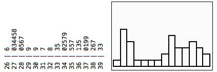
Now Try This 3.8
The heights in inches of 25 randomly selected adult females in the United States are shown in the table below.
| 63.1 | 61.1 | 62.6 | 64.1 | 63.8 | 63.7 | 62.9 | 65.5 | 68.2 | 64.1 |
| 62.9 | 60.8 | 66.9 | 69.6 | 62.9 | 61.8 | 62.9 | 66.0 | 64.9 | 63.7 |
| 61.4 | 63.4 | 66.8 | 65.4 | 70.2 |
(a) Make a stem and leaf plot of these data.
(b) Describe the shape, center, and variability of this distribution.
(a) The stem and leaf plot is shown below:
(b) This distribution is skewed to the right. The center of the distribution is the 13th measurement, which is 63.7 inches. The data ranges from 60.8 to 70.2 inches so there is a fair amount of variability in female heights.
3.1.6 Graphs of Quantitative Data: Time Plots
invisible clear both
Photo Credit: ssuaphotos/Shutterstock
invisible clear both
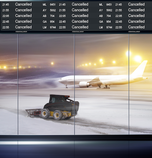
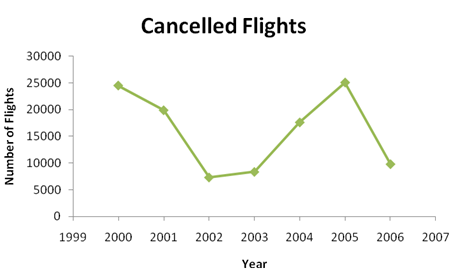
The final graph that we consider at this time is a time plot. A time plot shows how a quantitative variable changes over time. Typically, individual data points are plotted and then connected with either line segments or a smooth curve. Such plots are useful for displaying trends over a period of time, particularly when investigating increases or decreases in a studied variable. The Bureau of Transportation Statistics reports the following numbers of cancelled flights over the calendar years 2005 to 2013:
| Year | 1937 | 1953 | 1966 | 1971 | 1978 | 1988 | 2001 | 2013 |
|---|---|---|---|---|---|---|---|---|
| Percent Favoring Death Penalty | 60 | 68 | 42 | 49 | 62 | 79 | 68 | 60 |
Source: Bureau of Transportation Statistics
Figure 3.16 shows a time plot for these data.
Now Try This 3.9
Since the 1930s, the Gallup Organization has surveyed Americans on their opinion about the death penalty. Table 3.11 shows the percent of American adults who favor the death penalty for a person convicted of murder, as reported by Gallup.
| Year | Percent |
|---|---|
| 2000 | 78 |
| 2001 | 69 |
| 2002 | 72 |
| 2003 | 71 |
| 2004 | 68 |
| 2005 | 69 |
| 2006 | 70 |
| 2007 | 66 |
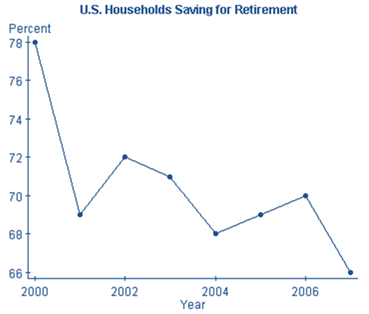
Use the graph to comment about the trend in retirement savings over this time period.
In general, the graph reflects a downward trend in the percentage of U.S. households saving for retirement. While the percentage fell from 28% in 2000 to 66% in 2007, there were increases in the percentage from 2001 to 2002, and again from 2004 to 2006.
3.1.7 Cautions about Making and Interpreting Graphs
Choosing the correct graph to display data is not always clear cut. Sometimes quantitative data are grouped in classes of unequal width; those data cannot be represented by a histogram. The data is then considered categorical, and a bar graph or pie chart must be used.
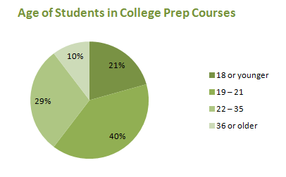
According to the Florida Department of Education, 105,977 students were enrolled in a developmental education or college preparatory course during 2006 – 2007. Table 3.11 gives the distribution of those students by age.
| Age | Number of Students |
|---|---|
| 18 or younger | 21,877 |
| 19 - 21 | 42,115 |
| 22 - 35 | 31,003 |
| 36 or older | 10,982 |
Source: Florida Department of Education
Age is certainly a quantitative variable, but because the ages are grouped in unequal classes, we cannot use a histogram to display them. Because the data set is so large, a pie chart (Figure 3.17) is preferable to a bar graph.
When we looked at the data on Babe Ruth’s home runs by men on base, we treated the variable as quantitative, with whole number values 0, 1, 2, and 3. We constructed a histogram (Figure 3.6) to display the data. If we had considered the number of men on base as categories, we would have created the bar graph in Figure 3.18 rather than a histogram.
And because the categories “None, One, Two, Three” represent all the possibilities, we can also convert these data to percentages and display them in a pie chart (Figure 3.19).
| Men on Base | Home Runs | Percentage |
|---|---|---|
| None | 349 | 49 |
| One | 251 | 35 |
| Two | 98 | 14 |
| Three | 16 | 2 |
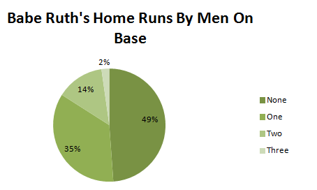
Do we get a different impression of Babe Ruth’s home runs when we use a histogram, a bar graph, or a pie chart? Probably not, so in this case any one of the graphs is acceptable.
When creating or interpreting a graph, it is important to pay attention to the graph’s axes. With a graph of an algebraic function, the axes are generally shown as the standard x- and y-axes (the lines y = 0 and x = 0). Real data can have values that are large enough that it is unreasonable to show all values beginning with 0. In such situations the axes should be clearly labeled (as in the CrunchIt! time plot in the answer above) to indicate actual data values near where the axes meet.
It is often particularly misleading when the vertical axis does not start at 0, because small changes in values can appear large when the scale is truncated. In the lefthand time plot in Fig. 3.20, the lowest percentage value is 66, while the highest is 78. The difference in these values seems exaggerated because the values from 0 to 66 do not appear on the axis. The time plot on the right uses a scale with vertical axis starting at 0. Though the percentages have varied over time, the increases and decreases do not seem as great as they appeared in the first plot.
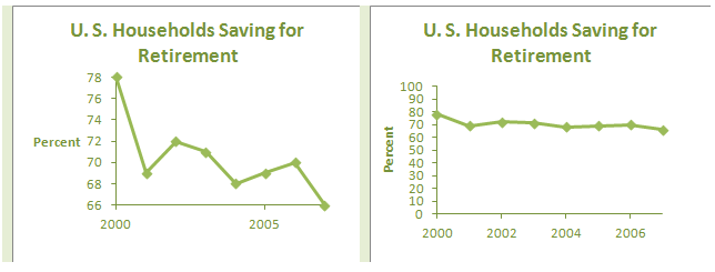
Do these two graphs give different impressions about how the percentage of households saving for retirement has changed? When you are creating a graph, try not to mislead your audience. When you are the viewer of a graph, think about how the data could have been presented differently.
A graph of a set of data can provide a good visual summary of important features of the data. In choosing an appropriate graph, you must first consider whether your data is categorical or quantitative.
Bar graphs and pie charts are used with data that is categorized. This includes not only data involving categorical variables (such as color or gender), but also quantitative data that has been sorted into unequal intervals.
Histograms, stem and leaf plots, and time plots are used with quantitative data. Histograms are commonly used to display frequencies or relative frequencies, and are used to approximate the shape, center and variability of the distribution. Like histograms, stem and leaf plots show the characteristics of the distribution, but they also retain the individual data values. They are best used with smaller data sets. Time plots display the changes in one or more quantitative variables over time.
In all use of graphical displays, the best advice is to keep the graph as simple as possible. While the media often display fancy graphs with 3-dimensional effects, statisticians prefer plain (if somewhat boring) 2-dimensional displays. Adding volume to bars or pie segments distorts the proportions of the graph and can mislead the viewer. In all statistical presentations, giving an accurate picture of the data is the ultimate goal.