3.2 Numerical Data Descriptions: Mean and Standard Deviation
When the data we are interested in are quantitative, we commonly summarize the data not only graphically but also numerically. As with our graphical descriptions, we would like our numerical descriptions to address the important characteristics of the data set—its shape, center and amount of variability. Consider once again the data table that gave information about some of the 25 top-grossing movies in the United States in May 2013.
| Title | Year | USA Box Office (millions of dollars) | Genre | Running Time | Academy Awards | MPAA Rating |
|---|---|---|---|---|---|---|
| E.T.: The Extra-Terrestrial | 1982 | 435 | Family | 115 | 4 | PG |
| Star Wars: Episode I - The Phantom Menace | 1999 | 431 | Sci-Fi | 133 | 0 | PG |
| Pirates of the Caribbean: Dead Man's Chest | 2006 | 423 | Adventure | 130 | 1 | PG13 |
| Toy Story 3 | 2010 | 415 | Animation | 103 | 2 | G |
| The Hunger Games | 2012 | 408 | Adventure | 121 | 0 | PG13 |
| Transformers: Revenge of the Fallen | 2009 | 402 | Action | 142 | 0 | PG13 |
| Star Wars: Episode III - Revenge of the Sith | 2005 | 380 | Sci-Fi | 140 | 0 | PG13 |
| The Lord of the Rings: The Return of the King | 2003 | 377 | Fantasy | 201 | 11 | PG13 |
Source: Internet Movie Database
In reviewing this table we see, in particular, that the third column and the fifth column each contain values of a quantitative variable. In order to get a “picture” of these data, we might want to determine how much, on average, a top-grossing film earned in the United States, or whether the running time for The Lord of the Rings: The Return of the King was unusually long. These are questions that can be answered using numerical descriptive measures.
3.2.1 Locating the Center: Mean
We will begin our discussion by considering a numerical description with which you are probably familiar, the mean. The mean of a set of quantitative data is simply its arithmetic average, the very same average you learned to calculate in elementary school. The mean is found by summing all data values, then dividing the result by the number of values. We indicate this symbolically using formulas:
Sometimes the formulas for the mean are written using summation notation.
See the formulas in summation form.
The summation formula for the population mean is .
The summation formula for the sample mean is .
(for a population) or
(for a sample),
where the subscripted x's indicated individual measurements.
You are probably thinking that these two formulas are remarkably similar; indeed, they are nearly identical. That is because what we do is exactly the same; what we say depends on whether we are working with a population or a sample.
In working with a population, we denote the mean by , the Greek letter mu. The upper case N is the population size (the number of values we are adding), and the x’s are the individual data values, labeled from 1 to N. If we are calculating the mean of a sample, we indicate the result by , which we call (not very creatively) x-bar, with the lower case n the sample size, and the x’s labeled from 1 to n.
While this might seem unnecessarily “picky” at first glance, the notation indicates two important distinctions that we must keep in mind:
- We denote the mean of a population of size N and the mean of a sample of size n differently, because the information they provide is different in nature. A population has only one mean, and if we calculate it correctly, we have the mean. When we calculate a sample mean, we are generally interested in using it to estimate the population mean. So while each sample has only one mean, if we select a different sample, we are likely to get a different sample mean. Recall that when we calculate a numerical descriptive measure for a population, we are finding a parameter; if we calculate a numerical descriptive measure for a sample, we are finding a statistic. It is easy to remember which is which—calculating from a population, you have a parameter; calculating from a sample, you have a statistic. Further, we use Greek letters for parameters and English ones for statistics. So is a parameter, while is a statistic.
- We denote an individual data value as x and the mean of a sample as . It is probably easier to see why the notation must be different here. Anyone who owns a vehicle has certainly felt the “pinch at the pump” and has witnessed the volatile gas prices, especially in the last few years. Certainly you have experienced a difference between the price of gasoline on a certain day (an x), and the average price of gasoline for a sample of days over several years (an ).
3.2.2 Calculating the Mean
Now that we have talked a lot about means, let’s actually calculate one. Here are data giving total precipiation In San Francisco, California for a sample of ten months:
| Monthly precipitation (inches) in San Francisco, California | ||||||||||
|---|---|---|---|---|---|---|---|---|---|---|
| Month | Feb. 2001 | Sept. 2002 | Aug. 2003 | Oct. 2004 | March 2006 | Feb. 2007 | Feb. 2009 | Jan. 2010 | July 2012 | April 2013 |
| Inches | 7.73 | 0.01 | 0.06 | 2.63 | 8.74 | 4.79 | 7.92 | 6.66 | 0.01 | 1.01 |
Calculating the sample mean, we find that
inches. So while the precipitation amounts varied a great deal over the months and years, the average of these amounts was just under 4 inches. We might further observe that 5 of the data values were less than the mean and 5 were greater than the mean.
Now Try This 3.10
On 8 randomly selected days in April 2013, the maximum temperatures in Fairbanks, Alaska were 34, 45, 40, 16, 25, 32, 11, 29 (degrees Fahrenheit).
The mean temperature for these 8 days was degrees Fahrenheit.
This calculation was fairly simple, even by hand, given the whole number values and the small sample size. What happens when numbers are not so nice or we have a large data set? In that case, we use statistical software to do our calculation.
Now Try This 3.11
Let’s consider our earlier question of how much, on average, a top-grossing film earned. The CrunchIt table below gives the US earnings, in millions of dollars, for the 25 top-grossing films as of May 2013:

Use CrunchIt, or some other statistical software, to calculate the mean USA earnings for these films. (Note that since this is all the 25 top-grossing films, not a sample of them, you are calculating µ, the mean of this population of 25 values.)
The mean earnings for these 25 films is million dollars.
Avatar, Titanic and The Avengers had earnings much larger than the other movies. Remove the earnings for these three movies and recalculate the mean.
When the earnings for Titanic, Avatar and The Avengers are removed from the set, the mean decreases by million dollars.
It is interesting to compare the means for various subsets of the data. For example, did the movies made in the 20th century earn less, on average, than those made in the 21st century? Or did the action movies have higher mean earnings than animated movies? You can find the answers these questions, or to other questions that interest you, by using the filter tool available in many statistical software packages, including CrunchIt!
3.2.3 Measuring Variability: Standard Deviation
Using the mean to locate the center of a distribution gives us one important piece of information, but it doesn’t tell us everything we might want to know. If your instructor reports that the class average on a statistics test is 75%, you wonder whether most students scored in the 70s, or whether anyone made 100% on the test. Knowing how much variability there is in the data set provides more information about the distribution of data. The range, the difference between the largest value and the smallest value, is the easiest way to describe the variability. For the gasoline data in the Try This 3.5 exercise the range of the sample of is $3.93 – $2.66=$1.27 per gallon.
The range tells us how far the maximum value is from the minimum value, but not how the values are distributed within the range. Are the values distributed uniformly over this interval? Are most of the values clustered near the mean? To answer questions like these, we use the standard deviation, a number that describes roughly, on average, how far the data values are from its center (as measured by the mean).
See the sample standard deviation formula in summation form, along with the summation form for the population standard deviation.
Note that for our purposes, we will be calculating the sample standard deviation s.
The standard deviation of a sample is given by .
The standard deviation of a population is given by .
Let’s start with the formula for the standard deviation of a sample, which we denote by s, and then “de-construct” it.
The numerator of the fraction consists of a sum of squares; each term being squared is the difference between an individual measurement (an x) and the sample mean (). We call each of these differences the measurement’s deviation from the mean. We then divide this sum by n – 1, one less than the sample size. Finally, we take the principal (positive) square root of the resulting number.
To illustrate the procedure, check out this whiteboard example: Standard Deviation
Now Try This 3.12
On 8 randomly selected days in January 2000, the amounts of snow on the ground in Fairbanks, Alaska were 16, 16, 17, 31, 32, 16, 16, and 16 (inches). Use the procedure in the example above to find the sample standard deviation for these amounts.
First, find the sample mean.
Next, find the sum of the squared deviations.
Now find the sample standard deviation, and report your result rounded to the nearest hundredth of an inch:
3.2.4 Standard Deviation Calculation FAQ's
This calculation might raise several questions in your mind.
Q: If we are concerned about deviations from the mean, why don’t we just add the deviations rather than their squares?
A: If you check the sum of the deviations, you will see that it is 0. This is always the case (which is not very informative), so we square the deviations, making the resulting values all nonnegative. Further, if the deviations are small in absolute value, the squares are also small in absolute value. If the deviations are large in absolute value, the squares are even larger.
Q: If we want to know what is happening “on average,” why don’t we divide by n rather than n – 1?
A: Since the sum of the deviations is always 0, once we know n-1 of the squared deviations we can always find the nth squared deviation. This means that we are not averaging n unrelated numbers but instead we average by dividing by the n-1 squared deviations that can vary freely.
Q: Once we have this “average,” why do we take its square root?
A: Before taking the square root, the quantity is measured in square units—the square of the units in which the data were originally measured. It is more helpful to our understanding to have the variability measured in the same units as the original measurements.
As with the mean, we generally use statistical software to calculate sample standard deviation.
Now Try This 3.13
Our sample of gasoline prices is shown below in CrunchIt. Use CrunchIt or some other statistical software to calculate the standard deviation for these prices.
Enter the standard deviation here, rounded to three decimal places:
3.2.5 Interpreting the Standard Deviation
Once we’ve calculated standard deviation, how should we interpret the number? Notice that the quantities involved in the standard deviation fraction are all non-negative. And the principal square root of a non-negative number is also non-negative. In fact, the standard deviation is only ever zero when all of the data values are identical. In that case, the mean is the same as each data value, so there is absolutely no deviation from the mean.
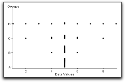
The more spread out that the data points are from the mean, the larger the standard deviation will be. Here is an example which illustrates this concept. The graph shown in Figure 3.21 is a side-by-side dotplot. A side-by-side dotplot displays each measurement by group. This graph is useful when the number of measurements in the data set is small. Our groups of data are A, B, C, and D, where each data set has ten values ranging from 0 to 9.
The mean for each of the four data sets is five. Although the mean is the same for each group, the variability of each data set is very different. It is easy to see, for instance, that the data values in group D are the most spread out from the mean, that group B has a very small amount of variability, and that there is no variability in the group A data set. Using statistical software to compute the standard deviations we see numerically that groups A, B, C, and D have increasing standard deviations, as shown in the table below.
| Standard deviations of data plotted in Figure 3.21 | ||||
|---|---|---|---|---|
| Group | A | B | C | D |
| Standard Deviation | 0.00 | 0.47 | 1.56 | 2.58 |
In order to see how a restaurant chain uses the mean and standard deviation to characterize net sales in various locations, view the video Snapshots: Summarizing Quantitative Data below.
3.2.6 Empirical (68-95-99.7) Rule
Knowing the mean and standard deviation can give us a good idea of how our set of data is distributed. In particular, when our data is roughly bell-shaped, the Empirical Rule tells us that:
- about 68% of all measurements lie with 1 standard deviation of the mean;
- about 95% of measurements lie within 2 standard deviations of the mean;
- about 99.7% (nearly all) of the measurements are within 3 standard deviations of the mean.
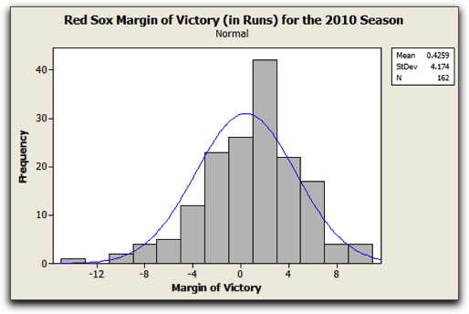
The histogram in Figure 3.22 shows the margin of victory (in runs) for the regular season games played by the Boston Red Sox during the 2010 season.
From the histogram it is clear that for the majority of the Red Sox’s games, they either won or lost games by no more than 4 runs. It was very rare for them to lose by more than 12 runs (in fact it only happened once), as was it for them to win by more than 8 runs. Since the data set is roughly bell-shaped, the Empirical Rule allows us to say even more.
The mean margin of victory for the Red Sox in 2010 was 0.429 runs, with a standard deviation of 4.174 runs. Thus, according to the Empirical Rule,
- 68% of the margins of victory should lie within 4.174 runs of 0.429, that is, between 0.4259 – 4.174 and 0.4259 + 4.174 runs, so between –3.7481 and 4.5999 runs. It turns out that indeed this was approximately true. In 112 of the 162 games that the Red Sox played during the 2010 regular season, their margin of victory was between -3.7481 and 4.5999 runs. Therefore 69% of the margin of victories fell within this range.
- 95% of the margins of victory should lie within 2 × 4.174 runs of 0.4259, that is, between 0.4259 – 8.348 and 0.4259 + 8.348 runs, so between –7.064 and 8.7739 runs. Again, what “should have happened”, essentially happened. Their margin of victory was between -7.064 and 8.7739 runs in 92.59% (150 of their 162 games).
- 99.7% of the margins of victory should lie within 3 × 4.174 runs of 0.4259, that is, between 0.4259 – 12.552 and 0.4259 + 12.552 runs, so between –12.1261 and 16.696 runs. In 99.3% (161 out of 162) of the games, the Red Sox had a margin of victory between -12.1261 and 16.696 runs.
What exactly do we mean by “bell-shaped”? The distribution should be roughly symmetric, with its peak near the center of its range, and the heights of the bars decreasing as you move to left and to the right of the peak. To see this more clearly, consider the histogram in Figure #. Although it is clearly not a perfect fit, the curve approximates the overall pattern of the distribution and resembles a bell, with its base sitting on the horizontal axis.
Now Try This 3.14
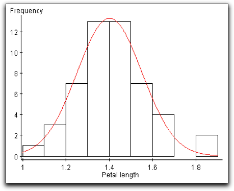
The graph at left is a histogram that we saw earlier in the chapter, displaying the distribution of petal lengths in centimeters for a sample of Setosa iris. We can see from the overlaid curve that this distribution is also bell-shaped.
The petal lengths graphed in this histogram are given in the CrunchIt table below:
Answer the following sequence of questions about this sample of data to make sure you've grasped all the concepts presented so far in this section.
First, find the mean of this sample of petal lengths, in centimeters, rounded to three decimal places:
It turns out that bell-shaped distributions occur frequently in nature and are often good distributions of real data. SAT scores, heights of adult women, and lengths of human pregnancies are all examples of distributions that are roughly bell-shaped.
3.2.7 z-Scores
For bell-shaped distributions, information about how many standard deviations separates a measurement from the mean gives a good idea of precisely where that measurement lies. For example, the Empirical Rule tells us that measurments that are more than 2 standard deviations from the mean lie either in the bottom 2.5% or the top 2.5% of the data. Because of this, it is helpful to calculate the distance between a measurement and the mean using standard deviation units. In order to do this, we use a statistical measure called a z-score. A z-score uses standard deviation as a "ruler" to measure how far a measurement is away from the mean. The formula for calculating a z-score is
Because the z-score formula includes subtracting the mean from a measurement (the “deviation from the mean” once again), if a measurement is larger than the mean, its z-score will be positive; if the measurement is smaller than the mean, its z-score will be negative. Thus, the z-score tells us both the number of standard deviations the measurement is from the mean, and the side of the mean on which it lies. Further, the more standard deviations a measurement is away from the mean, regardless of direction, the more unusual that measurement is with respect to the rest of the data. Thus, a z-score of –2.1 indicates a more unusual measurement than a z-score of 0.85.
3.2.8 Using z-Scores

invisible clear both
Photo Credit: AP Photo/Harry Harris, File
invisible clear both
Frequently people are interested in comparing measurements not merely within a single distribution but between two different distributions. Perhaps the classic example of such a comparison is the argument among baseball fans about who is the greatest homerun hitter of all time. When baseball stars played in different eras and under different conditions, how can we compare their performances? One way to consider the question is to decide which player was more outstanding in his own era
Suppose we want to determine if Babe Ruth or Hank Aaron was more outstanding, given the time that they played baseball. From 1914-1935 Babe Ruth played almost exclusively for the Red Sox and the Yankees, while Hank Aaron played for the Milwaukee (later Atlanta) Braves and the Milwaukee Brewers between 1954 and 1976.
We’ll compare the yearly homerun production of Babe Ruth and Hank Aaron by looking at how each player’s “at bats” per homerun compared to his contemporaries. For the years Babe Ruth played, from 1914-1935, the league average AB/HR was 123.49, with a standard deviation of 87.78. Babe Ruth’s AB/HR career average value was 17.00. (These calculations omit Ruth’s first year of play since he only played five games that year.) For the years Hank Aaron played, from 1954-1976, the league average AB/HR was 42.14, with a standard deviation of 6.92. Hank Aaron’s AB/HR career average value was 18.51. Calculating z-scores, we find that
while .
So Ruth’s AB/HR value was 1.21 standard deviations below the mean for his era, and Aaron’s AB/HR value was 3.42 standard deviations below the mean for his era. The negative values in this case indicating fewer at bats required per home run hit than the average for the era. Thus, we conclude that Aaron’s performance was more outstanding compared to his contemporaries, and, by this measure, he was the better homerun hitter.
The following whiteboard demonstrates z-scores and the Empirical Rule.
Now Try This 3.19
For all men running a marathon in 2005, the average finishing time was 4.47 hours, with a standard deviation of 1.02 hours. The average finishing time for all women was 5.02 hours, with a standard deviation of 1.12 hours. The 2005 Boston Marathon Men’s Open winner was Hailu Negussie of Ethiopia, with a time of 2.20 hours, while the Women’s Open winner was Catherine Ndereba of Kenya, with a time of 2.42 hours. Use z-scores (calculate to two decimal places) to determine which individual was faster compared to his or her own peers. (All values are converted from hour-minute-second times given at www.marathonguide.com and www.bostonmarathon.org, and are correct to two decimal places.)
- z-score for Mr. Negussie:
- z-score for Ms. Ndereba:
These z-scores indicate that:
| A. |
| B. |
3.2.9 How Do Outliers Affect the Mean and Standard Deviation

invisible clear both
Photo Credit: ARENA Creative/Shutterstock
invisible clear both
The Cleveland Cavalier total players’ payroll exceeded $51,000,000 in 2010-2011. Although the majority of players’ salaries were between roughly ½ million and 4 million dollars, there were a few exceptions. In particular, Antawn Jamison collected $13.36 million dollars, not too bad for a year’s work. Figure 3.2.4 shows a dotplot of annual salaries for the players on the Cavs’ roster.
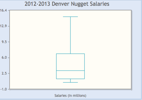
Using software, we find that the mean salary for a Cav’s player was $3.68 million with a standard deviation of $3.77 million. Do these values change much if we delete the high outlier, $13.35 million? The answer is yes. The revised mean and standard deviation, based on the remaining players’ salaries, are considerably lowered. The mean is now $2.93 million and the standard deviation is $2.64 million. Deleting one high salary resulted in having the mean players’ salary decrease by almost $1 million, which is substantial. If you think about how the mean and the standard deviation are computed, this change might not be so surprising since both formulas take into account the value of every data measurement.
A measure is called resistant if is not influenced by extremely high or low data values. Both the mean and standard deviation are not resistant to outliers. When describing a data set, the moral of the story is to graph your data first. If the graphs are severely skewed or have outliers, the mean and standard deviation might not reflect an accurate description of the data set’s center and variability. In the next section we look at another measure of center and variability which are, in general, resistant to outliers.