4.3 Linear Regression
In the previous two sections we were interested in describing the relationship between two quantitative variables using graphical and numerical methods. When graphical and numerical methods suggest that there is a sufficiently strong linear association between the two variables, our goal will be to find a linear model to describe the relationship. We will then use this line to predict values of the response variable for given values of the explanatory variable.
Before we look at finding models for our data, let’s recall a few key ideas about lines that you learned in algebra. First, every line can be written in the form y=a+bx where a is the y-intercept and b is the slope. Slope is a measure of the steepness and direction of the line, and the y-intercept is the y-value where the line intersects the y-axis.
With real-world problems, the data that we are modeling are almost never perfectly linear, so we will be interested in finding an equation of a line which, in some sense, best represents the data set. In this section, we are interested in finding such a line, one called a regression line. A regression line predicts values of the response variable, y, for given values of the explanatory variable, x. We’ll let ˆy (pronounced y-hat) represent the predicted value of y to distinguish it from the observed value of y. Therefore, we’ll write the equation of our regression line in the form ˆy=a+bx .
The video Snapshots: Introduction to Regression provides a first look at the concepts involved in linear regression.
4.3.1 "The" Regression Line

In Section 4.1 we looked at average April temperatures (in degrees Fahrenheit) and latitude data for cities in the northern hemisphere. Figure 4.16 displays a scatterplot of the data, along with a table of values.
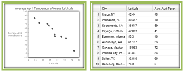
The scatterplot of these data indicates a very strong negative linear association between latitude and average April temperature for cities in the northern hemisphere, and a correlation coefficient of r= –0.9603 confirms this fact. Because there is a strong linear relationship between these two variables, we are interested in finding a regression line to model the relationship. With "average April temperature" as the response variable (y) and “latitude” as the explanatory variable (x), we will find an equation of a line that predicts values of y for given x-values.
Because the points don’t fall on a line, it is not possible to find an equation of a line that passes through all of the data points. We’re trying to do the next best thing, that is, get close to as many points as possible. We could pick two points from the data set, and use the techniques of algebra to determine the line containing those points. Then we could adjust the slope and y-intercept of such a line until we believe that we have obtained a line that represents the pattern of the data well. However, this can be a time-consuming (and not very rewarding) process.
When we refer to "the" regression line for a set of data with a linear trend, we mean the line that "best fits" the data. For statisticians, there is only one "best-fitting" line, and it satisfies a specific mathematical criterion. Finding this line can be done manually, but in practice, the regression line is found using statistical software, such as CrunchIt! For now, we’ll focus on finding the regression line using software, and then interpreting its meaning. Later in the section we’ll describe what "best fitting" means in this context, and look at the mathematics behind the formulas for slope and y-intercept.
For the set of data displayed in Figure 4.16, CrunchIt! reports the regression line as:
Avg. April Temp = 96.83 - 1.118 × Latitude.
Notice that CrunchIt! uses the actual names of the explanatory and response variables (the column names in the CrunchIt! table) rather than x and ˆy. This is useful because it serves as a reminder of what we have chosen as explanatory and response.
Notice that CrunchIt! doesn’t put the little hat over the response variable, so you have to remind yourself that this model is used to find predicted y-values. It does not report the observed y-value for an x-value in the data set (except in the rare and lucky instance when a data point lies on the regression line).
We will follow the CrunchIt! practice of using the actual variable names in our regression equations, distinguishing the variables themselves with italics. Thus, we can see that this line is indeed of the form y=a+bx, with
Avg. April Temp. as y,
Latitude as x,
a = 96.83 and
b = –1.118.
Therefore the y-intercept (Avg. April Temp.-intercept) for this line is 96.83 and the slope is –1.118.
The line is graphed on the scatterplot shown in Figure 4.17.
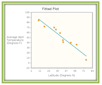
This line fits the data pretty well. Notice that, in this instance, the line doesn’t go through any of the points, but is pretty close to all of them. Let’s use the model to make some predictions.
Toronto, Canada’s latitude is 43.667°N . According to the regression model, Avg. April Temp = 96.83 – 1.118 × Latitude, what is Toronto’s predicted average April temperature? Figure 4.3.3 shows the scatterplot and regression line, with the red line indicating Toronto’s latitude of 43.667°N . Our question then is what is the appropriate average April temperature for the point on the regression line with first coordinate 43.667?
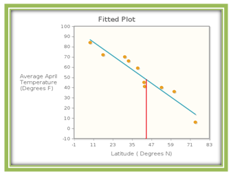
The regression equation predicts that Avg. April Temp = 96.83 – 1.118 × 43.667 = 48.0103 degrees Fahrenheit, which is actually a pretty good estimate since the average April temperature in Toronto is 44 degrees Fahrenheit.
Now Try This 4.8
The correlation coefficient of 0.5173 indicates that there is a moderate, positive, linear association between number of Facebook friends and hours per day spent on social network sites. The sample data are given below.

(a) Find the least squares regression line to predict the number of hours per day spent on social network sites based on the number of Facebook friends. (Be sure to choose your explanatory and response variables appropriately.)
(b) Use your model to predict the number of hours spent if a student has 600 Facebook friends:
(c) In the sample of students used to construct the linear model, one student had 300 Facebook friends. Find the predicted number of hours spent for this student:
(d) For the student described in part (c), is the predicted value the same, higher, or lower than this observed value shown in the table? On a plot of the data, where does the observed data point lie with respect to the regression line?
Hours per Day on Social Networks = 0.8411 + 0.004654 × Facebook Friends.
(b) A student with 600 Facebook friends is predicted to spend 0.8411 + 0.004654 × 600 = 3.6335 hours per day on social network sites (a little more than 3 ½ hours per day).
(c) A student with 300 Facebook friends is predicted to spend 0.8411 + 0.004654 × 300 = 2.2373 hours per day on social network sites
(d) The predicted value of 2.2373 hours is larger than the observed value. Therefore, the observed data point lies below the regression line.
4.3.2 Interpreting Slope and y-Intercept
What do the values of the slope and y-intercept tell us about the relationship between latitude and temperature? Since a y-intercept is the value of y when x = 0, in the context of this problem, this means that if a city lies on the equator, the model predicts that its average April temperature will be 96.82503 degrees Fahrenheit.
The slope, b, of the any line y can be interpreted as follows: For every one unit increase in x, y changes by b units. In the context of this problem, this means that for every one unit increase in latitude, average April temperature changes by –1.118 units. Even better, this means that for every additional degree increase in latitude, the average April temperature decreases by 1.118 degrees Fahrenheit. So for (roughly) every 4 degrees north you travel, temperature is dropping by about 5 degrees Fahrenheit.
In any model, the slope can (and should be) interpreted in the context of the problem. Often though, the y-intercept interpretation is not useful. We’ll see why shortly.
Now Try This 4.9
The linear regression equation for the time spent on social media versus number of Facebook friends data set is Hours per Day on Social Networks = 0.8411 + 0.004654 × Facebook Friends.
(a) Interpret the slope of this model in the context of the situation.
(b) Interpret the y-intercept of the model in the context of the situation.
(b) The y-intercept of 0.8411 means that a student with no Facebook friends will spend 0.8411 hours per day on social network sites.
4.3.3 Prediction Errors
When working with "real world" data, it is extremely unlikely that the data points fall in a perfectly linear pattern. Therefore, when we use a linear regression equation to model the data, prediction error will be present. For a given data value of x, we define its residual to be the difference between its observed value y and its predicted value ˆy.
Let’s look again at the graph of the data and the regression line that we saw previously in Figure 4.17.

The latitude for Ithaca, NY is 42.44ºN . The actual average temperature for April is 45 degrees Fahrenheit. The model predicts that the average temperature is 49.37 degrees Fahrenheit, which is an overestimate. The residual for Ithaca, NY is therefore y−ˆy=45−49.37=−4.37
Next locate the data point for Anchorage, Alaska (latitude 61.167ºN) in Figure 4.19. Because the regression line lies below this point, we see that the model is underestimating the average April temperature in Anchorage. The model predicts that the average April temperature will be 28.43 degrees Fahrenheit. The actual temperature is 36 degrees so the residual for this data point is 7.57.
The following graph, called a residuals plot, displays the residuals for each of the ten data points, with each x-coordinate being the latitude of the city, and the corresponding y-coordinate the prediction error.
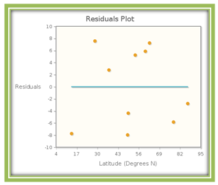
The residuals are of varying size. Some are positive, while others are negative. The sum of the residuals is zero, so the mean residual is also zero. The residual plot shows how far above or how far below the regression line a particular data point lies. If a data point is above the regression line, its corresponding point in the residual plot lies above the y=0 line, and by exactly the same vertical distance (and similarly for points lying below the regression line).
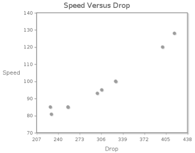
The following contains data on the top 10 roller coasters with the largest drops.

Now Try This 4.10
Make a scatterplot of drop versus speed. Use the scatterplot to describe the association between drop and speed.
The form of the association is ; the direction of the association is ; the strength of the association is .
The StatClips video Regression—Introduction and Motivation provides an interesting example that summarizes what we have presented thus far, and prepares you for the discussion ahead.
4.3.4 The "Best Fitting" Linear Equation
In the latitude/temperature example, we saw that CrunchIt! Used Avg. April Temp = 96.82503-1.118155 × Latitude as the regression line. Why this line? The software reported what is known as the "least squares regression equation".
Recall that we are looking for the line that gets "closest to" the (not perfectly linear) data points. Because the sum of the residuals is always 0, negative residuals are, in a sense, "counteracting" positive residuals. To measure how far off our line is, we look at the square of each residual instead.
This accomplishes two goals. First, these squares are all non-negative, so their sum will not be zero. (A particular residual will be zero, if the data point lies on the regression line, but since the data is not linear, all residuals cannot be zero.) Second, if a point is close to the regression line, its residual will be small in absolute value, and its square will be relatively small.
On the other hand, a residual with a large absolute value will produce a large squared value. For our purposes, a line that is close to lots of points is better than one that goes exactly through a couple but misses others by large vertical distances.
For any data set, we can compute the sum of the squared residuals for any particular line. But we don’t want just any line. Rather, we want the line that minimizes the sum of the squared residuals, ∑(y−ˆy)2. This is the line that makes "least" the "squares," and the line we will call the best-fitting line.
Let’s examine this idea with a very small data set, one with nice values. Figure 4.21 gives the data and its scatterplot.
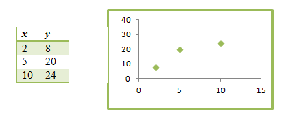
Suppose that we find a regression equation using the first two data points. Then we get the model ˆy=0+4x, whose graph is shown on the scatterplot in Figure 4.22.
In Table 4.6, we calculate the squared residuals for this line.
| x | y | ˆy | y−ˆy | (y−ˆy)2 |
|---|---|---|---|---|
| 2 | 8 | 8 | 0 | 0 |
| 5 | 20 | 20 | 0 | 0 |
| 10 | 24 | 40 | -16 | 256 |
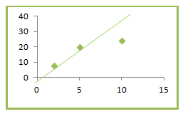
So the sum of the squared residuals is 256. It is clear from the plot that this line is too steep and misses the third point by a good distance. We certainly should be able to find a smaller sum of the squared residuals. The line that goes through the first and third data points is ˆy=4+2x. Its graph and the corresponding table of squared residuals are shown in Figure 4.23.
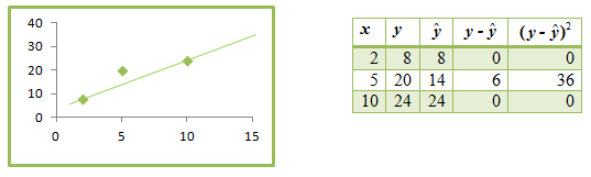
We see that the sum of the squared residuals, 36, is much smaller than that of the first line we used. The line shown in Figure 4.24 seems to have a pretty good slope; perhaps if we moved it up a bit, we would decrease the sum of the squared residuals. Table 4.7 shows several lines, each with slope 2 but different y-intercepts, along with each line’s sum of squared residuals.
| Regression Equation | Sum of Squared Residuals |
|---|---|
| ˆy=5+2x | 27 |
| ˆy=6+2x | 24 |
| ˆy=8+2x | 36 |
Of these three lines, ˆy=6+2x has the smallest sum of squared residuals, but how do we know we can’t find a line with a sum even smaller? The beauty of the least squares regression line is that it guarantees us the smallest possible sum of squared residuals. As we previously indicated, we’ll use software exclusively to find the least squares linear model.
For the (very small) data set for which we have been creating models, the least squares regression equation is ˆy=6.6939+1.8776x, with slope and y-intercept each rounded to 4 decimal places. The sum of squared errors for this model is 23.5102. While a, b, and the sum of squared residuals are all close to the best model we found, we would be unlikely to stumble across the least squares model. So we are happy to rely on software to report the equation.
However, in case you are wondering about how the line is found, here are the formulas to determine slope a and intercept b for the least squares regression equation ˆy=a+bx:
- b=r×(sysx), where r is the correlation coefficient, sx is the standard deviation of the values of x, and sy is the standard deviation of the values of y.
- a=¯y−bׯx where ¯x is the mean of the values of x and ¯y is the mean of the values of y.
For the example above, we find that r = 0.9113, ¯x = 5.667, sx = 4.0415, ¯y = 17.3333, and sy = 8.3267. Then the appropriate values of a and b are
b=0.9113(8.32674.0415)=1.8776
and
α=17.3333−1.8776×5.6667=6.6935,
which agree to three decimal places with the values found by software. (The difference in the fourth decimal place for a can be explained by our using rounded values in our calculations.)
4.3.5 How Good Is the Least Squares Regression Line?
In general, the reason for using linear regression is to predict y-values in situations in which the actual y-values are unknown. It is sensible to wonder how good our linear model is at predicting these unknown y-values. A logical starting place to investigate this question is to examine how well the model predicts the y-values that we do know.
We have already seen that the correlation coefficient measures the strength and the direction of the linear relationship between our two variables. It turns out that the square of the correlation coefficient, r2 (sometimes written as R2), gives us more specific information about how well the least squares equation predicts our known y-values.
r2 tells us the fraction of the variability in the observed y-values that can be explained by the least squares regression. Because r is a number between –1 and 1 inclusive, r2 is between 0 and 1 inclusive. And because r2 represents a fraction of the total variability in the y-values, we generally convert it to a percent. So another way to interpret r2 is to say that it represents the percent of the variability in y-values that is explained by the variability of the x-values, according to our linear regression model.
The language here is a little tricky, and the meaning of r2 can be somewhat confusing. Consider a set of data that is perfectly linear and with positive slope. It has a correlation coefficient of 1, so r2 is also 1. This means that all of the variability in the y-values (100% of it) can be explained by the linear model. That is, the model predicts exactly how the y-value changes for a given change in x.
Recalling that for our latitude vs. temperature example, r was 0.9603, we determine that r2 = 0.9222. How would we interpret this value in the context of the situation? We would say that about 92% of the variation in the average April temperatures can be explained by the linear regression model. Or, we could say that for our least squares regression equation, about 92% of the variability in the average April temperatures can be explained by the variability in the cities’ latitudes.
That’s quite a large percentage to be accounted for by the model, and we can’t always expect such good results from real data. Depending on the situation, a researcher might consider even an r2 smaller than 50% as indicating a linear regression model worth using.
Now Try This 4.17
For the linear regression model giving a rollercoaster’s speed based on its drop, the correlation coefficient was 0.9808.
(a) Find r2:
(b) Interpret r2
4.3.6 The Effect of Outliers
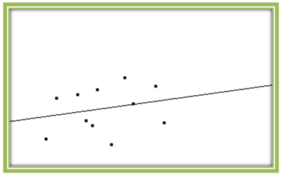
The importance of making a scatterplot of the data can be seen when we examine the effect of outliers on a linear regression model. The scatterplot shown in Fig. 4.25 displays a weak positive linear relationship (r = 0.2365), and we see quite a bit of scattering of data points around the regression line. In this case, the linear relationship accounts for only about 5% of the variability in the y-values (since r2 = 0.0559).
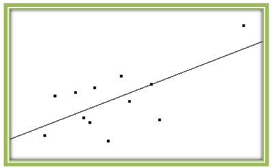
What happens if we add an outlier to this scatterplot? As we see in Fig. 4.26, the outlier makes the data appear more linear. Indeed, the correlation coefficient is now 0.6715. This makes it seem as though a linear model is much more appropriate in this case. But is it really? If this were a set of real data, we would want to check to see whether that point represents actual data values or errors in data collection or entry. And even if it the values are correct, linear regression may not be appropriate.
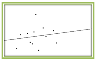
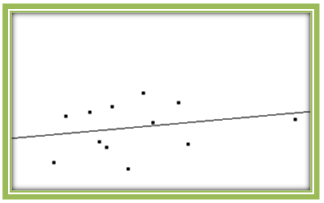
Figures 4.27 and 4.28 show two additional scatterplots. In Fig. 4.27, the outlier is in the y-direction only. While it decreases the correlation coefficient to 0.1631, it has little effect on the original regression line. In Fig. 4.28, the outlier is in the x-direction only. Here r is 0.2359, similar to the original value, and once again, the regression line is close to the original.
These plots were all created using the Correlation and Regression applet. You should make some plots yourself, adding and removing outliers to see their effects on the regression model.
Once again we remind you to always plot your data. It is not enough to rely on the correlation coefficient alone to determine whether linear regression is appropriate. In statistics it is always wise to “look before you leap.”
4.3.7 Further Considerations
As we have indicated, the usefulness of linear regression lies in our ability to use the model to make predictions when we don’t have observed values of x and y. Recall that we substituted Toronto’s latitude (which we did know) into our linear model to predict a value for its average April temperature (which we didn’t know). We obtained a reasonable estimate for this temperature (about 48˚F) because Toronto’s latitude is similar to the other cities’ upon which we built our model.
Making predictions using values of the explanatory variable that lie within the range of the given x-values generally produces y-values that are appropriate estimates. On the other hand, making predictions using values of the explanatory variable outside the range of the given data is called extrapolation. The linear regression model is a mathematical equation into which you can substitute any number you like. However, there is an assumption behind the model that the trend displayed in the given data continues indefinitely, which may not be the case at all.
We could use our roller coaster regression model Speed = 26.2547 + 0.2326 × Drop to predict the speed of a roller coaster with a drop of 800 feet (or 8000 feet for that matter). For a drop of 800 feet, we would get a predicted speed of about 212 miles per hour. But 800 feet is nearly twice as large a drop as that for Kingda Ka, which has the largest drop (418 feet) in our data set. There is no reason to believe that our linear model is reliable for that large a drop, or that it has produced a reasonable estimate. This is the same issue we faced when we tried to interpret the y-intercept for this linear model. A vertical drop of 0 is outside the range of the given data, so the y-intercept value does not have a sensible practical meaning.
It is common, even if somewhat dangerous, to extrapolate using the linear regression equation. However, as you use x-values farther away from your data values, your estimates become less reliable. Use caution when extrapolating—don’t go very far beyond the given x-values, and exercise a bit of skepticism when reading the results of others’ extrapolation.
In addition, remember that the predictions in the model go only one way—we use values of x to predict values of y, not vice versa. While correlation remains the same when you switch the roles of the explanatory and response variables, the regression model changes when you make the same switch. It is important to decide before you start which variable you want to predict, and make that variable the response variable.
Finally, even if everything goes smoothly—you have a reasonably strong linear relationship, your scatterplot indicates that linear regression is appropriate, and you are not extrapolating (or at least not too far out)—you still must be careful about the conclusions that you draw. In the best of circumstances, correlation and regression suggest that a relationship between two variables exists. They do not imply that the relationship involves cause and effect.
Linear regression is a widely used and effective statistical technique. Linear models are easy to understand, and making predictions is straightforward. It is important to remember, however, that linear regression is not appropriate in all situations. You must be careful about when you use linear regression, and how you interpret the results.