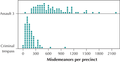
EXAMPLE 18 Comparison dotplots
 Suppose a criminal justice researcher wants to compare the occurrences of third-degree assault and criminal trespass across the police precincts of New York City. The researcher could construct a comparison dotplot, as shown in Figure 29. This graph shows that the number of criminal trespass misdemeanors per precinct lie mostly below 300, whereas the number of third-degree assaults per-precinct frequencies lie mostly above 300.
71

Note: All of the graphs and tables learned in this section may be used for quantitative data. But histograms, frequency polygons, stem-and-leaf displays, and dotplots cannot be used for qualitative data.
NOW YOU CAN DO
Exercises 65–66.
Note that the two groups are graphed using the same number line, which makes comparison easier.