EXAMPLE 21 Choosing the appropriate graphical summary
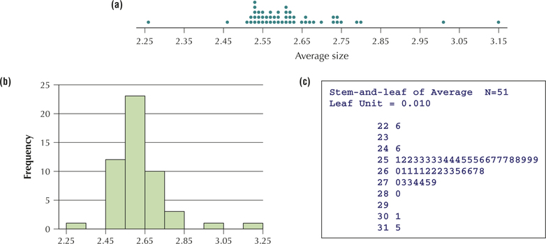
Statistically literate citizens recognize that one may select different graphical summaries, depending on the intention of the presenter. Figures 35a, 35b, and 35c contain a dotplot, a histogram, and a stem-and-leaf display, respectively, of the average size of households in the 50 states and the District of Columbia. Which graphical summary— the dotplot, the histogram, or the stem-and-leaf display—is most useful if our primary objective is to
- assess symmetry and skewness?
- be able to construct it quickly using paper and pencil?
- retain complete knowledge of the original data set?
- give a presentation to people who have never taken a stats course?
75

Figure 2.35: FIGURE 35 (a) Dotplot; (b) histogram; (c) stem-and-leaf display. Which is most useful?
Solution
- All three graphics are good at assessing symmetry and skewness.
- The dotplot's great asset is its simplicity. It can be quickly drawn, with minimal preparation, in contrast to the other two summaries, which require some organization or calculation.
- The stem-and-leaf display was invented in order to retain complete knowledge of the data set. Histograms are the least effective in this regard.
- The histogram is widely used in the real world and is probably the best choice for a presentation to those who have never taken a stats course.