EXAMPLE 24 Constructing a time series plot
murderrate
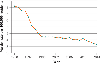
 Table 37 contains the murder rate per 100,000 residents for New York City, from 1990 to 2014.
- Construct a time series plot of the data.
- Describe any patterns you see.
Solution
- We indicate the years 1990–2014 on the horizontal axis of the time series plot (Figure 48). Then, for each year, we plot the murder rate per 100,000 residents. Finally, we join the points using line segments.Table 2.85: TABLE 37 Murder rate in New York City, 1990–2014
Year Rate Year Rate Year Rate 1990 14.5 1999 5 2008 4.3 1991 14.2 2000 5 2009 4 1992 13.2 2001 5 2010 4.5 1993 13.3 2002 4.8 2011 3.9 1994 11.1 2003 4.9 2012 3.5 1995 8.5 2004 4.6 2013 3 1996 7.4 2005 4.5 2014 2.7 1997 6 2006 4.8 1998 5.1 2007 4.2  FIGURE 48 Time series plot. Murder rate in New York City, 1990–2014.
 - Note that the murder rate fell quickly from 1993 to 1998 and then tended to flatten out until 2010, when it began a slow descent until 2014. In the Step-by-Step Technology Guide, we illustrate how to construct this time series graph using technology.
NOW YOU CAN DO
Exercises 17 and 18.
[Leave] [Close]