EXAMPLE 6 Working with tabular data
Table 8 is a crosstabulation showing the SAT Writing exam score for females and males in 2014. Note that the data are not presented in raw form, such as the automobiles in Table 6. Instead, the frequencies for each cell have been presented. Use Table 8 to construct the following:
- Frequency distribution of the Gender of SAT Writing exam takers, for females and males
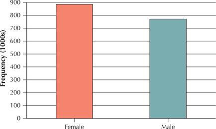
- Frequency bar graph of the Gender of SAT Writing exam takers, for females and males

Table 2.8: Table 8 Each cell represents the number of 2014 SAT Writing exam takers who scored in the given range, by gender.
| SAT Writing score | ||||
|---|---|---|---|---|
| Gender | 200–390 | 400–590 | 600–800 | Total |
| Female | 169,314 | 550,172 | 164,469 | 883,955 |
| Male | 178,606 | 464,949 | 132,537 | 776,092 |
| Total | 347,920 | 1,015,121 | 297,006 | 1,660,047 |
Table 2.8: Source: The College Board.
Solution
- The total column on the right-hand side of Table 8 provides us with the frequency distribution, which is shown in Table 9.Table 2.9: Table 9 Frequency distribution of SAT Writing exam takers across the genders
Gender Frequency Female 883,955 Male 776,092 Total 1,660,047 - We use the frequency distribution in Table 9 to produce the bar graph shown in Figure 4.
48

Figure 2.4: FIGURE 4 Bar graph of Gender of SAT Writing exam takers.
We work with the tabular data in Table 8 to construct further graphs and distributions in the exercises.
NOW YOU CAN DO
Exercises 22, 38–40, 42–44, and 46–56.