EXAMPLE 8 Comparison bar charts
Student-Run Café Business
Have you ever thought what it must be like to run a business? Business students at a Midwestern public university found out because they volunteered to manage a Student-Run café in the business school, which replaced a for-profit vendor that closed. In this chapter, we examine sales data from the Student-Run café, such as the number of coffees sold and the number of sodas sold, to help us learn about how to describe data using graphs and tables. The data set is called Café, a brief excerpt of which is shown in Table 10.
café
| Month | Time period |
Day of week |
… | Sodas | Coffees | Sales | Max. daily temperature (°F) |
|---|---|---|---|---|---|---|---|
| Jan | 1 | 2 - Tue | … | 20 | 41 | 199.95 | 36 |
| Jan | 1 | 3 - Wed | … | 13 | 33 | 195.74 | 34 |
| Jan | 1 | 4 - Thu | … | 23 | 34 | 102.68 | 39 |
| Jan | 1 | 5 - Fri | … | 13 | 27 | 162.88 | 40 |
| Jan | 1 | 1 - Mon | … | 13 | 20 | 101.76 | 36 |
| Jan | 1 | 2 - Tue | … | 33 | 23 | 186.94 | 26 |
| Jan | 1 | 3 - Wed | … | 15 | 32 | 120.18 | 34 |
| Jan | 1 | 4 - Thu | … | 27 | 31 | 228.78 | 33 |
| Jan | 1 | 5 - Fri | … | 12 | 30 | 88.02 | 20 |
| Feb | 1 | 1 - Mon | … | 19 | 27 | 119.57 | 37 |
| ⋮ | ⋮ | ⋮ | ⋮ | ⋮ | ⋮ | ⋮ | ⋮ |
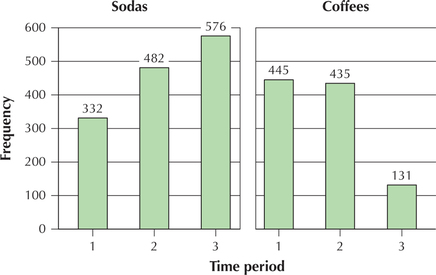
There are 47 days of sales data. The variable time period is a categorical variable that equals 1 for the first 16 days (late January to early February), 2 for the second 16 days (late February to early March), and 3 for the last 15 days (late March to early April). This variable allows us to examine changes in sales behavior over time. Construct a comparison bar chart of the number of sodas sold and the number of coffees sold, over the three time periods, and comment on the change in customer purchasing behavior as the winter months turned to spring.
50
Solution
Figure 6 shows the comparison bar chart of the number of sodas sold and the number of coffees sold, over the three time periods. As winter turned to spring, soda sales increased from 332 to 576, while coffee sales decreased from 445 to 131.
