Question 2.103
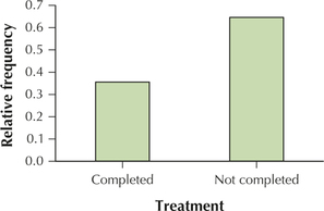
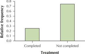
103. Use the data from the comparison pie chart to make the following relative frequency bar charts.
- Treatment status for suburban females
- Treatment status for urban females
2.1.103
(a)

(b)

103. Use the data from the comparison pie chart to make the following relative frequency bar charts.
2.1.103
(a)

(b)
