EXAMPLE 43Normal probability plots
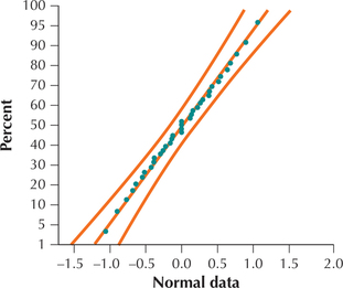
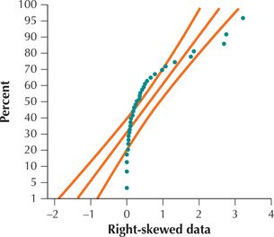
Figures 68 and 69 show normal probability plots for two different data sets. Analyze these plots for evidence for or against the normality of each data set.
Solution
In Figure 68, the points are arrayed nicely along the straight line, and all the points lie within the curved bounds. We therefore conclude that the data represented in Figure 68 are normally distributed. (In fact, the underlying data are drawn from a normal distribution.) In Figure 69, the points do not line up in a straight line, and many points lie outside the curved bounds, indicating that the data set is not normal. We therefore conclude that the data represented in Figure 69 are not normally distributed. (In reality, the underlying data set is right-skewed.)


NOW YOU CAN DO
Exercises 27–30.