STEP-BY-STEP TECHNOLOGY GUIDE: Quantitative Data
carbon
Suppose we want to produce a histogram of the carbon emissions data from Example 12 (page 63).
TI-83/84
Entering a Data Set
- Step 1 Press STAT, then press ENTER. Highlight the L1 list.
- Step 2 Clear out any old data in L1. Press the up arrow key, then CLEAR, then ENTER.
- Step 3 Enter the first data value 93.28, and press ENTER.
- Step 4 Continue entering data until the entire data set is in L1 (Figure 36).
Constructing a Histogram
- Step 1 Press 2nd, then Y =. In the STAT PLOTS menu, highlight 1:, and press ENTER.
- Step 2 Highlight ON, and press ENTER. Select the histogram icon (Figure 37), and press ENTER.
- Step 3 Press ZOOM, then select 9:ZOOMSTAT.
- Step 4 Press TRACE. Selecting each class, in turn, provides class limits and class frequency. The histogram is given in Figure 38.
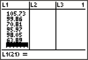
FIGURE 36 All data entered.
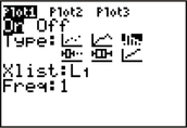
FIGURE 37 Selecting the histogram icon.
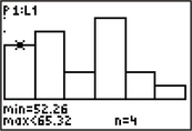
FIGURE 38 Histogram with leftmost class selected.
Page 76
EXCEL
Constructing a Histogram
Make sure the Data Analysis package has been installed on your version of Excel.
- Step 1 Input the carbon emissions data into column A. Click Data > Data Analysis.
- Step 2 Select Histogram and click OK.
- Step 3 For the input range, select the cells in which the data set resides. If the topmost cell has the variable name, select Labels. Select Chart Output, then click OK.
MINITAB
Constructing a Histogram
- Step 1 Enter the carbon emissions data into column C1. Name the column Carbon.
- Step 2 Click Graph > Histogram. Choose Simple, and click OK.
- Step 3 Select C1 Carbon, and click Select. Then click OK.
- Step 4 The histogram is shown in Figure 39. Note that by default, Minitab uses midpoints instead of class limits to define the classes. Double-clicking anywhere on the midpoint values (50, 60, …) brings up a dialog box providing a wide range of options for changing the number of classes, class limits, etc.
Constructing a Stem-and-Leaf Display
- Step 1 Enter the carbon emissions data into column C1. Name the column Carbon.
- Step 2 Click Graph > Stem-and-Leaf.
- Step 3 Click inside the space indicated Graph variables, select C1 Carbon, and click Select. Then click OK.
- Step 4 The output shown in Figure 40 tells us that the leaf unit is defined to be ones (1.0). Therefore, the stem unit is tens. (Ignore the leftmost column, which simply provides a cumulative count of the data points from the minimum and maximum.) The first row shows 526, indicating two data points, 52 and 56.
Dotplots
- Step 1 Enter the carbon emissions data into column C1. Name the column Carbon.
- Step 2 Click Graph > Dotplot. Select Simple. Click OK.
- Step 3 Click in the Graph Variables section, click C1 Carbon, and Select. Click OK.
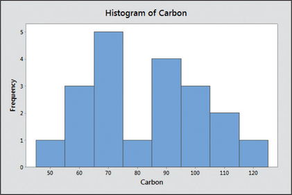
FIGURE 39 Minitab histogram.
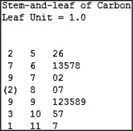
FIGURE 40 Minitab stem-and-leaf display.
SPSS
Constructing a Histogram and a Stem-and-Leaf Display
- Step 1 Input the carbon emissions data into the first column, and name the column Carbon.
- Step 2 Click Analyze > Descriptive Statistics > Explore…
- Step 3 Select Carbon on the left, and click the first arrow to move it to the Dependent List.
- Step 4 Click Plots…, select Stem-and-leaf and Histogram. Click Continue.
- Step 5 Select Plots from the Display options. Click OK.
Dotplots
- Step 1 Input the carbon emissions data into the first column, and name the column Carbon.
- Step 2 Click Graphs > Legacy Dialogs > Scatter/Dot…
- Step 3 Select Simple Dot, and click Define. Click Carbon, and move it to the X Axis Variable. Click OK.
JMP
Constructing a Histogram and a Dotplot
- Step 1 Click File > New > Data Table. Input the carbon emissions data into Column 1. Name Column 1 Carbon.
- Step 2 Click Graph > Graph Builder. Click and drag Carbon from the Variables box to the X axis.
- Step 3
- For a histogram, select Histogram from the options above the plot. The plot and graph options are shown in Figure 41. Click Done.
- For a dotplot, select Points from the options above the plot. Make sure Jitter, under Points, is checked. Click Done.
Constructing a Stem-and-Leaf Display
- Step 1 Click File > New > Data Table. Input the carbon emissions data into Column 1. Name Column 1 Carbon.
- Step 2 Click Analyze > Distribution. Click Carbon in the Select Columns box, then click Y, Columns. Click OK.
- Step 3 Click the red triangle next to Carbon. Click Stem and leaf. The output is shown in Figure 42.
Page 77
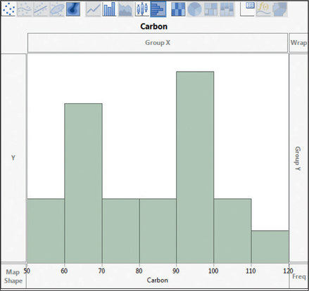
FIGURE 41 JMP histogram.
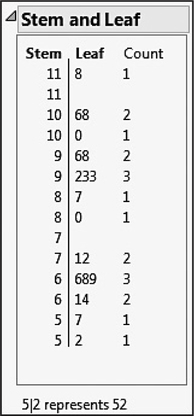
FIGURE 42 JMP stem-and-leaf.
CRUNCHIT!
Constructing a Histogram
- Step 1 Click File, highlight Load from Larose, Discostat3e > Chapter 2, and click on Example 02_12.
- Step 2 Click Graphics, and select Histogram. For Sample, select Carbon. (You may optionally select the number of bins, the bin width, and the location for the leftmost lower class limit.) Then click Calculate.
Constructing a Dotplot
- Step 1 Click File, highlight Load from Larose, Discostat3e > Chapter 2, and click on Example 02_12.
- Step 2 Click Graphics, and select Dot Plot. For Sample, select Carbon. Then click Calculate.
[Leave] [Close]