Descriptive Statistics
The study of programs to promote health generated a large amount of data. How did the researchers make sense of such a mass of information? How did they summarize it in meaningful ways? The answer lies in descriptive statistics. Descriptive statistics do just what their name suggests—
Frequency Distribution
Suppose that at the start of the health-
2, 5, 0, 1, 2, 2, 7, 0, 6, 2, 3, 1, 4, 5, 2, 1, 1, 3, 2, 1, 0, 4, 2, 3, 0, 1, 2, 3, 4, 1
Even with only 30 cases, it is difficult to make much sense of these data. Researchers need a way to organize such raw scores so that the information makes sense at a glance. One way to organize the data is to determine how many participants reported exercising zero hours per week, how many reported exercising one hour, and so on, until all the reported amounts are accounted for. If the data were put into a table, the table would look like Table A.1.
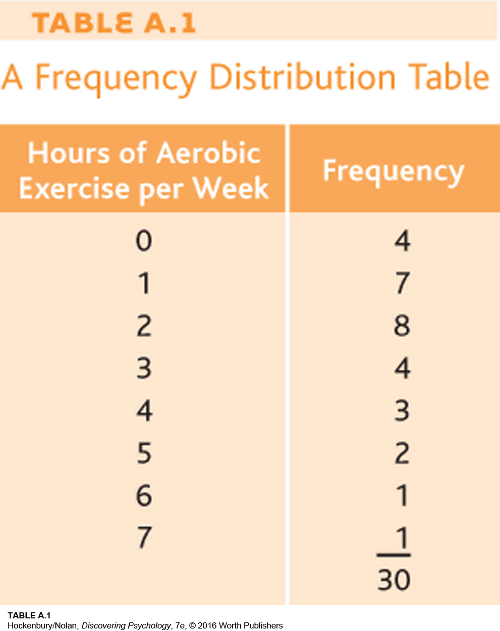
This table is one way of presenting a frequency distribution—a summary of how often various scores occur. Categories are set up (in this case, the number of hours of aerobic exercise per week), and occurrences of each category are tallied to give the frequency of each one.
What information can be gathered from this frequency distribution table? We know immediately that most of the participants did aerobic exercise less than three hours per week. The number of hours per week peaked at two and declined steadily thereafter. According to the table, the most diligent exerciser worked out about an hour per day.
Some frequency distribution tables include an extra column that shows the percentage of cases in each category. For example, what percentage of participants reported two hours of aerobic exercise per week? The percentage is calculated by dividing the category frequency (8) by the total number of people (30), which yields about 27 percent.
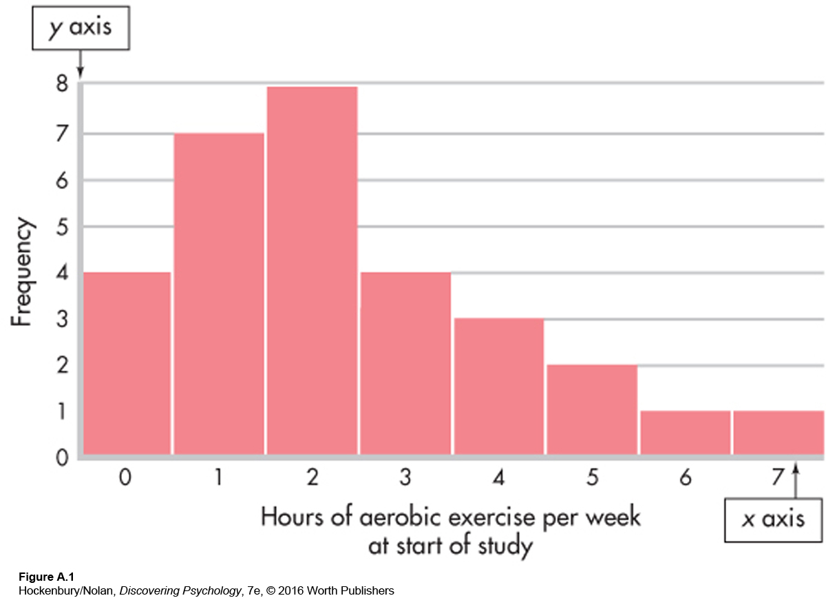
While a table is good for summarizing data, it is often useful to present a frequency distribution visually, with graphs. One type of graph is the histogram (Figure A.1). A histogram is like a bar chart with two special features: The bars are always vertical, and they always touch. Categories (in our example, the number of hours of aerobic exercise per week) are placed on the x axis (horizontal), and the y axis (vertical) shows the frequency of each category. The resulting graph looks something like a city skyline, with buildings of different heights.
Another way of graphing the same data is with a frequency polygon, shown in Figure A.2. A mark is made above each category at the point representing its frequency. These marks are then connected by straight lines. In our example, the polygon begins before the “0” category and ends at a category of “8,” even though both of these categories have no cases in them. This is traditionally done so that the polygon is a closed figure.
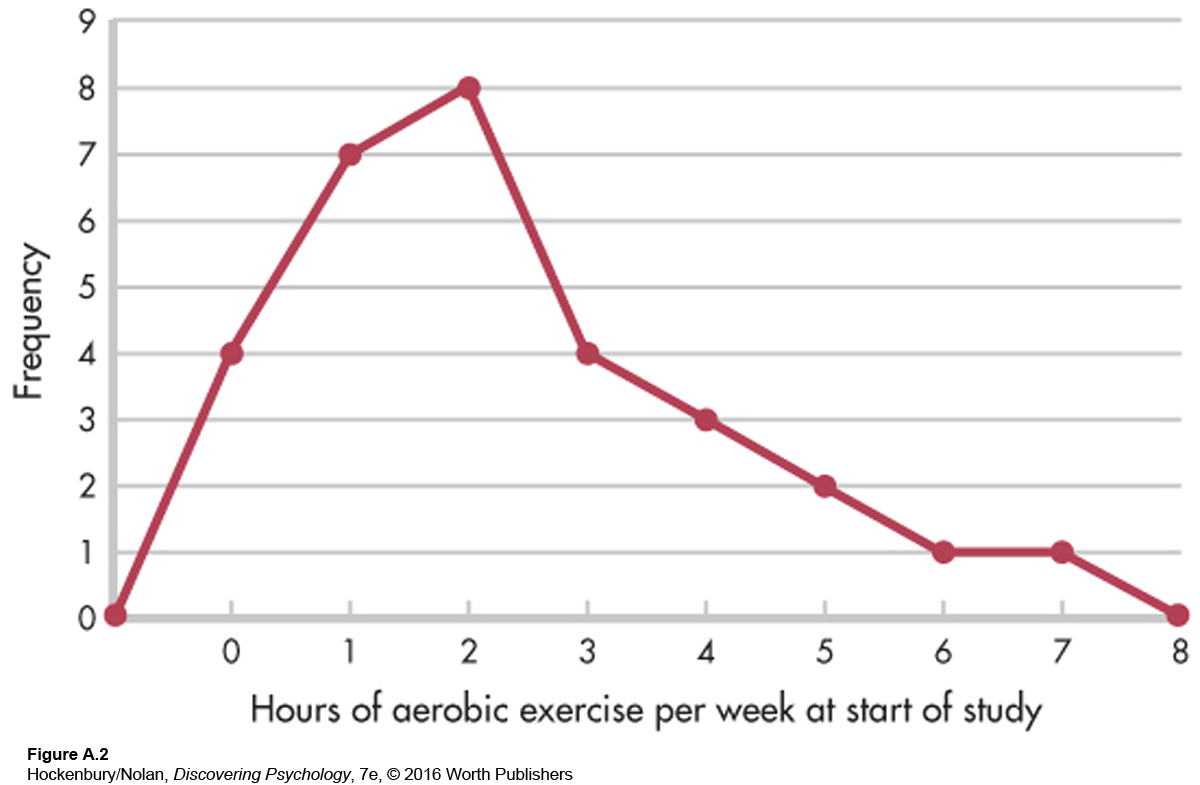
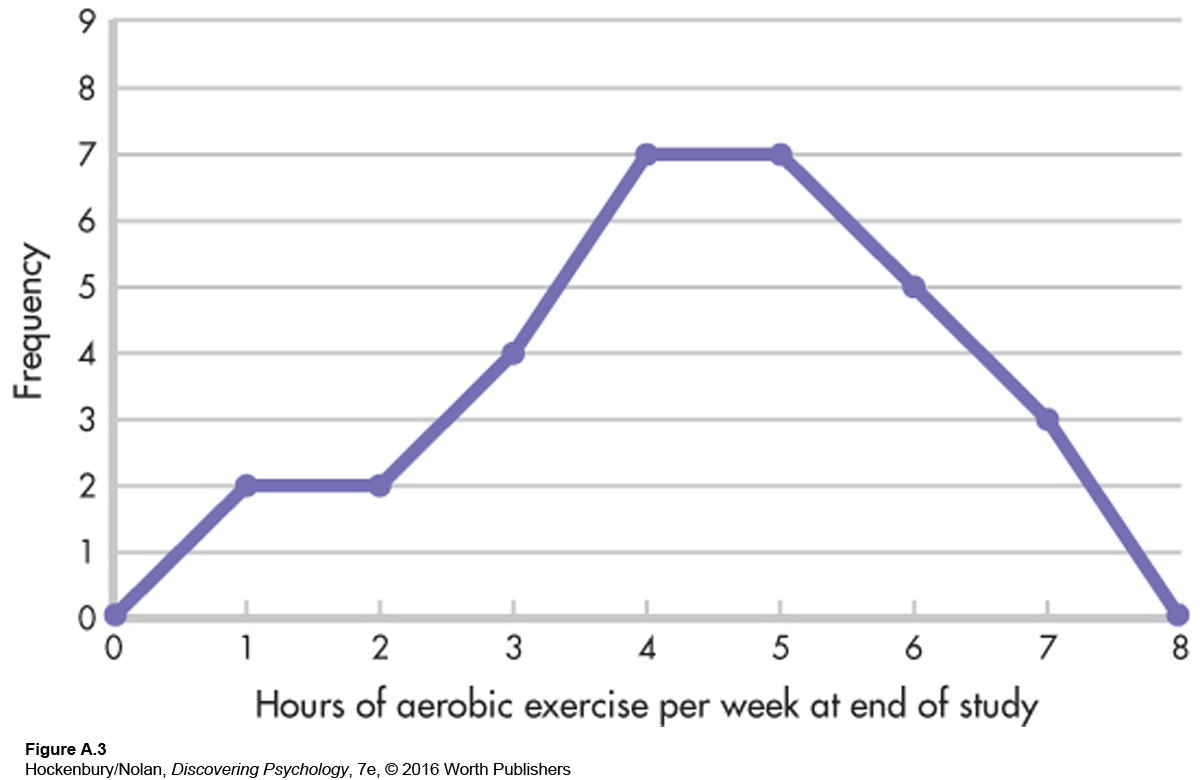
Frequency polygons are good for showing the shape of a distribution. The polygon in Figure A.2 looks like a mountain, rising sharply over the first two categories, peaking at 2, and gradually diminishing from there. Such a distribution is asymmetrical, or a skewed distribution, meaning that if we drew a line through the middle of the x axis (halfway between 3 and 4 hours), more scores would be piled up on one side of the line than on the other. More specifically, the polygon in Figure A.2 represents a positively skewed distribution, indicating that most people had low scores. The “tail” of the distribution extends in a positive direction. A negatively skewed distribution would have mostly high scores, with fewer scores at the low end of the distribution. In this case, the tail of the distribution extends in a negative direction. For example, if the traditional diet and exercise intervention worked, the 30 participants should, as a group, be exercising more at the end of the study than they had been at the beginning. Perhaps the distribution of hours of aerobic exercise per week at the end of the study would look something like Figure A.3—a distribution with a slight negative skew.
In contrast to skewed distributions, a symmetrical distribution is one in which scores fall equally on both halves of the graph. A special case of a symmetrical distribution, the normal curve, is discussed in a later section.
A useful feature of frequency polygons is that more than one distribution can be graphed on the same set of axes. For example, the end-
By the way, Figure A.3 is actually a figment of my imagination. According to the diaries kept by the traditional and alternative program participants, compliance with the exercise portion of the program decreased over time. This does not necessarily mean that these participants were exercising less at the end of the study than at the beginning, but they certainly did not keep up the program as it was taught to them. Compliance with the prescribed diets was steadier than compliance with exercise; compliance by the alternative group dropped between three months and six months, and then rose steadily over time. There was, however, one major difference between the two intervention groups in terms of compliance. Participants in the alternative group were more likely to be meditating at the end of the study than their traditional group counterparts were to be practicing progressive relaxation.
Measures of Central Tendency
Frequency distributions can be used to organize a set of data and tell us how scores are generally distributed. But researchers often want to put this information into a more compact form. They want to be able to summarize a distribution with a single score that is “typical.” To do this, they use a measure of central tendency.
THE MODE
The mode is the easiest measure of central tendency to calculate. The mode is simply the score or category that occurs most frequently in a set of raw scores or in a frequency distribution. The mode in the frequency distribution shown in Table A.1 is 2; more participants reported exercising two hours per week than any other category. In this example, the mode is an accurate representation of central tendency, but this is not always the case. In the distribution 1, 1, 1, 10, 20, 30, the mode is 1, yet half the scores are 10 and above. This type of distortion is the reason measures of central tendency other than the mode are needed.
THE MEDIAN
Another way of describing central tendency is to determine the median, or the score that falls in the middle of a distribution. If the exercise scores were laid out from lowest to highest, they would look like this:
0, 0, 0, 0, 1, 1, 1, 1, 1, 1, 1, 2, 2, 2, 2, 2, 2, 2, 2, 3, 3, 3, 3, 4, 4, 4, 5, 5, 6, 7
↑
What would the middle score be? Since there are 30 scores, look for the point that divides the distribution in half, with 15 scores on each side of this point. The median can be found between the 15th and 16th scores (indicated by the arrow). In this distribution, the answer is easy: A score of 2 is the median as well as the mode.
THE MEAN
A problem with the mode and the median is that both measures reflect only one score in the distribution. For the mode, the score of importance is the most frequent one; for the median, it is the middle score. A better measure of central tendency is usually one that reflects all scores. For this reason, the most commonly used measure of central tendency is the mean, or arithmetic average. You have calculated the mean many times. It is computed by summing a set of scores and then dividing by the number of scores that went into the sum. In our example, adding together the exercise distribution scores gives a total of 70; the number of scores is 30, so 70 divided by 30 gives a mean of 2.33.
Formulas are used to express how a statistic is calculated. The formula for the mean is

In this formula, each letter and symbol has a specific meaning:
X̅ is the symbol for the mean. (Sometimes you’ll see M used as the symbol of the mean instead.)
Σ is sigma, the Greek letter for capital S, and it stands for “sum.” (Taking a course in statistics is one way to learn the Greek alphabet!)
X represents the scores in the distribution, so the numerator of the equation says, “Sum up all the scores.”
N is the total number of scores in the distribution. Therefore, the formula says, “The mean equals the sum of all the scores divided by the total number of scores.”
Although the mean is usually the most representative measure of central tendency because each score in a distribution enters into its computation, it is particularly susceptible to the effect of extreme scores. Any unusually high or low score will pull the mean in its direction. Suppose, for example, that in our frequency distribution for aerobic exercise, one exercise zealot worked out 70 hours per week. The mean number of aerobic exercise hours would jump from 2.33 to 4.43. This new mean is deceptively high, given that most of the scores in the distribution are 2 and below. Because of just that one extreme score, the mean has become less representative of the distribution. Frequency tables and graphs are important tools for helping us identify extreme scores before we start computing statistics.
Measures of Variability
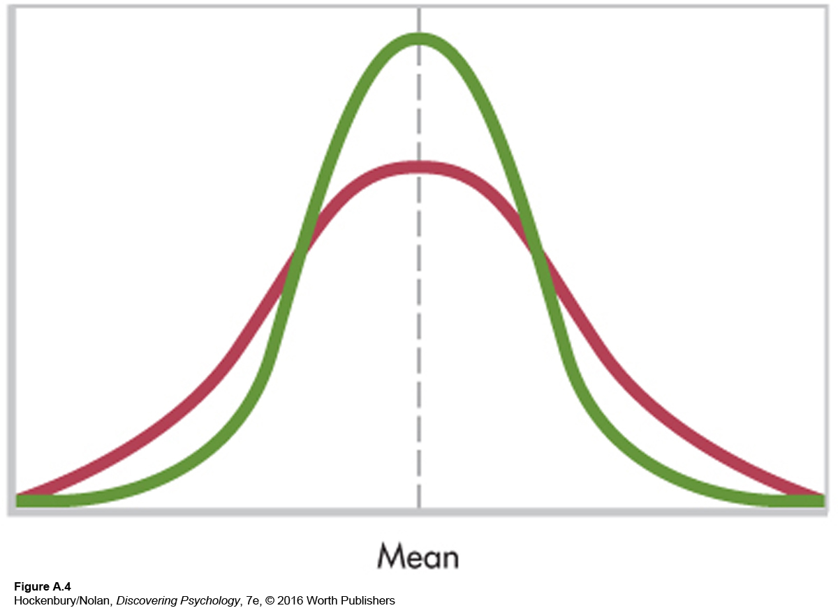
In addition to identifying the central tendency in a distribution, researchers may want to know how much the scores in that distribution differ from one another. Are they grouped closely together or widely spread out? To answer this question, we need some measure of variability. Figure A.4 shows two distributions with the same mean but with different variability.
A simple way to measure variability is with the range, which is computed by subtracting the lowest score in the distribution from the highest score. Let’s say that there are 15 participants in the traditional diet and exercise group and that their weights at the beginning of the study varied from a low of 95 pounds to a high of 155 pounds. The range of weights in this group would be 155 – 95 = 60 pounds.
As a measure of variability, the range provides a limited amount of information because it depends on only the two most extreme scores in a distribution (the highest and lowest scores). A more useful measure of variability would give some idea of the average amount of variation in a distribution. But variation from what? The most common way to measure variability is to determine how far scores in a distribution vary from the distribution’s mean. We saw earlier that the mean is usually the best way to represent the “center” of the distribution, so the mean seems like an appropriate reference point.
What if we subtract the mean from each score in a distribution to get a general idea of how far each score is from the center? When the mean is subtracted from a score, the result is a deviation from the mean. Scores that are above the mean would have positive deviations, and scores that are below the mean would have negative deviations. To get an average deviation, we would need to sum the deviations and divide by the number of deviations that went into the sum. There is a problem with this procedure, however. If deviations from the mean are added together, the sum will be 0 because the negative and positive deviations will cancel each other out. In fact, the real definition of the mean is “the only point in a distribution where all the scores’ deviations from it add up to 0.”
We need to somehow “get rid of” the negative deviations. In mathematics, such a problem is solved by squaring. If a negative number is squared, it becomes positive. So instead of simply adding up the deviations and dividing by the number of scores (N), we first square each deviation and then add together the squared deviations and divide by N. Finally, we need to compensate for the squaring operation. To do this, we take the square root of the number just calculated. This leaves us with the standard deviation. The larger the standard deviation, the more spread out are the scores in a distribution.
Let’s look at an example to make this clearer. Table A.2 lists the hypothetical weights of the 15 participants in the traditional group at the beginning of the study. The mean, which is the sum of the weights divided by 15, is calculated to be 124 pounds, as shown at the bottom of the left-
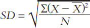
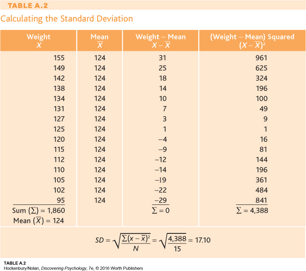
Notice that when scores have large deviations from the mean, the standard deviation is also large.
z Scores and the Normal Curve
The mean and the standard deviation provide useful descriptive information about an entire set of scores. But researchers can also describe the relative position of any individual score in a distribution. This is done by locating how far away from the mean the score is in terms of standard deviation units. A statistic called a z score gives us this information:
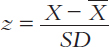
This equation says that to compute a z score, we subtract the mean from the score we are interested in (that is, we calculate its deviation from the mean) and divide this quantity by the standard deviation. A positive z score indicates that the score is above the mean, and a negative z score shows that the score is below the mean. The larger the z score, the farther away from the mean the score is.
Let’s take an example from the distribution found in Table A.2. What is the z score of a weight of 149 pounds? To find out, you simply subtract the mean from 149 and divide by the standard deviation.
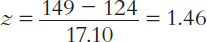
A z score of +1.46 tells us that a person weighing 149 pounds falls about one and a half standard deviations above the mean. In contrast, a person weighing 115 pounds has a weight below the mean and would have a negative z score. If you calculate this z score, you will find it is – 0.53. This means that a weight of 115 is a little more than one-
Some variables, such as height, weight, and IQ, if graphed for large numbers of people, fall into a characteristic pattern. Figure A.5 shows this pattern, which is called the standard normal curve or the standard normal distribution. The normal curve is symmetrical (that is, if a line is drawn down its center, one side of the curve is a mirror image of the other side), and the mean, median, and mode fall exactly in the middle. The x axis of Figure A.5 is marked off in standard deviation units, which, conveniently, are also z scores. Notice that most of the cases fall between –1 and +1 SDs, with the number of cases sharply tapering off at either end. This pattern is the reason the normal curve is often described as “bell shaped.”
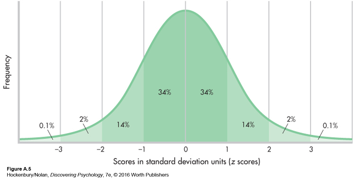
The great thing about the normal curve is that we know exactly what percentage of the distribution falls between any two points on the curve. Figure A.5 shows the percentages of cases between major standard deviation units. For example, 34 percent of the distribution falls between 0 and +1. That means that 84 percent of the distribution falls below one standard deviation (the 34 percent that is between 0 and +1, plus the 50 percent that falls below 0). A person who obtains a z score of +1 on some normally distributed variable has scored better than 84 percent of the other people in the distribution. If a variable is normally distributed (that is, if it has the standard bell-
Correlation
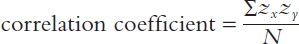
So far, the statistical techniques we’ve looked at focus on one variable at a time, such as hours of aerobic exercise weekly or pounds of weight. Other techniques allow us to look at the relationship, or correlation, between two variables. Statistically, the magnitude and direction of the relationship between two variables can be expressed by a single number called a correlation coefficient.
To compute a correlation coefficient, we need two sets of measurements from the same individuals or from pairs of people who are similar in some way. To take a simple example, let’s determine the correlation between height (we’ll call this the x variable) and weight (the y variable). We start by obtaining height and weight measurements for each individual in a group. The idea is to combine all these measurements into one number that expresses something about the relationship between the two variables, height and weight. However, we are immediately confronted with a problem: The two variables are measured in different ways. Height is measured in inches, and weight is measured in pounds. We need some way to place both variables on a single scale.
Think back to our discussion of the normal curve and z scores. What do z scores do? They take data of any form and put them into a standard scale. Remember, too, that a high score in a distribution always has a positive z score, and a low score in a distribution always has a negative z score. To compute a correlation coefficient, the data from both variables of interest can be converted to z scores. Therefore, each individual will have two z scores: one for height (the x variable) and one for weight (the y variable).
Then, to compute the correlation coefficient, each person’s two z scores are multiplied together. All these “cross-
A correlation coefficient can range from +1.00 to –1.00. The exact number provides two pieces of information: It tells us about the magnitude of the relationship being measured, and it tells us about its direction. The magnitude, or degree, of relationship is indicated by the size of the number. A number close to 1 (whether positive or negative) indicates a strong relationship, while a number close to 0 indicates a weak relationship. The sign (+ or –) of the correlation coefficient tells us about the relationship’s direction.
A positive correlation means that as one variable increases in size, the second variable also increases. For example, height and weight are positively correlated: As height increases, weight tends to increase also. In terms of z scores, a positive correlation means that high z scores on one variable tend to be multiplied by high z scores on the other variable and that low z scores on one variable tend to be multiplied by low z scores on the other. Remember that just as two positive numbers multiplied together result in a positive number, so two negative numbers multiplied together also result in a positive number. When the cross-
A negative correlation, in contrast, means that two variables are inversely related. As one variable increases in size, the other variable decreases. For example, professors like to believe that the more hours students study, the fewer errors they will make on exams. In z-score language, high z scores (which are positive) on one variable (more hours of study) tend to be multiplied by low z scores (which are negative) on the other variable (fewer errors on exams), and vice versa, making negative cross-
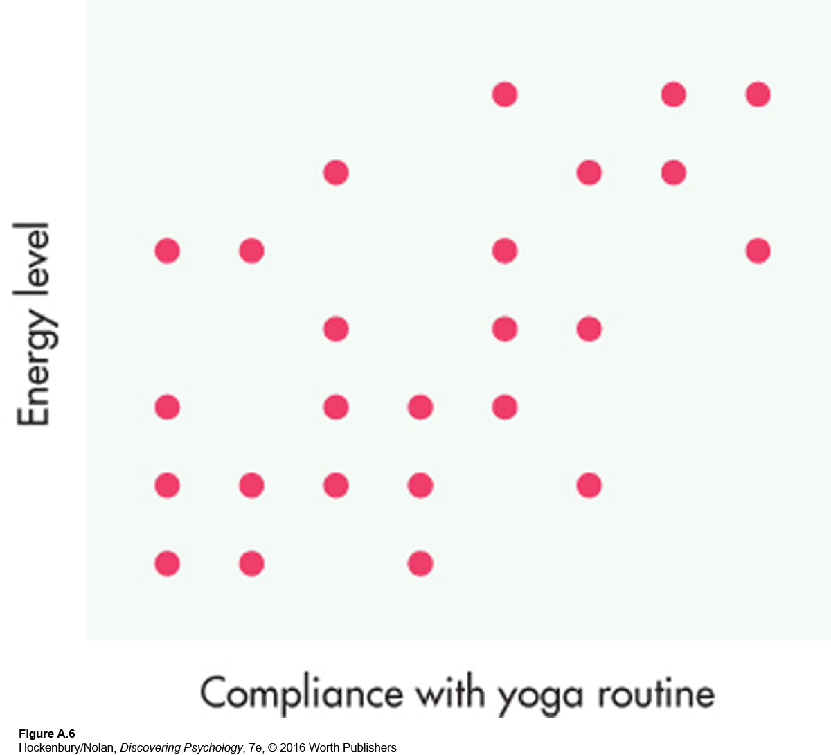
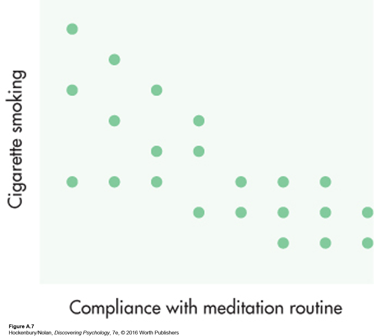
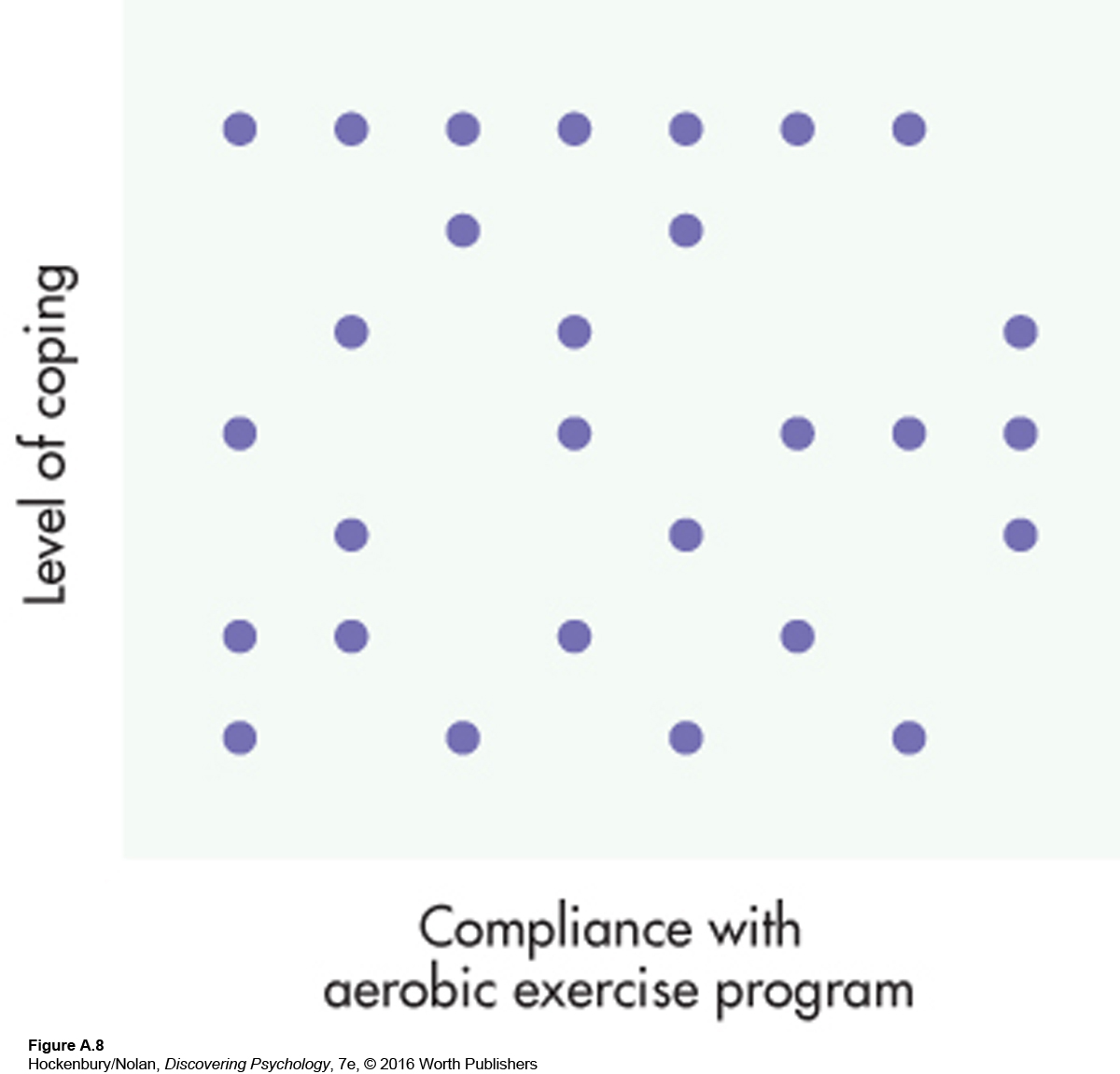
An easy way to show different correlations is with graphs. Plotting two variables together creates a scatter diagram or scatter plot, like the ones in Figures A.6, A.7, and A.8. These figures show the relationship between complying with some component of the alternative health-
Figure A.6 shows a moderately strong positive relationship between compliance with the yoga part of the alternative program and a person’s energy level. You can see this just by looking at the pattern of the data points. They generally form a line running from the lower left to the upper right. When calculated, this particular correlation coefficient is +.59, which indicates a correlation roughly in the middle between 0 and +1.00. In other words, people who did more yoga tended to have higher energy levels. The “tended to” part is important. Some people who did not comply well with the yoga routine still had high energy levels, while the reverse was also true. A +1.00 correlation, or a perfect positive correlation, would indicate that frequent yoga sessions were always accompanied by high levels of energy, and vice versa. What would a scatter diagram of a perfect +1.00 correlation look like? It would be a straight diagonal line starting in the lower left-
Several other positive correlations were found in this study. Compliance with the alternative diet was positively associated with increases in energy and positive health perceptions. In addition, following the high-
The study also found some negative correlations. Figure A.7 illustrates a negative correlation between compliance with the meditation part of the alternative program and cigarette smoking. This correlation coefficient is –.77. Note that the data points fall in the opposite direction from those in Figure A.6, indicating that as the frequency of meditation increased, cigarette smoking decreased. The pattern of points in Figure A.7 is closer to a straight line than is the pattern of points in Figure A.6. A correlation of –.77 shows a relationship of greater magnitude than does a correlation of +.59. But though –.77 is a relatively high correlation, it is not a perfect relationship. A perfect negative relationship would be illustrated by a straight diagonal line starting in the upper left-
Finally, Figure A.8 shows two variables that are not related to each other. The hypothetical correlation coefficient between compliance with the aerobic exercise part of the traditional program and a person’s level of coping is +.03, barely above 0. In the scatter diagram, data points fall randomly, with no general direction to them. From a z-score point of view, when two variables are not related, the cross-
In addition to describing the relationship between two variables, correlation coefficients are useful for another purpose: prediction. If we know a person’s score on one of two related variables, we can predict how he or she will perform on the other variable. For example, in a recent issue of a magazine, I found a quiz to rate my risk of heart disease. I assigned myself points depending on my age, HDL (“good”) and total cholesterol levels, systolic blood pressure, and other risk factors, such as cigarette smoking and diabetes. My total points (–2) indicated that I had less than a 1 percent risk of developing heart disease in the next five years. How could such a quiz be developed? Each of the factors I rated is correlated to some degree with heart disease. The older you are and the higher your cholesterol and blood pressure, the greater your chance of developing heart disease. Statistical techniques are used to determine the relative importance of each of these factors and to calculate the points that should be assigned to each level of a factor. Combining these factors provides a better prediction than any single factor because none of the individual risk factors correlate perfectly with the development of heart disease.
One thing you cannot conclude from a correlation coefficient is causality. In other words, the fact that two variables are highly correlated does not necessarily mean that one variable directly causes the other. Take the meditation and cigarette-