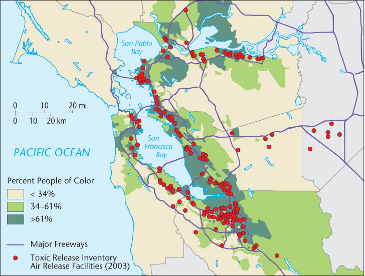
Figure 5.24 Industrial air pollution and minority neighborhoods. This figure maps the locations of TRI (Toxic Release Inventory) facilities with active air pollution releases in the San Francisco Bay Area, relative to the proportion of residences of people of color. The map clearly shows the close coincidence in space between activities harmful to human health and neighborhoods where one-third or more of the population is Black, Latino, or Asian. In this example, mapping is used to promote environmental social justice.