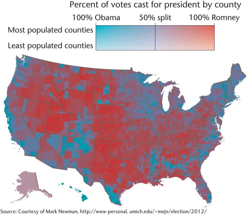
Figure 6.12 Purple America. Rather than using stark color contrasts to represent the 2012 presidential election results, this map uses color shading. How does the use of shading affect our understanding of a sharply divided American electorate that appears so prominent in Figure 6.10? What other kinds of geographic voting patterns emerge? (Source: Courtesy of Mark Newman, http://www-personal.umich.edu/~mejn/election/2012.)