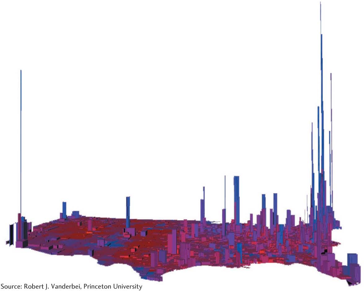
Figure 6.13 Presidential election results in 3D. In this map, height represents voters per square mile (for the 2004 presidential election), so urban areas stand out in contrast to suburban and rural areas. What political-geographic patterns are noticeable here? (Source: Robert J. Vanderbei, Princeton University.)