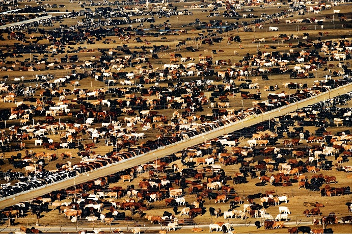
Some social scientists use the term “Affluenza” (a pun on affluence and influenza) to describe a disease of developed, and sometimes developing, countries caused by placing too large a priority on the attainment of physical wealth and comforts. People consumed with living the “good life” can ironically become less healthy and happy. A common side effect of affluenza is obesity, along with the many diseases associated with it. As recently as the Great Depression, it was common, even among the middle class, for families to eat meat only a few times a week. Even if meat was eaten daily, it was in much smaller portions. The reason for the difference between then and now is that people then had to pay the true price of the meat they ate. They either raised it themselves or bought meat whose cost wasn't offset by government subsidies. Meat soon became cheaper, and consumers, possibly seeing meat as a sign of success, began to eat more and more of it. With this change in diet came an increase in obesity and other diseases that had once been rare. The world's two most populous countries, India and China, are now going through a similar dietary transition, as their citizens' incomes and standards of living increase. Time will tell if these countries will be able to avert the health crisis and environmental issues that were experienced by the United States.
1.
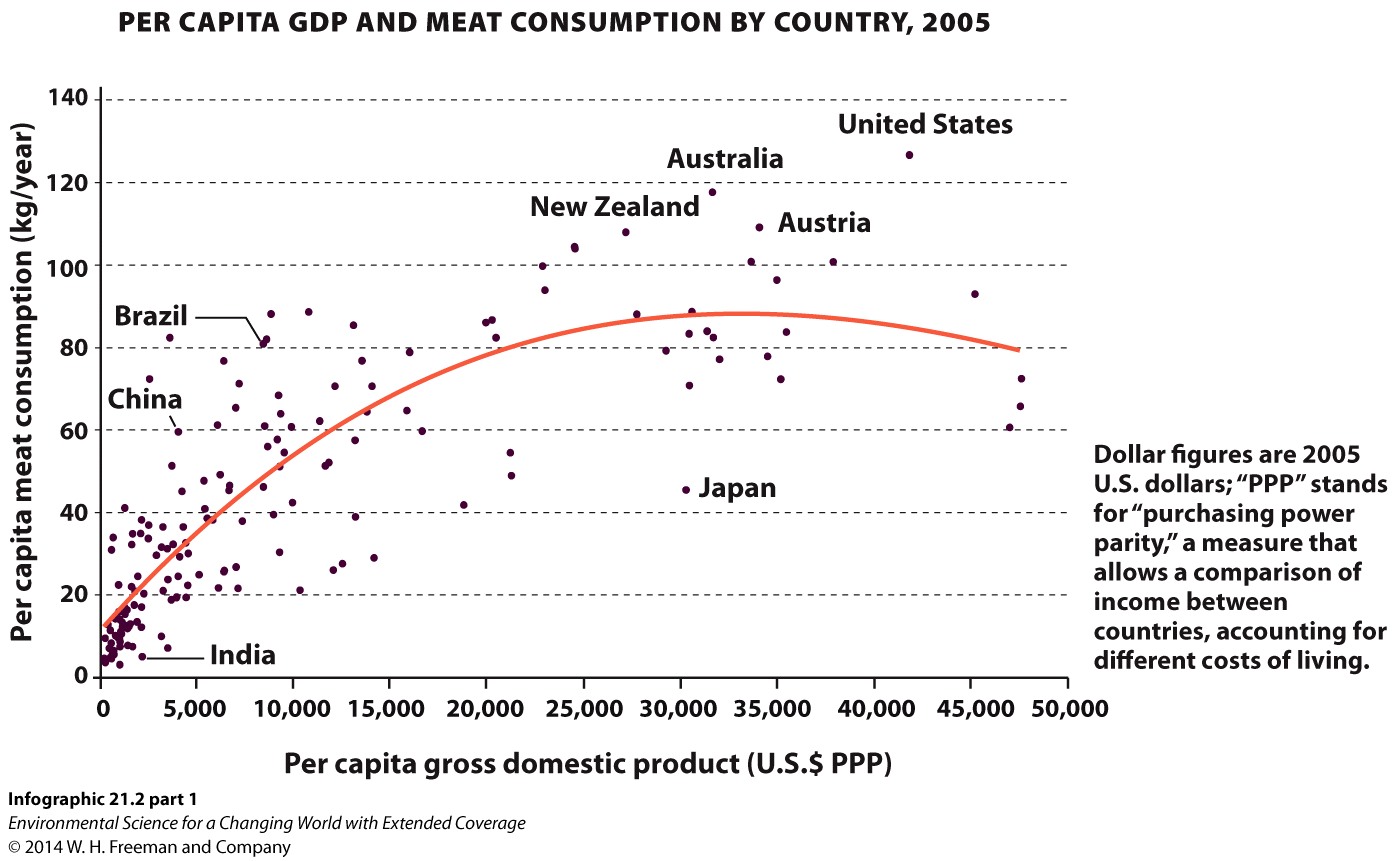
Among other data, the graph above displays _______ in several different countries.
A.
B.
C.
D.
999
Try again.
Correct.
Incorrect.
2.
The MOST likely reason that only eight of the dots in the graph are labeled is that:
A.
B.
C.
D.
999
Try again.
Correct.
Incorrect.
3.
Of the countries below, the one with the lowest meat-consumption-to-income ratio is:
A.
B.
C.
D.
999
Try again.
Correct.
Incorrect.
4.
Thought Question: What do you think the red line represents? Why do you think it is curved?
The red line is most likely a 'best-fit' line, which is a mathematical approximation of the trend found in the relationship between income and meat consumption. It appears as though some sort of exponential or parabolic line fit the data well, but one could imagine a straight best fit line, approximating a linear algebraic function starting near India and angling towards Austria.
5.
Thought Question: According to the World Bank, from 2005–-2011, the annual per-capita income in US$ PPP for India, China, and the United States was $3,650, $8,442, and $48,442. According to The Economist, the average annual per-capita meat consumption in those countries in 2007 was 3.2, 54, and 125 kg. Which of those countries eats the most meat (in kilograms) per income dollar? Which country eats the least? How could you explain the difference between the two?
Dividing the kilograms of meat consumed per person per year by the annual per-person income results in the following:
So, it would seem that the average person in China spends more of his or her income on meat consumption than either the United States or India. India consumes meat per income at a rate an order of magnitude lower than either the United States or China. You could propose any of a number of reasons for the difference between India and China. One would be cultural: Vegetarianism is part of many of the faiths in India, but not in China. Another would be that perhaps there is a minimum level of income at which buying meat regularly becomes feasible.
6.
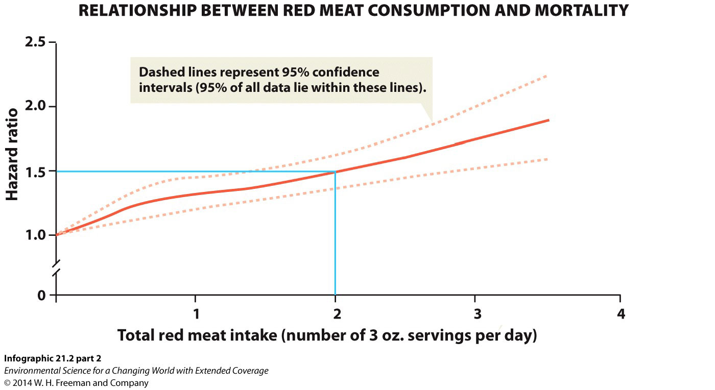
What does "hazard ratio" represent?
A.
B.
C.
D.
999
Try again.
Correct.
Incorrect.
7.
It is MOST correct to say that a person consuming two 3-ounce portions of red meat per day likely has a hazard ratio of:
A.
B.
C.
D.
999
Try again.
Correct. The dashed 95% confidence interval lines indicate where the hazard ratio most likely is at any given portion size. If you look at the confidence interval lines for two portions, you will see that the upper dashed line is at around 16 or 17 hazard-ratio units and the lower line is around 12 or 13 hazard-ratio units. This means that, although your best prediction is that two portions per day equals 15, there's a 95% chance it's as much as 2 greater or less than 15 (13–17).
Incorrect. The dashed 95% confidence interval lines indicate where the hazard ratio most likely is at any given portion size. If you look at the confidence interval lines for two portions, you will see that the upper dashed line is at around 16 or 17 hazard-ratio units and the lower line is around 12 or 13 hazard-ratio units. This means that, although your best prediction is that two portions per day equals 15, there's a 95% chance it's as much as 2 greater or less than 15 (13–17).
8.
Thought Question: For your reference, a typical hamburger in the major fast-food chains has about 3–4 oz of red meat. Where does that put your hazard ratio? Will this chart alter your eating habits?
Only you know how much red meat you eat. However, the typical college student is usually not inclined to alter dietary habits unless faced with medical necessity.