
Chapter 1. Scatter Plot Graphs
Part A: Background
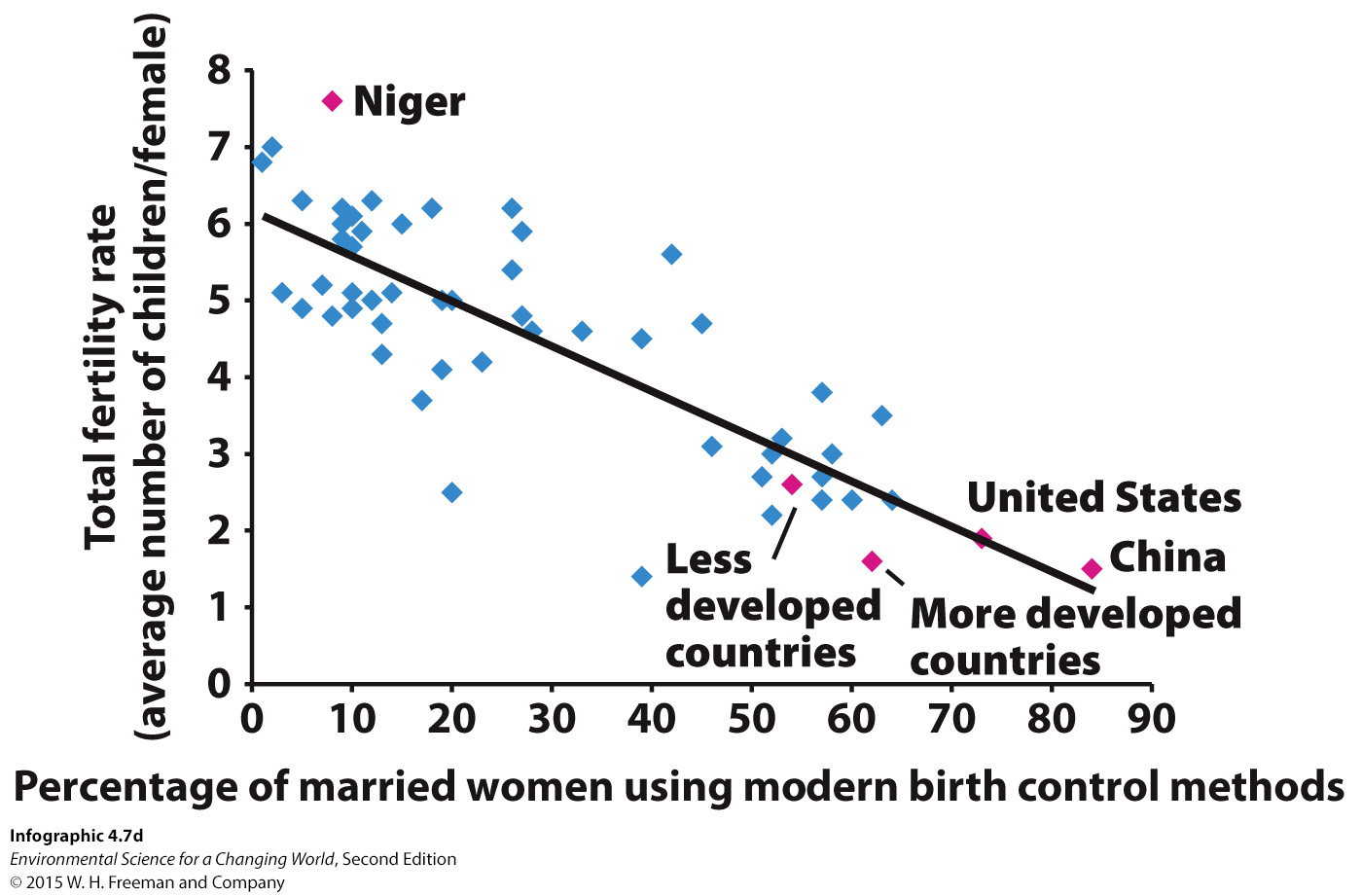
Total Fertility Rate is a measurement of the average number of children a typical woman will have in a country. This number is highly correlated with the years of education available to an average woman in that country. These variables are important in determining why the population growth rate in developing countries is so rapid.
Part B: Examine the Data Set
This data contrasts the expected years of schooling for girls born in each country with the projected number of children per women.
| Country | Expected Years of Schooling Girls Receive | Projected Children Per Woman (Total Fertility Rate) |
|---|---|---|
| Australia | 19.6 | 1.9 |
| United States | 16.8 | 2.1 |
| Libya | 16.2 | 2.5 |
| Brazil | 14.2 | 1.8 |
| Indonesia | 12.9 | 2.1 |
| Honduras | 11.4 | 3.1 |
| India | 10.7 | 2.6 |
| Nigeria | 9.0 | 5.5 |
| Ethiopia | 8.7 | 4.0 |
| Senegal | 8.2 | 4.7 |
| Haiti | 7.6 | 3.3 |
| Pakistan | 7.3 | 3.4 |
| Burkina Faso | 6.4 | 5.8 |
| Niger | 4.9 | 7.0 |
| Somalia | 2.4 | 6.3 |
1.
Which of these most accurately describes what we need to do with the data?
| A. |
| B. |
| C. |
| D. |
| E. |
Part C: Build the Graph
Instructions: Create a graph below, giving it a title such as “Education and Total Fertility Rate of Women.” Label the X axis as “Years of Schooling Girls Receive”, and the the Y axis as "Total Fertility Rate". Draw a line of best fit through the data points.
| Country | Expected Years of Schooling Girls Receive | Projected Children Per Woman (Total Fertility Rate) |
|---|---|---|
| Australia | 19.6 | 1.9 |
| United States | 16.8 | 2.1 |
| Libya | 16.2 | 2.5 |
| Brazil | 14.2 | 1.8 |
| Indonesia | 12.9 | 2.1 |
| Honduras | 11.4 | 3.1 |
| India | 10.7 | 2.6 |
| Nigeria | 9.0 | 5.5 |
| Ethiopia | 8.7 | 4.0 |
| Senegal | 8.2 | 4.7 |
| Haiti | 7.6 | 3.3 |
| Pakistan | 7.3 | 3.4 |
| Burkina Faso | 6.4 | 5.8 |
| Niger | 4.9 | 7.0 |
| Somalia | 2.4 | 6.3 |

Part D: Apply Skills
There are four basic kinds of relationships that can be derived from scatterplot data.
1) Direct relationships (positive correlations) occur when both factors increase together or decrease together (e.g as one goes up, the other goes up, or as one goes down the other goes down).
2) Inverse relationships (negative correlations) occur when as one factor increases the other decreases. (The graph you just drew shows an inverse relationship between total fertility rate and education for women.)
3) Exponential relationships occur when the rate of change increases (or decreases) over time giving a characteristic J-shaped curve (for an increasing rate of change) or a “backward” J-curve (for a decreasing rate of change).
4) There is no relationship when one variable increases or decreases, while the other does not, or when there is no discernible pattern (no detectable increase or decrease).
Part D: Apply Skills
Infographic 4.6 (Infant Mortality Rate and Birth Rate) is a scatter plot that shows the correlation between infant mortality rate and total fertility rate.
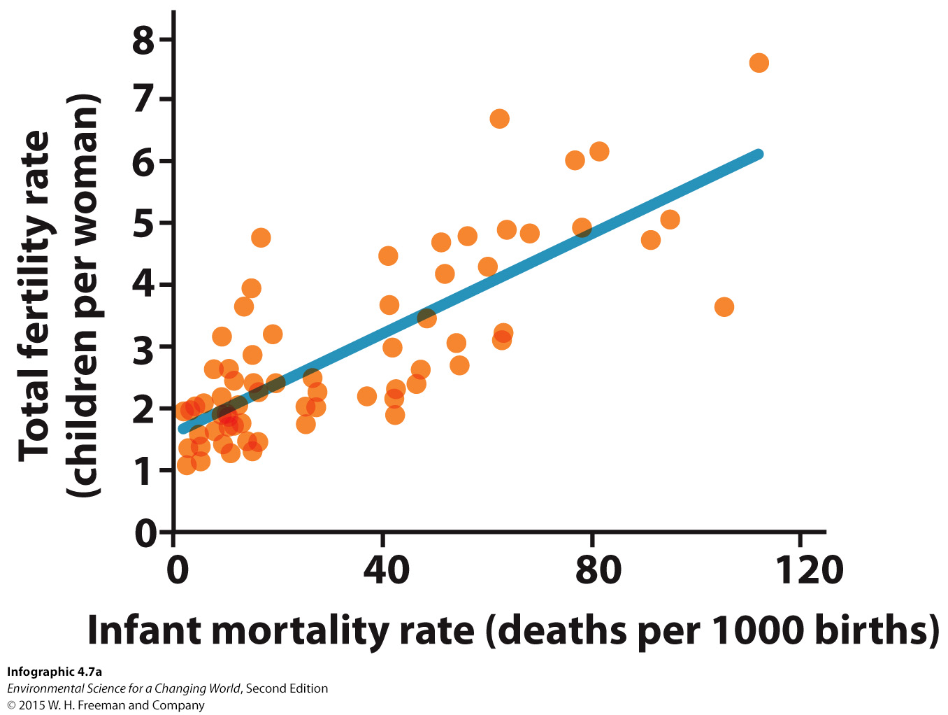
There is also a correlation between desired fertility and total fertility rate.
4.
Is infant mortality rate graphed as a dependent or independent variable?
| A. |
| B. |
Activity results are being submitted...