Using Visuals in Your Own Arguments
Using Visuals in Your Own Arguments
Given the power of images, it’s only natural that you would use them in your own composing. In fact, many college instructors now expect papers for their courses to be posted to the Web, where digital photos, videos, and design elements are native. Other instructors invite or even require students to do multimedia reports or to use videos, photo collages, cartoons, or other media to make arguments — an assignment not unlike that given to the artists in the Smithsonian’s “Star-Spangled Banner” project. If using visual media still strikes you as odd in academic settings, just consider that such arguments can have all the reach and versatility of more conventional verbal appeals to pathos, ethos, and logos. Often even more.
Using Images and Visual Design to Create Pathos
Many advertisements, YouTube videos, political posters, rallies, marches, and even church services use visual images to trigger emotions. You can’t flip through a magazine, watch a video, or browse the Web without being cajoled or seduced by figures or design elements of all kinds — most of them fashioned in some way to attract your eye and attention.
Technology has also made it incredibly easy for you to create on-the-spot photographs and videos that you can use for making arguments of your own. With a GoPro camera strapped to your head, you could document transportation problems in and around campus and then present your visual evidence in a paper or an oral report. You don’t have to be a professional these days to produce poignant, stirring, or even satirical visual texts.
Yet just because images are powerful doesn’t mean they always work. When you compose visually, you have to be certain to generate impressions that support your arguments, not weigh against them.
Shape Visuals to Convey Appropriate Feelings
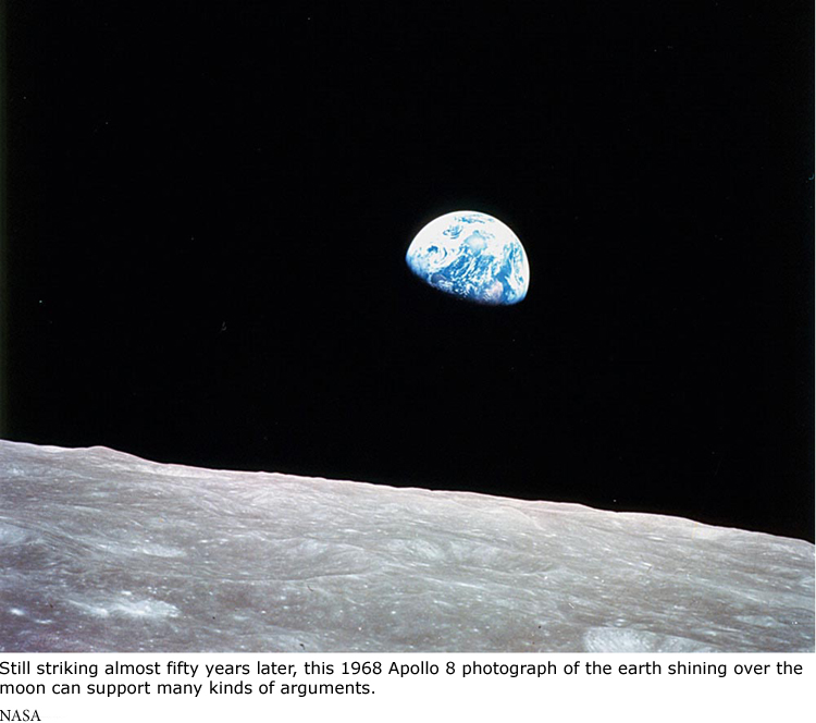
To appeal visually to your readers’ emotions, think first of the goal of your writing: you want every image or use of multimedia to advance that purpose. Consider, for a moment, the iconic Apollo 8 “earthrise” photograph of our planet hanging above the horizon of the moon. You could adapt this image to introduce an appeal for additional investment in the space program. Or it might become part of an argument about the need to preserve frail natural environments, or a stirring appeal against nationalism: From space, we are one world. Any of these claims might be supported successfully without the image, but the photograph — like most visuals — will probably touch members of your audience more strongly than words alone could.
Consider Emotional Responses to Color
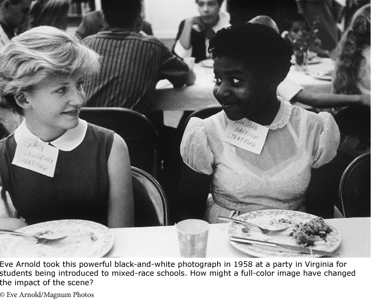
As the “earthrise” photo demonstrates, color can have great power too: the beautiful blue earth floating in deep black space carries a message of its own. Indeed, our response to color is part of our biological and cultural makeup. So it makes sense to consider what shades are especially effective with the kinds of arguments you’re making, whether they occur in images themselves or in elements such as headings, fonts, backgrounds, screens, banners and so on. And remember that a black-and-white image can also be a memorable design choice.
In most situations, let your selection of colors be guided by your own good taste, by designs you admire, or by the advice of friends or helpful professionals. Some design and presentation software will even help you choose colors by offering dependable “default” shades or an array of pre-existing designs and compatible colors (for example, of presentation slides). To be emotionally effective, the colors you choose for a design should follow certain commonsense principles. If you’re using background colors on a political poster, Web site, or slide, the contrast between words and background should be vivid enough to make reading easy. For example, white letters on a yellow background are not usually legible. Similarly, bright background colors should be avoided for long documents because reading is easiest with dark letters against a light or white background. Avoid complex patterns; even though they might look interesting and be easy to create, they often interfere with other more important elements of a presentation.
When you use visuals in your college projects, test them on prospective readers. That’s what professionals do because they appreciate how delicate the choices of visual and multimedia texts can be. These responses will help you analyze your own arguments and improve your success with them.
Using Images to Establish Ethos
If you are on Facebook, LinkedIn, or other social networking sites, you no doubt chose photographs for those sites with an eye to creating a sense of who you are, what you value, and how you wish to be perceived. You fashioned a self-image. So it shouldn’t come as a surprise that you can boost your credibility as a writer by using visual design strategically: we know one person whose Facebook presentation of images and media so impressed a prospective employer that she got a job on the spot. So whether you are using photographs, videos, or other media on your personal pages or in your college work, it pays to attend to how they construct your ethos.
How does the image of the student from Mt. Holyoke impact your response to Sarah Fraas’s piece “Trans Women at Smith: The Complexities of Checking ‘Female’”?
Understand How Images Enhance Credibility and Authority
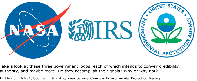
You might have noticed that just about every company, organization, institution, government agency, or club now sports a logo or an emblem. Whether it’s the Red Cross, the Canadian Olympic Committee, or perhaps the school you attend, such groups use carefully crafted images to signal their authority and trustworthiness. An emblem or a logo can also carry a wealth of cultural and historical implications. That’s why university Web sites typically include the seal of the institution somewhere on the homepage (and always on its letterhead) or why the president of the United States travels with a presidential seal to hang on the speaker’s podium.
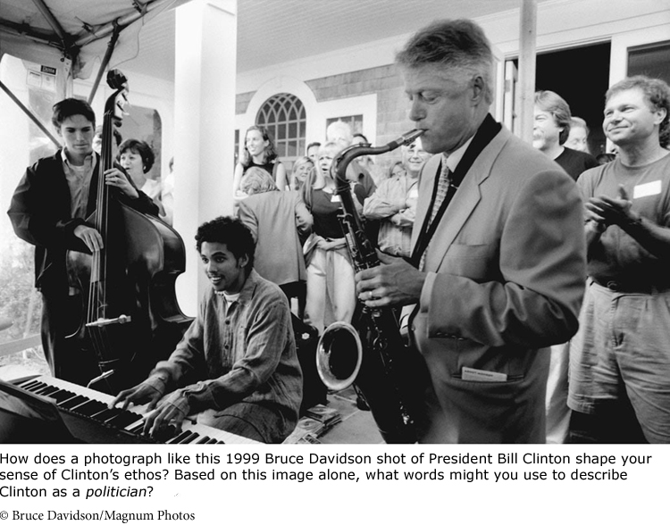
Though you probably don’t have a personal logo or trademark, your personal ethos functions the same way when you make an argument. You can establish it by offering visual evidence of your knowledge or competence. In an essay on safety issues in competitive biking, you might include a photo of yourself in a key race, embed a video showing how often serious accidents occur, or include an audio file of an interview with an injured biker. The photo proves that you have personal experience with biking, while the video and audio files show that you have done research and know your subject well, thus helping to affirm your credibility.
Predictably, your choice of medium also says something important about you. Making an appeal on a Web site sends signals about your technical skills, contemporary orientation, and personality. So if you direct people to a Facebook or Flickr page, be sure that any materials there present you favorably. Be just as careful in a classroom that any handouts or slides you use for an oral report demonstrate your competence. And remember that you don’t always have to be high-tech to be effective: when reporting on a children’s story that you’re writing, the most sensible medium of presentation might be cardboard and paper made into an oversized book and illustrated by hand.
You demonstrate your ethos simply by showing an awareness of the basic design conventions for any kind of writing you’re doing. It’s no accident that lab reports for science courses are sober and unembellished. Visually, they reinforce the professional ethos of scientific work. The same is true of a college research paper. So whether you’re composing a term paper, a résumé, a film, an animated comic, or a Web site, look for successful models and follow their design cues.
Consider How Details of Design Reflect Your Ethos
As we have just suggested, almost every design element you use in a paper or project sends signals about character and ethos. You might resent the tediousness of placing page numbers in the appropriate corner, aligning long quotations just so, and putting footnotes in the right place, but these details prove that you are paying attention. Gestures as simple as writing on official stationery (if, for example, you are representing a club or campus organization) or dressing up for an oral presentation matter too: suddenly you seem more mature and competent.
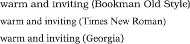
Even the type fonts that you select for a document can mark you as warm and inviting or as efficient and contemporary. The warm and inviting fonts often belong to a family called serif. The serifs are those little flourishes at the ends of the strokes that make the fonts seem handcrafted and artful:
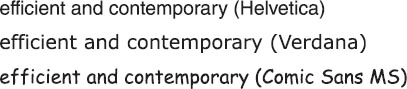
Cleaner, modern fonts go without those little flourishes and are called sans serif. These fonts are cooler, simpler, and, some argue, more readable on a computer screen (depending on screen resolution):
Other typographic elements send messages as well. The size of type can make a difference. If your text or headings are in boldface and too large, you’ll seem to be shouting:
LOSE WEIGHT! PAY NOTHING!*
Tiny type, on the other hand, might make you seem evasive:
*Excludes the costs of enrollment and required meal purchases. Minimum contract: 12 months.
Finally, don’t ignore the signals you send through your choice of illustrations and photographs themselves. Images communicate your preferences, sensitivities, and inclusiveness — sometimes inadvertently. Conference planners, for example, are careful to create brochures that represent all participants, and they make sure that the brochure photos don’t show only women, only men, or only members of one racial or ethnic group.
Consider the design choices made by the creators of the diversity posters in Chapter 26. Which ones are effective? Do any design choices get in the way of their messages?
RESPOND •
Choose a project or an essay you have written recently and examine it for how well visually it establishes your credibility and how well it is designed. Ask a classmate or friend to look at it and describe the ethos you convey through the item. Then go back to the drawing board with a memo to yourself about how you might use images or media to improve it.
Using Visual Images to Support Logos
Not that long ago, media critics ridiculed the colorful charts and graphs in newspapers like USA Today. Now, comparable features appear in even the most traditional publications because they work: they convey information efficiently and persuasively. We now expect evidence to be presented graphically and have learned to use and interact with multiple streams of data and information.
Organize Information Visually
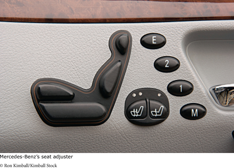
Graphic presentation calls for design that enables readers and viewers to look at an item and understand what it does. A brilliant, much-copied example of such an intuitive design is a seat adjuster invented many years ago by Mercedes-Benz (see photo below). It’s shaped like a tiny seat. Push any element of the control, and the real seat moves in that direction — back and forth, up and down. No instructions are necessary.
Good visual design can work the same way in an argument by conveying evidence, data, and other information without elaborate instructions. Titles, headings, subheadings, enlarged quotations, running heads, and boxes are some common visual signals:
Use headings to guide your readers through your print or electronic document. For long and complex pieces, use subheadings as well, and make sure they are parallel.
Use type font, size, and color to show related information among headings.
Arrange headings or text on a page to enforce relationships among comparable items, ideas, or bits of evidence.
Use a list or a box to set off material for emphasis or to show that it differs from the rest of the presentation. You can also use shading, color, and typography for emphasis.
Place your images and illustrations strategically. What you position front and center will appear more important than items in less conspicuous places. Images of comparable size will be treated as equally important.
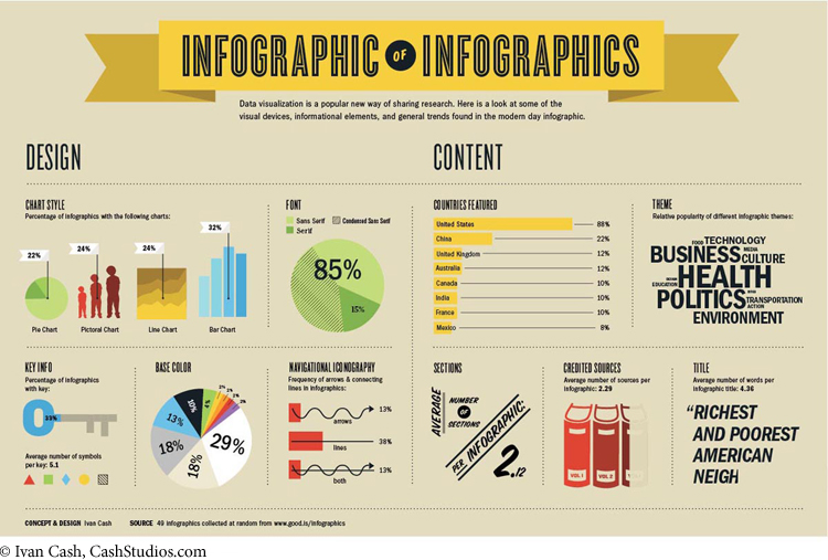
Remember, too, that design principles evolve and change from medium to medium. A printed text or presentation slide, for example, ordinarily works best when its elements are easy to read, simply organized, and surrounded by restful white space. But some electronic texts thrive on visual clutter, packing a grab bag of data into a limited space (See the “Infographic of Infographics” below.) Look closely, though, and you’ll probably find the logic in these designs.
Use Visuals to Convey Data Efficiently
Words are capable of great precision and subtlety, but some information is conveyed far more effectively by charts, graphs, drawings, maps, or photos — as several items in Chapter 4 illustrate. When making an argument, especially to a large group, consider what information might be more persuasive and memorable in nonverbal form.
A pie chart is an effective way of comparing parts to the whole. You might use a pie chart to illustrate the ethnic composition of your school, the percentage of taxes paid by people at different income levels, or the consumption of energy by different nations. Pie charts depict such information memorably.
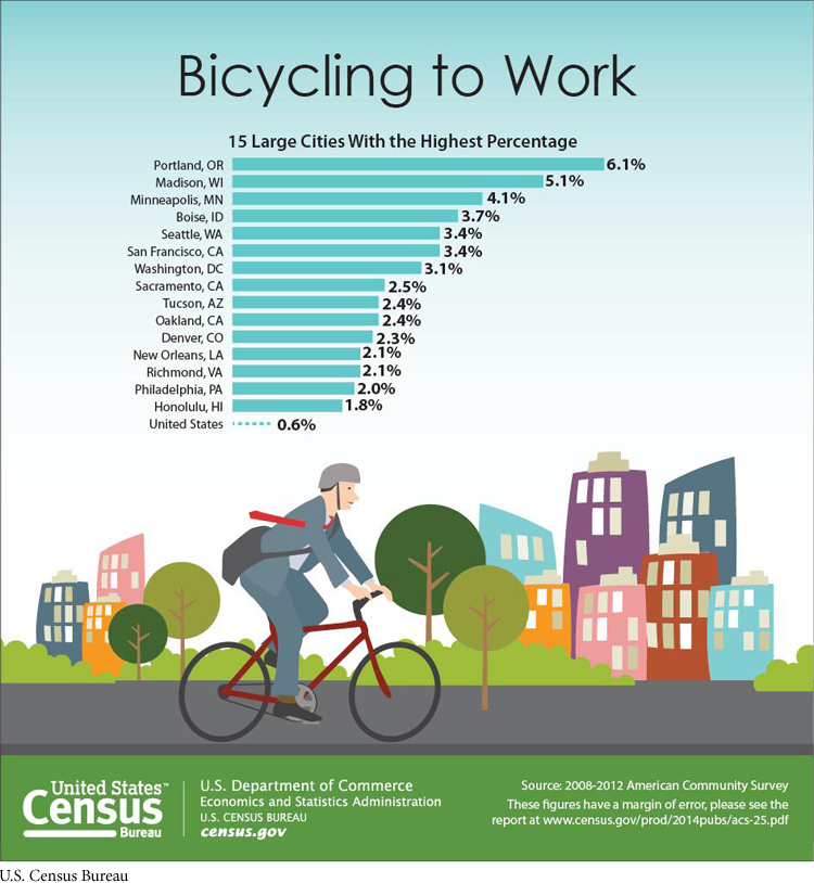
A graph is an efficient device for comparing items over time or according to other variables. You could use a graph to trace the rise and fall of test scores over several decades, to show college enrollment by sex, race, and Hispanic origin, or to track bicycle usage in the United States, as in the bar graph below.
Diagrams or drawings are useful for attracting attention to details. Use drawings to illustrate complex physical processes or designs of all sorts. After the 2001 attack on the World Trade Center, for example, engineers prepared drawings and diagrams to help citizens understand precisely what led to the total collapse of the buildings.
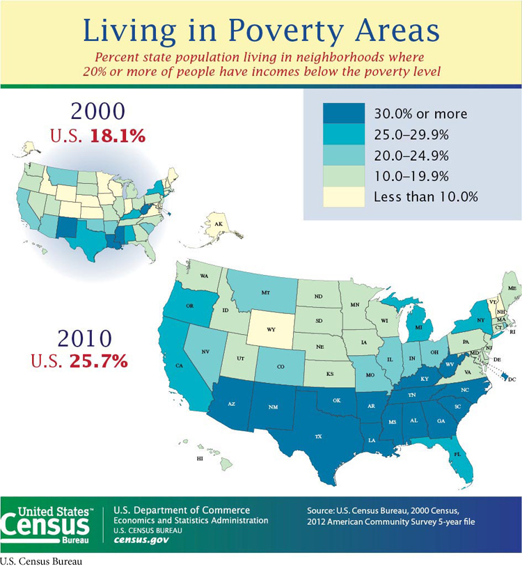
You can use maps to illustrate location and spatial relationships — something as simple as the distribution of office space in your student union or as complex as poverty in the United States, as in the map below. In fact, scholars in many fields now use geographic information system (GIS) technology to merge maps with databases in all fields to offer new kinds of arguments about everything from traffic patterns and health care trends to character movements in literary works. Plotting data this way yields information far different from what might be offered in words alone. You can find more about GIS applications online.
Timelines allow you to represent the passage of time graphically, and online tools like Dipity can help you create them for insertion into your documents. Similarly, Web pages can make for valuable illustrations. Programs like ShrinkTheWeb let you create snapshots of Web sites that can then be inserted easily into your writing. And when you want to combine a variety of graphs, charts, and other texts into a single visual argument, you might create an infographic using software such as Google Public Data Explorer, Many Eyes, StatPlanet, and Wordle.
Follow Professional Guidelines for Presenting Visuals
Charts, graphs, tables, illustrations, timelines, snapshots of Web sites, and video clips play such an important role in many fields that professional groups have come up with guidelines for labeling and formatting these items. You need to become familiar with those conventions as you advance in a field. A guide such as the Publication Manual of the American Psychological Association (6th edition) or the MLA Handbook for Writers of Research Papers (7th edition) describes these rules in detail. See also Chapter 15, “Presenting Arguments.”
Remember to Check for Copyrighted Material
You also must be careful to respect copyright rules when using visual items that were created by someone else. If you do introduce any borrowed items into academic work, be careful to document them fully. It’s relatively easy these days to download visual texts of all kinds from the Web. Some of these items — such as clip art or government documents — may be in the public domain, meaning that you’re free to use them without requesting permission or paying a royalty. But other visual texts may require permission, especially if you intend to publish your work or use the item commercially. Remember: anything you place on a Web site is considered “published.” (See Chapter 21 for more on intellectual property and fair use.)